
GIJN’s Data Journalism Top 10: European Election, Data via Audio, Tax Fraud & Parserator
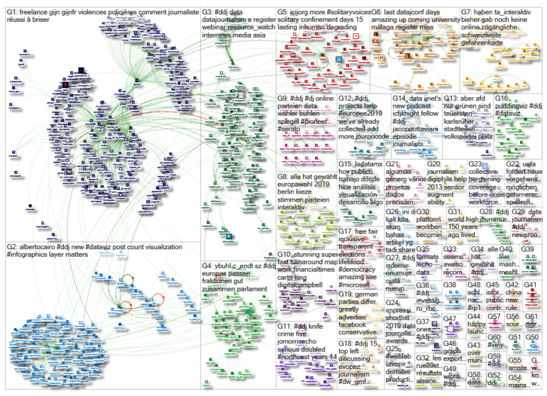
What’s the global data journalism community tweeting about this week? Our NodeXL #ddj mapping from May 27 to June 2 finds immense buzz around the recent European Parliament elections, with @SZ explaining the EU political landscape, @morgenpost looking at the results in Berlin, and @journocode collecting data journalism pieces related to the election. There’s also @datajournalism‘s tips on presenting data through audio and @BIRNSrbija‘s data investigation into major corporate tax fraud in Serbia.
Presenting Data Through Audio
Data journalism is typically associated with data visualization, but it can be presented for the ears as well as the eyes. A mix of journalists and experts — Sophie Chou, Michael Corey, Adèle Humbert, Petr Kočí, Jacques Marcoux and Paul McNally — shared tips and techniques for representing data through audio.
Test Your European Knowledge
In the same vein as The New York Times’ “You Draw It” interactives, BR24 has produced 10 interactive quizzes for you to test your knowledge of the European Union. The questions range from whether citizens trust the European Parliament to which EU country has the highest proportion of foreigners.
Explaining the European Party Landscape
The recently elected members of the European Parliament come from 28 different countries and 181 different national parties. In order to work effectively, these parties join forces to form transnational groups. Süddeutsche Zeitung tries to explain where these groups lie on the political spectrum and how they fit together.
European Election Card in Berlin
Berliner Morgenpost created an interactive map showing how Berliners voted in the recent European election. Check out which were the three strongest forces, the districts that changed hands, places where non-voters could have swung the vote, and more.
https://twitter.com/nthnashma/status/1132934030394044417
More on the European Election
Interested in more European election data journalism stories? Journocode has collected more than 30 here and are asking for more contributions here. Datajournalism.com also has a newsletter on how data journalists tackled coverage of the election here.
Parserator
Parserator is not a new tool, but it comes in handy for parsing messy and large volumes of addresses, names or any unstructured text into useful components. Data Journalism Turkey recommends it here. More details on Github.
#FollowFriday: @albertocairo
Interested in data visualization and how you can make your infographics better? Follow data viz expert Alberto Cairo’s blog. He provides constructive critiques on existing charts, tips and food for thought.
https://twitter.com/AlbertoCairo/status/1134789493116956674
Data Investigation Into Tax Fraud
BIRN Serbia investigates a huge corporate and tax fraud scheme in Serbia involving more than 2,000 companies that have successfully avoided paying tens of millions of euros in taxes.
https://twitter.com/jackoozell/status/1134392688118247424
Hungary’s Residency Permit Boom
The number of residency permits in Hungary issued to non-EU nationals increased dramatically in 2017. Atlatszo visualized the data of permits issued for different reasons from 2009 to 2017. You can also filter by country.
Webinar: Open Data Asia
Resource Watch, Earth Journalism Network and Internews are organizing a training webinar for journalists based in Asia on June 12. Explore how you can utilize public datasets for your reporting.
Thanks, once again, to Marc Smith of Connected Action for gathering the links and graphing them. The Top Ten #ddj list is curated weekly.
 Eunice Au is GIJN’s program coordinator. Previously, she was a Malaysia correspondent for Singapore’s The Straits Times, and a journalist at the New Straits Times. She has also written for The Sun, Malaysian Today and Madam Chair.
For a look at Marc Smith’s mapping on #ddj on Twitter, check out this map.

Basic Data Journalism Tips for Editors

My Favorite Tools: Venezuela’s Lisseth Boon on Design and Data Visualization

Document of the Day: Visual Vocabulary
A Call for Debate: Taking Open Data and Government to the Next Level

Turning the Threat to a Distant Glacier into a Local Story Through Data Visualization

Making Trillions Make Sense: How Reuters Visualized the AI Economy

Summer Reading List for Data Journalists: For Those Who Believe in the Power of Storytelling with Numbers

From Data to Storytelling: Concept and Design Tips from the Financial Times’ John Burn-Murdoch

This work is licensed under a Creative Commons Attribution-NoDerivatives 4.0 International License
Republish our articles for free, online or in print, under a Creative Commons license.
Republish this article
This work is licensed under a Creative Commons Attribution-NoDerivatives 4.0 International License
Read Next
Climate Data Journalism
Turning the Threat to a Distant Glacier into a Local Story Through Data Visualization
New York Times climate and environmental graphics reporter Mira Rojanasakul discusses how her team visualized the sea level rise threat from the melting Thwaites Glacier in Antarctica.
Data Journalism
Making Trillions Make Sense: How Reuters Visualized the AI Economy
How do you make a trillion dollars feel real to someone who has never seen that much money? Vineet Khare and Mayank Bhatt faced that very challenge for their data-driven investigation into AI investment.
Data Journalism
Summer Reading List for Data Journalists: For Those Who Believe in the Power of Storytelling with Numbers
Featuring books spanning four continents, these recommended reads provide a global perspective on data journalism.
Data Journalism
From Data to Storytelling: Concept and Design Tips from the Financial Times’ John Burn-Murdoch
The chief data reporter for the Financial Times discusses how he considers the use of text, color, and annotation to aid visual storytelling through charts and graphics.