OPEN CALL: Cyber Investigations Training Course – Digital Threats in the Age of AI
August 7, 2026 • 23:59
-
day
days
-
hour
hours
-
min
mins
-
sec
secs

Accessibility Settings

color options

monochrome muted color dark

reading tools

isolation ruler

Tag

data visualization

220 posts

Data Journalism

Best of Data Journalism for Video Storytelling

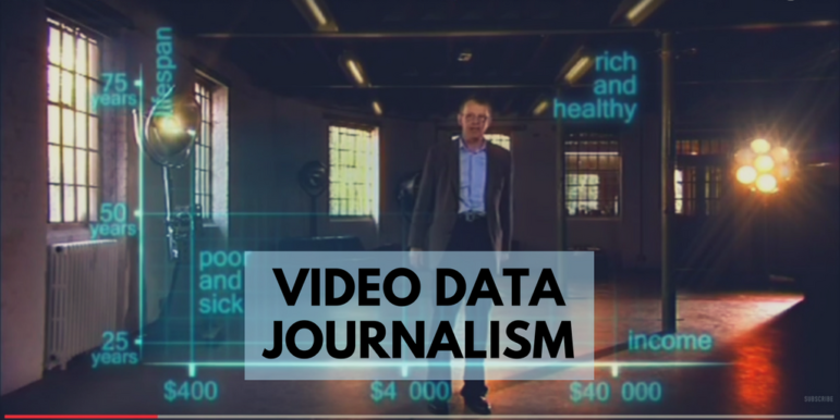
Wondering how to best adapt data journalism for broadcast? UK online journalism expert Paul Bradshaw has done a round-up of impressive examples from five countries — a primer on exploring data storytelling for video and television.

Data Journalism

Top Ten #ddj: This Week’s Top Data Journalism

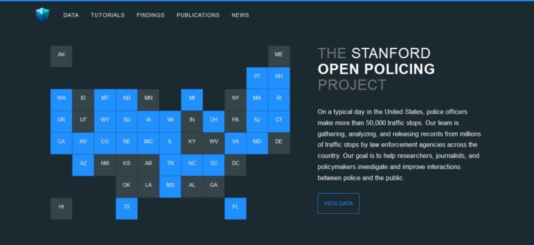
What’s the global #ddj community tweeting about? Our NodeXL mapping from June 19 to 25 includes Germany’s housing discrimination problem by @SPIEGELONLINE and @br_data, data on police interaction with the public from @StanfordEng and @StanfordJourn and a report on big data for gender from @Data2X.

Data Journalism

Top Ten #ddj: This Week’s Top Data Journalism

What’s the global #ddj community tweeting about? Our NodeXL mapping from June 5 to 11 includes #VisualTrumpery from @mcrosasb, analysis of Theresa May’s election disaster by @GuardianVisuals, dataviz structuring strategies from @eagereyes, and school enrollment woes in Delhi from @htTweets.

Data Journalism

Top Ten #ddj: This Week’s Top Data Journalism

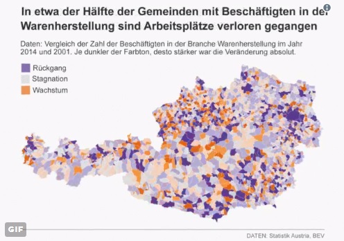
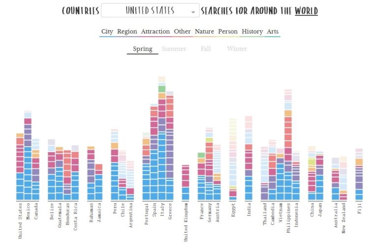
What’s the #ddj community tweeting about? Our NodeXL mapping from May 22 to 28 includes what it’s like to code as a journalist from @CJR, artists and designers visualizing Google search data from @FastCoDesign, the Data Journalism Awards 2017 shortlist from @mberzosa and Austria’s changing job market from @derStandardat.

Data Journalism

Top Ten #ddj: The Week’s Most Popular Data Journalism Links

Here are top data journalism tweets for May 1-7, per our NodeXL mapping: delayed cherry blossoms (@TheEconomist); dataviz how-to (@albertocairo); 20 million starving (@washingtonpost); Munich route planner code (@Munichrocker); FB German filter bubble (@SZ); Open Data Index (@pinardag); and more.

Data Journalism Methodology

La Nación Maps Pollution on Argentina’s Matanza River

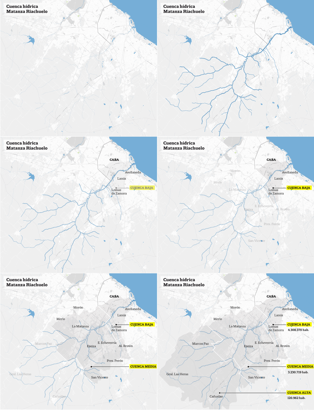
There is a huge amount of data available on pollution and disease caused by the Matanza River – widely known as River Riachuelo – the problem was transforming it into information that those affected could easily understand. In a special multimedia report, La Nación used open data and data visualization to illustrate the extent of the problem.

Data Journalism

Top Ten #ddj: The Week’s Most Popular Data Journalism Links

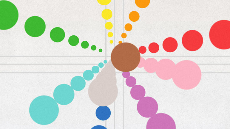
Here are top data journalism tweets for Apr 24-30, per our NodeXL mapping: draw it yourself interactives (@br_data); visualizing Google searches (@albertocairo); opinion polls analysis (@SZ); Politibot’s graphics (@politibot); French election (@BIQdata); ProPublica jobs (@ProPublica); and more.

Data Journalism

Top Ten #ddj: The Week’s Most Popular Data Journalism Links

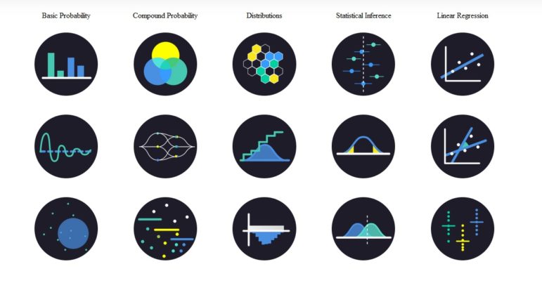
Here are the top data journalism tweets for Feb 27-Mar 5, per our NodeXL mapping: #NICAR17 readings (@albertocairo); fake news guide collaboration (@jwyg); US visa restrictions (@ddjournalism); statistics’ interactive viz (@BrownUniversity); Guardian’s 10-point guide to ddj (@smfrogers); & more.

Data Journalism

Top Ten #ddj: The Week’s Most Popular Data Journalism Links

Here are the hottest data journalism tweets for Jan 30-Feb 5, per our NodeXL mapping: Visual Trumpery (@albertocairo); dataviz colour functions (@FastCoDesign); How to Lie with Statistics (@PenguinBooks); mapping 13m climate change tweets (@CarbonBrief); OpenStreetMap (@datenjournalist); & more.

Data Journalism

Top Ten #ddj: The Week’s Most Popular Data Journalism Links

Here are the hottest data journalism tweets for Jan 16-22, per our NodeXL mapping: dataviz catalog (@flowingdata); Inaugurations compared (@pewresearch); big data & polls (@ddjournalism); Hispanics in America (@UniNoticias); Le Monde data (@decodeurs); Obama’s record (@nytimes); & more.