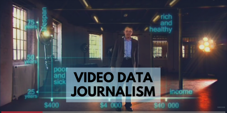
Best of Data Journalism for Video Storytelling
The best-known examples of data journalism tend to be based around text and visual, but it’s harder to find data journalism in video and audio. Ahead of the launch of my new MA in Data Journalism at the Birmingham School of Media, I thought I would share my list of examples of video data journalism that I use with students in exploring data storytelling across multiple platforms. If you have others, I’d love to hear about them.
FOI Stories in Broadcast
Freedom of Information stories are one of the most common situations when broadcasters will have to deal with more in-depth data. These are often brought to life by thorough case studies and interviewing experts.
 In 2015, for example, a former and then-current MA student worked with the BBC’s Victoria Derbyshire program on FOI responses from 42 police forces relating to violence in schools. The online version of the story included an interview with a former teacher affected by the issue.
Other British examples include this ITV story on mental health trusts cutting beds and this Channel 4 Dispatches piece on benefit sanctions. And I keep a list of other FOI-based stories by the BBC here.
In 2013, Canada’s Fifth Estate Rate My Hospital investigation featured a number of case study and expert video clips online, this time more presenter-led, while also in Canada this Global News story on pit bull attacks uses charts and tables online, but vox pops and archive clips in the (embedded) broadcast treatment. You can also watch broadcast treatments of stories by their data journalist Patrick Cain into car testing and problem gambling.
Another data journalist in a broadcast organization is Tisha Thompson at NBCUniversal. Her examples include “collecting rape statistics when the military refuses to hand them over” (more here) and government employees accused of stealing the beer they’re supposed to be delivering (more here). (Thompson says this is “Why you should make your own database, especially when the government doesn’t do it.”) There’s also water quality in Virginia and Maryland; high-end luxury and fashion brands on a list of government seizures; and potholes.
https://www.youtube.com/watch?v=zIGLZpjqubM
In Switzerland, broadcaster SRF has an impressive data operation. In one recent segment a TV team printed a table onto a 60-meter long sheet of paper to illustrate a story.
Striking Statistics
Hans Rosling, who died earlier this year, did much to popularize the use of statistics and data visualization. His engaging presentation style led BBC4 to commission a series on “The Joy of Stats.” Here’s one of the highlights:
Broadcast Data Journalism by Students
Karl Idsvoog at Kent State University shared a number of examples of his students producing video reports on their data journalism projects, including pieces on university marketing budgets, free cars for coaches and high school concussions. They’re all good examples of data stories that can be found on your doorstep.
Network Analysis in Video
Network analysis — analyzing relationships between actors in a story — is becoming more and more widely used. Following are a couple of examples where a broadcaster has used it.
First, the BBC’s Newsnight leans on a galactic metaphor:
And second, Channel 4 News uses a network to illustrate the complex story of Rangers Football Club’s troublesome finances:
Data: Behind the Story
One of the reasons it’s not always easy to think of good examples of data journalism in video and audio is because the data itself is hidden. Channel 4’s investigative program Dispatches often features investigations where data analysis is involved, but it’s not always obvious in the program itself.
Britain’s Hidden Child Abuse — shown below — involved compiling spreadsheets to demonstrate the scale of the problem, which also helped one reporter to identify recurring reasons why people did not involve the police authorities.
Those spreadsheets were also crucial in convincing the lawyers that they could defend any legal action.
I also quite like this social video, which is really about a data comparison (the same information could have been presented in a chart):
https://www.facebook.com/bbcnews/videos/1836551699695013/
Web-native Video
Data video journalism doesn’t have to be made for broadcast. Many of the stories that I’ve worked on in the BBC England data unit have included a video clip. This investigation we did into library cuts includes a caption-led video on how one prominent library has been affected by the cuts.
Across social media the BBC also used a short clip to illustrate some of the key statistics from the story:
https://www.facebook.com/bbcbreakfast/videos/1294853730528762/
As an aside, many radio stations reported on the story by interviewing librarian Lauren Smith, and well-known authors.
This story on the impact of a government scheme leads on a video clip which includes interviews with people who used the scheme, and this investigation into midwife-led units also led on a video with someone who, like one in four patients, had to be transferred to a consultant-led unit. This music festival data story’s lead video goes from a GIF-style stop motion to expert interviews.
And if you’re doing a data story involving animals, there really has to be video too.
Germany’s public service broadcaster Bayerischen Rundfunk produces data journalism, including the example below:
Diskriminierung auf dem Wohnungsmarkt. Es fängt schon beim Namen an. Recherche von @BR_Data & @Spiegelonline pic.twitter.com/mihOsdNYxS
— BR24 (@BR24) June 22, 2017
…and here’s another from SRF with their social video unit Nouvo:
Handy verloren? Dank staatlicher Überwachung kriegst du’s zurück! ?Das zeigt eine Recherche von @srfdata pic.twitter.com/p3WV5JrA7d
— Nouvo SRF (@NouvoDE) March 7, 2017
This post was originally published on the Online Journalism Blog and is reproduced here with permission.
 Paul Bradshaw runs the MA in Data Journalism and the MA in Multiplatform and Mobile Journalism at Birmingham City University, where he is an associate professor. He publishes the Online Journalism Blog, has written for The Guardian and The Telegraph’s data blogs, and is author of the Online Journalism Handbook.

Step-By-Step Guide for Journalists on the Basics of Google Sheets

GIJC23 – When the Data Aren’t There: Building Your Own Datasets

Basic Data Journalism Tips for Editors

My Favorite Tools: Venezuela’s Lisseth Boon on Design and Data Visualization

Turning the Threat to a Distant Glacier into a Local Story Through Data Visualization

Making Trillions Make Sense: How Reuters Visualized the AI Economy

Summer Reading List for Data Journalists: For Those Who Believe in the Power of Storytelling with Numbers

From Data to Storytelling: Concept and Design Tips from the Financial Times’ John Burn-Murdoch

This work is licensed under a Creative Commons Attribution-NoDerivatives 4.0 International License
Republish our articles for free, online or in print, under a Creative Commons license.
Republish this article
This work is licensed under a Creative Commons Attribution-NoDerivatives 4.0 International License
Read Next
Climate Data Journalism
Turning the Threat to a Distant Glacier into a Local Story Through Data Visualization
New York Times climate and environmental graphics reporter Mira Rojanasakul discusses how her team visualized the sea level rise threat from the melting Thwaites Glacier in Antarctica.
Data Journalism
Making Trillions Make Sense: How Reuters Visualized the AI Economy
How do you make a trillion dollars feel real to someone who has never seen that much money? Vineet Khare and Mayank Bhatt faced that very challenge for their data-driven investigation into AI investment.
Data Journalism
Summer Reading List for Data Journalists: For Those Who Believe in the Power of Storytelling with Numbers
Featuring books spanning four continents, these recommended reads provide a global perspective on data journalism.
Data Journalism
From Data to Storytelling: Concept and Design Tips from the Financial Times’ John Burn-Murdoch
The chief data reporter for the Financial Times discusses how he considers the use of text, color, and annotation to aid visual storytelling through charts and graphics.