Top Ten #ddj: This Week’s Top Data Journalism
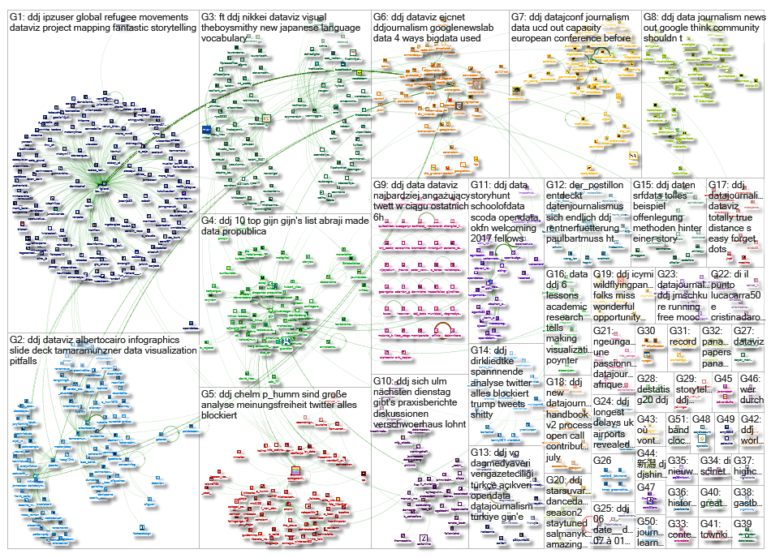
![]() What’s the global #ddj community tweeting about? Our NodeXL mapping from June 26 to July 2 includes a new data journalism handbook by @smfrogers, timeless hits and blocked tweets from @SPIEGELONLINE, data visualization pitfalls by @tamaramunzner and mapping projections from Azimuthal to Mercator by @eOpinionTvNews.
What’s the global #ddj community tweeting about? Our NodeXL mapping from June 26 to July 2 includes a new data journalism handbook by @smfrogers, timeless hits and blocked tweets from @SPIEGELONLINE, data visualization pitfalls by @tamaramunzner and mapping projections from Azimuthal to Mercator by @eOpinionTvNews.
New Data Journalism Handbook in 2018
Google News Lab is partnering with the the European Journalism Centre to launch a new version of the Data Journalism Handbook, which will be published in four languages next year. There will be an open call for contributions on July 31.
A new #Data #Journalism handbook : https://t.co/elotpXmKCy #BigData #DataScience #Analytics #ML #Media pic.twitter.com/5pEGYMd4f2
— Josep Lluís Micó (@jlmico) July 1, 2017
Scatterplots and Timeless Hits
Which hits of past decades are still heard today on Spotify? Listen and explore the change of musical taste in Spiegel’s cool interactive player.
ICYMI: Explore and listen to the most popular songs of the past decades. Make scatterplots great again! #dataviz https://t.co/R9twUOwYPb pic.twitter.com/ptLgwHLojP
— Patrick Stotz (@PatrickStotz) July 3, 2017
Germany’s Blocked Twitter Accounts
Spiegel’s analysis of Twitter shows more than 250 accounts were held or blocked in Germany in April and May this year.
Auswertung tausender Tweets: Meinungsfreiheit? Was Twitter alles blockiert https://t.co/f07Javhj3Y pic.twitter.com/w8iXc2UQEW
— SPIEGEL ONLINE (@SPIEGELONLINE) June 27, 2017
Pixel Art Viz
Check out 8 Bit Statistics, which analyzes statistics and presents its findings in pixel art visualizations.
Pixel art × stats × viz ⇨ ??: “8-Bit Statistics” by @8BitStatistics https://t.co/UDmonLnoRF #8bit #dataviz #ddj pic.twitter.com/lVa0uxR1Kg
— Mara Averick (@dataandme) June 28, 2017
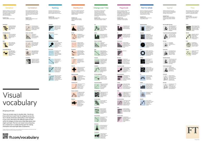
32 Dataviz Pitfalls to Avoid
Tamara Munzner, a computer science professor at University of British Columbia, says designers must take into account three different kinds of resource limitations when creating data visualizations: computers, humans and displays. She lists 32 pitfalls to avoid, including not designing for color deficiency.
Slide deck by @tamaramunzner: Data Visualization Pitfalls to Avoid https://t.co/TJjtC3ZLSZ #dataviz #infographics #ddj pic.twitter.com/JnyowgD7CA
— Alberto Cairo (@albertocairo) June 27, 2017
Mapping Perspectives
Peters projection, Mercator projection, Pacific-centered and Azimuthal polar projection maps all show us different perspectives of the world. Any one perspective is not any more correct than another — just different.
5 Maps that will change how you see the world https://t.co/BhlvxYXVfg pic.twitter.com/yjXUMLJy3X
— CitizensNewsNetwork (@eOpinionTvNews) June 27, 2017
A NIFTY Tool
NIFTY is a system that finds mutations of a single piece of information across the daily news cycle. It provides a streamlined way to identify what phrases and quotes are making the news and the interest in stories over time.
A #nifty tool to uncover the media’s most reported phrases or quotes: https://t.co/bVRDt78bzE @ejcnet #ddj
— DataDrivenJournalism (@ddjournalism) June 27, 2017
#DataJConf in Dublin, July 6-7
The European Data and Computational Journalism Conference starts Thursday and will feature talks on leveraging search data to bring elections to life, data journalism as a civic duty and the state of global data journalism.
UCD School of Info & Comm Studies is hosting the 1st European Data & Computational Journalism conference on 6&7 Julyhttps://t.co/6xLD6zUJgV pic.twitter.com/Aw9KzUgaS3
— UCD iSchool (@UCD_iSchool) June 27, 2017
The Story Hunt
“The Story Hunt: Uncover the EU,” a program hosted by the Open Knowledge Foundation Germany‘s teams of Datenschule, OpenBudgets and SubsidyStories.eu, came to an end last week. Journalists, analysts, non-profit organizations, developers and designers formed interdisciplinary teams that collaboratively worked on finding stories, leads and data analyses around the EU and its money flows.
The five #storyhunt workshops are finished! Check out the learning materials: https://t.co/ynhbaFQERV#dataviz #scraping #DataAnalytics
— Open Budgets EU (@OpenBudgetsEU) June 29, 2017
Turkey Data Group Joins GIJN
Data Journalism Turkey was among 10 new members approved by the GIJN Board of Directors last month. The nonprofit organization is a news and resource site for journalists, designers, editors, communication students and academics to develop and support data journalism practice.
#VeriGazeteciliği Türkiye( https://t.co/j4J98tRUms), GIJN’e katıldı #vg #ddj #datajournalism https://t.co/znr9zuGqSp pic.twitter.com/M6WuYBkpYz
— Veri Gazeteciliği TR (@DagmedyaVeri) June 30, 2017
Thanks, once again, to Marc Smith of Connected Action for gathering the links and graphing them.


