
10 Questions
From Poet to Reporter, Covering the Human Angle of Conflict in Nigeria
The managing editor of HumAngle, which covers the human costs of conflict and terrorism, discusses the challenges of investigative coverage in Nigeria.
The managing editor of HumAngle, which covers the human costs of conflict and terrorism, discusses the challenges of investigative coverage in Nigeria.

This session was designed to provide investigative journalists with the skills to investigate the arms trade and military aid.

Three senior investigative journalists shared tips and tools on investigating the conflict in Gaza.
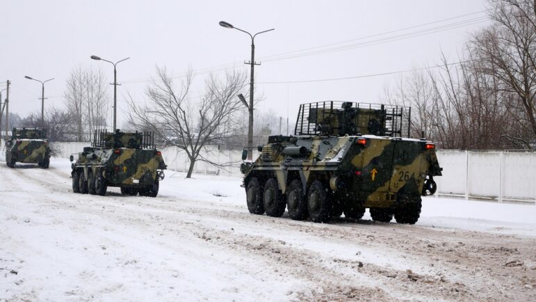
Featuring sanctions lists, databases of politically-exposed persons, details on military expenditure and arms embargoes, plus interactive maps and charts on armed violence.

Sexual violence is a feature of conflict and war. Its impact is felt by individuals, but also by families and communities, and its destructive effects persist for generations. Reporting criminal acts of any sort in an active conflict is difficult enough; documenting and reporting sexual violence during a conflict poses even more challenges. In this […]
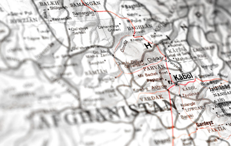
When the Taliban seized control of Kabul, international news outlets focused their attention on what was happening at the airport. But experts told the GIJC21 this was symptomatic of how the West failed to understand – and report – the real story during the 20-year conflict in Afghanistan.
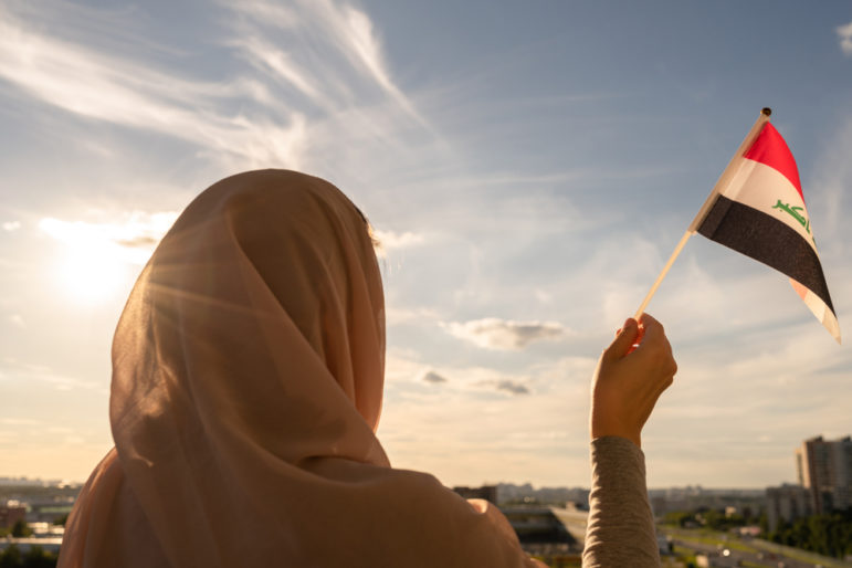
In recent years it has become increasingly difficult to report on Iraq, with attacks and threats against journalists leaving investigative journalists in the country at risk. In this article, an award-winning reporter explores what is happening and what is at stake.
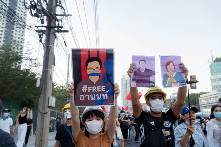
In August 2020, the leaders of Thailand’s pro-democracy movement published a list of demands after tens of thousands of reformists joined their call to take to the streets. Only one local media outlet dared to publish them: Prachatai, a bold start-up committed to promoting freedom of expression and democracy.
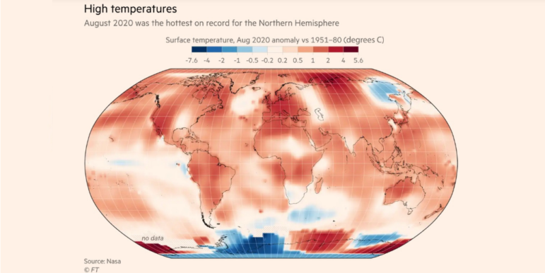
How fast is the coronavirus spreading in countries around the world? Our NodeXL #ddj mapping from September 14 to 20 finds data visualization designer Jan Willem Tulp simulating the speed of COVID-19 infections and German television news program ZDF heute mapping how the pandemic traversed the globe. Meanwhile, Thibi Recipes explores tutoring data journalism as if you’re following a cooking recipe, the Financial Times reports on climate extremes, and ICIJ and Buzzfeed bare suspect financial data.
In interviews with GIJN, six leading photojournalists from around the world described six very different approaches for dealing with the safety, access, and technical challenges of shooting the pandemic. From using bulletproof vests and embedding strategies to projected images and screenshots of Zoom meetings, these photographers detailed some of the creative thinking needed to document a world in lockdown.