Accessibility Settings

color options

monochrome muted color dark

reading tools

isolation ruler
Data Quiz 2 image 2
Data Quiz 2 image 2

Stories

Topics

Test Your Data Visualization Skills With GIJN’s Latest Quiz

Quizzes are not a new way of learning, but they are an important tool for the world of journalism. Not only can it help your team gain awareness when working with data, but it can also be practical in solving very complex issues. And if you are an educator like me, it can also be great ready-made material to share with — and enlighten — your students.

Previously, I created a quiz focused on data visualization best practices. This second quiz, however, is centered around 10 basic to more advanced issues encountered at every stage of data journalism. After you take the quiz, each answer will also include useful additional resources and examples. The main goal of this quiz is to learn by answering. (You can skip questions you are unsure of.)

Questions, suggestions, and feedback are always welcome. Have fun!

Take the quiz here to test your knowledge.


Pinar Dag is GIJN’s Turkish Editor. She is also a lecturer in the new media department of Kadir Has University and the co-founder of the Data Literacy Association (DLA)Data Journalism Platform Turkey, and DağMedya. Since 2012, Pinar has been organizing workshops for journalists on these issues and, for the past two years, has been on the pre-jury of the Sigma Data Journalism Awards.


Republish our articles for free, online or in print, under a Creative Commons license.

Republish this article


Material from GIJN’s website is generally available for republication under a Creative Commons Attribution-NonCommercial 4.0 International license. Images usually are published under a different license, so we advise you to use alternatives or contact us regarding permission. Here are our full terms for republication. You must credit the author, link to the original story, and name GIJN as the first publisher. For any queries or to send us a courtesy republication note, write to hello@gijn.org.

Read Next

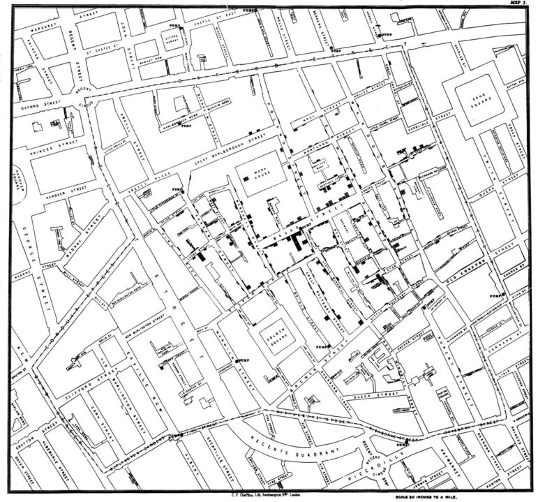
1854 Broad Street Cholera Outbreak Map

Data Journalism

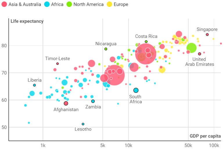
Think You Know Your Data Visualization? Take GIJN’s Quiz to Find Out

From Wikileaks to the FinCEN files, huge stories have made use of data visualizations to engage their readers and simplify complicated topics. But while data journalism is a powerful tool for investigative journalists, the vast possibilities of this world are wasted if reporters cannot effectively communicate the data they have found to the reader. To test your knowledge, GIJN has created an annotated quiz so readers can assess their current knowledge and understand the mistakes we all make while creating data visualizations.

Data Journalism

My Favorite Tools: Alberto Cairo on Data Visualization

For our series on journalists’ favorite tools, we spoke to Alberto Cairo, head of visualization at the University of Miami’s Institute for Data Science and Computing. Cairo shared several user-friendly tools and core principles to help investigative reporters shape their data visually to create new insights for audiences.

Data Journalism

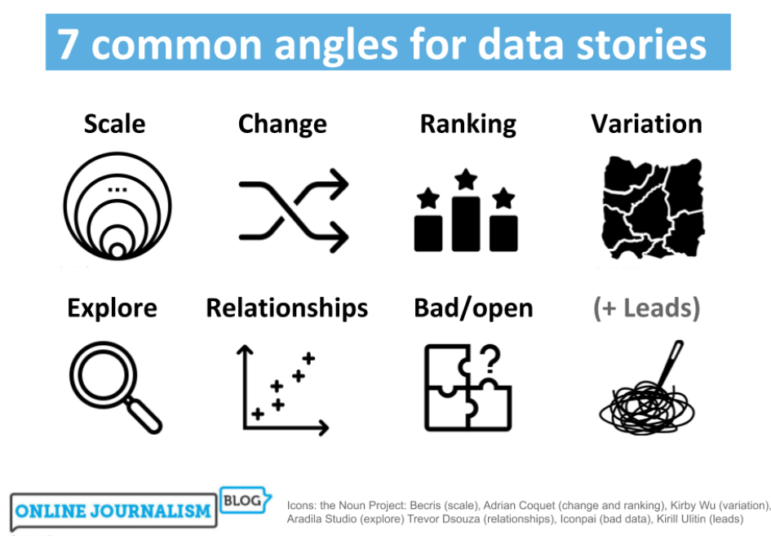
From Relationships to Ranking: Angles for Your Next Data Story

British data journalism instructor Paul Bradshaw analyzed 100 pieces of data journalism and identified seven common story angles. Here, he uses real-world examples to show how common angles can generate useful story ideas, and the strategies and considerations that reporters should keep in mind.