Data Journalism Top 10: China’s Fishing Fleet, Queer Cinema, Hurricane Ian, Iran Protests
Read this article in

Step-By-Step Guide for Journalists on the Basics of Google Sheets

Tipsheet for Using Ocean Data in Your Investigations

No Coding Required: A Step-by-Step Guide to Scraping Websites With Data Miner

GIJC23 – The Future of Data Journalism: New Analytical Tools, Data Visualization, and AI
China’s global fishing operation is prompting concerns about overfishing and destruction of marine life and ecosystems. Using ship transponder data, The New York Times mapped the activity of the massive Chinese fishing fleet across the world. Our weekly NodeXL and human curation of the most popular data journalism stories on Twitter also highlights queer cinema history in Southeast Asia, patterns in US food franchises, Iran’s protests for women’s rights, and social housing issues in Canada.
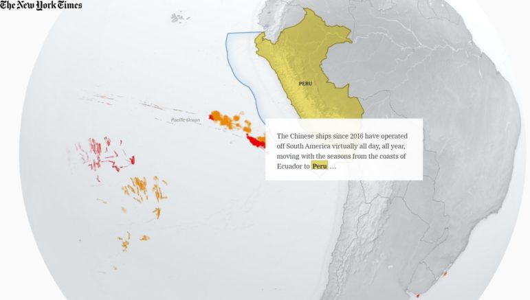
China’s Global Fishing Reach
China has developed a massive, deep-water fishing fleet over the past two decades, and increasingly, it is fishing thousands of miles away from China, in oceans worldwide. One of the factors allowing Chinese ships to fish longer at sea without returning to port is the use of refrigerated cargo ships that act as carrier vessels servicing smaller ships, which assist in transferring fuel and supplies and collecting catches of fish. The New York Times tracked and visualized the movement of China’s fishing fleet, which is so large that it has raised concerns about the harm being done to the environment, marine species and ecosystems, as well as local economies.
Queer Cinema in Southeast Asia
From Thailand’s kathoey to Indonesia’s waria, and from Malaysia’s mak nyah to Philippines’ bakla, queer and non-binary identities have long been a part of Southeast Asian culture. Singapore-based data storytelling studio Kontinentalist crowdsourced a database of Southeast Asian queer films since the 1970s and created a timeline of these films to explore the public perception and dialogue surrounding these identities in the region over time.
Patterns of US Food Franchises
Clio Andris and Xiaofan Liang, two researchers at the Georgia Institute of Technology, mapped independent and chain restaurants across the United States. Certain patterns started to emerge from the dataset: Kentucky, West Virginia, and Alabama had the most chain restaurants, and states with a higher percentage of Trump voters tended to have a higher share of chain restaurants. The Washington Post dove into the data and tested other variables in an attempt to figure out the basis for the correlation between Trump supporters and food franchises.
Iran Protests
Mahsa Amini, a 22-year-old Iranian woman, was arrested last month for not wearing a hijab in accordance with Iran’s official morality standards. Her subsequent death, in police custody under suspicious circumstances, sparked large protests across the country. These demonstrations have since morphed into a broader call for respecting women’s rights. Political leaders and celebrities around the world have been cutting their hair in solidarity with Iranian women. Data visualization designer Federica Fragapane is shining a light on this struggle using a simple visualization of a hair braid, with each line symbolizing a person killed while protesting.
Social Housing Issues in Winnipeg
According to the Canadian Observatory on Homelessness, at least 235,000 people experience homelessness in Canada every year. The Walrus and the Investigative Journalism Foundation dug into the challenges of the unhoused and revealed flaws in the social housing system of Winnipeg, Canada, through tracking the experience of one homeless man.
Spain’s Corporate Tax Bill
Despite earning a lot more profit in 2021, companies are paying far less corporate tax in Spain last year compared to 2017. Spain’s online news site elDiario dives into why this has occurred, explaining such factors as how tax reforms have contributed to eroding tax bases and reducing the tax bill.
Record Number of Amazon Fires
Before Brazil’s polls were held on October 2 this year, fires in the Amazon rainforest reached new records. Swiss-based, German-language daily Neue Zürcher Zeitung reported on data from the Brazilian space research agency Inpe: in just the first three days of last month, there were as many flares in the Amazon as in the whole of September 2021. Journalists mapped the concentration of these fires across Brazil, Bolivia, and Peru, and examined possible reasons for the increase in fires.
Poor Trucking Safety
The Wall Street Journal analyzed US government inspection records of trucking companies. It reported that more than 1,300 truckers contracted by Amazon between February 2020 and early August 2022 received low safety scores that typically warranted concern. The Journal’s analysis also found that truckers contracted by the online retail giant were allegedly much more likely to get a poor unsafe driving score compared to their peers in other trucking firms. Amazon responded to The Journal saying its network of carriers is safe.
Hurricane Ian’s Destruction
Hurricane Ian, a Category 4 storm (out of a scale of five), battered western Cuba and the southeast US last month, with powerful winds and storm surges leaving widespread destruction. The New York Times used before and after photos to show the amount of damage, and journalists also mapped the extent of where surge flooding may have exceeded six feet.
Better Use of Text in Dataviz
Datviz designers: Are the words in your visualizations usually an afterthought? Time to make a change. Datawrapper’s Lisa Charlotte Muth wrote an extensive guide to designing text in your graphics for better readability, including considerations for font sizes, styles, phrasing, and colors.
Bonus: Beautiful 3D Mapping
Julian Hoffmann, urban data analyst at Grosvenor Group, compiled two lists of stunning 3D maps and globes produced by creators and mapmakers that one should follow on Twitter. Here’s part one, and part two.
Thanks again to Marc Smith and Harald Meier of Connected Action for gathering the links and graphing them. The Top Ten #ddj list is curated weekly.
 Eunice Au is GIJN’s global team manager. Previously, she was a Malaysia correspondent for Singapore’s The Straits Times, and a journalist at Malaysia’s New Straits Times. She has also written for The Sun, Malaysian Today, and Madam Chair.
For a look at NodeXL’s mapping on #ddj and data journalism on Twitter, check out this map.
Step-By-Step Guide for Journalists on the Basics of Google Sheets
Tipsheet for Using Ocean Data in Your Investigations
No Coding Required: A Step-by-Step Guide to Scraping Websites With Data Miner
GIJC23 – The Future of Data Journalism: New Analytical Tools, Data Visualization, and AI

How a WhatsApp Community Is Bringing India’s Data Storytellers Together

Turning the Threat to a Distant Glacier into a Local Story Through Data Visualization

One Name at a Time: How Die Zeit Built a Searchable Database of Nazi Party Members

Visualizing a Trillion Dollars, India’s Warming Cities, Russian Mercenaries at Sea, and World Cup Player Physiques

This work is licensed under a Creative Commons Attribution-NoDerivatives 4.0 International License
Republish our articles for free, online or in print, under a Creative Commons license.
Republish this article
This work is licensed under a Creative Commons Attribution-NoDerivatives 4.0 International License
Read Next
Data Journalism
How a WhatsApp Community Is Bringing India’s Data Storytellers Together
Recently, more than 400 people gathered in the Indian city of Bengaluru for VizChitra 2026, a conference on data visualization and storytelling — but that is only a small part of the story.
Climate Data Journalism
Turning the Threat to a Distant Glacier into a Local Story Through Data Visualization
New York Times climate and environmental graphics reporter Mira Rojanasakul discusses how her team visualized the sea level rise threat from the melting Thwaites Glacier in Antarctica.
Data Journalism
One Name at a Time: How Die Zeit Built a Searchable Database of Nazi Party Members
An online tool set up by the German newspaper Die Zeit, in cooperation with archives in Germany and in the United States, allows people to search several million Nazi Party membership cards.
Data Journalism Top 10
Visualizing a Trillion Dollars, India’s Warming Cities, Russian Mercenaries at Sea, and World Cup Player Physiques
Also highlighting how films portray Ukrainians, increasing tree cover in Spain, and how couples meet.