Data Journalism
GIJN’s Data Journalism Top 10: Visualizing the 2018 News Cycle, the History of Football and Sacked Coaches
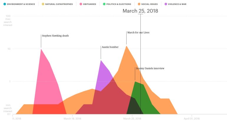
What’s the global data journalism community tweeting about this week? Our NodeXL #ddj mapping from January 21 to 27 finds @schemadesign and @GoogleTrends teaming up to visualize news cycles in 2018, the @washingtonpost’s flyover tour of the entire US-Mexico border and two interesting football-related visualizations: @ftblsm’s history of football and @NZZ’s analysis of whether football coaches Jose Mourinho and Julen Lopetegui should have been sacked.