Accessibility Settings

color options

monochrome muted color dark

reading tools

isolation ruler

Series

Top 10 in Data Journalism

430 posts

Data Journalism

Data Journalism Top 10: Russia’s School Roads, Myanmar’s Rich Generals, Cameroon’s Deadly Gold Mines, Visualizing the Capitol Riot

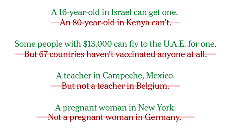
In the wake of the terrorist attacks on September 11, 2001, the United States invaded Afghanistan to overthrow the Taliban. As the US prepares to withdraw its troops later this year, our NodeXL #ddj mapping found an interactive project by Al Jazeera showcasing the impact of a conflict that has directly claimed the lives of an estimated 241,000 people. In this edition, we also feature a story about the difficulties some Russian students have getting to school by IStories, an investigation into deaths related to gold mining holes by InfoCongo, and a visual vocabulary for data projects by the Financial Times.

Data Journalism

Data Journalism Top 10: Apartheid Architecture, Night Trains, Conflict Reporting, LGBTQ & Refugee Vaccines

Would you board a night train instead of a plane in order to help protect the environment? European policymakers hope more and more citizens will do so. Our NodeXL #ddj mapping from May 3 to 9, found an article by Bloomberg analyzing a plan to drastically cut greenhouse gas emissions by rolling out more cross-border rail lines. In this edition, we also feature a multimedia project looking at an architectural phenomenon linked to apartheid in South Africa, a Washington Post story about the true toll of the coronavirus pandemic in Mexico City, and a guide on using data in conflict reporting.

Data Journalism

Data Journalism Top 10: COVID’s Psychic Numbing, Disappearing Glaciers, Chemical Weapons, Homeschooling Fatigue, Basketball’s Three-Pointers

Homeschooling has presented many challenges to parents and legal guardians of children around the world, with many dissatisfied with the online learning experience. Our NodeXL #ddj mapping from April 26 to May 2 found a piece by Voxeurop highlighting that most people in Europe aren’t keen on their kids continuing to study remotely even if provided with the necessary materials and support. In this edition, we also feature an interactive project by the Guardian exploring disappearing glaciers, a look at Stephen Curry’s remarkable basketball records by The Washington Post, and an archive of publications using data sonification to tell stories.

Data Journalism

Data Journalism Top 10: The Rise of Big Tech, India’s Bad Vaccine Data, Why Data Journalists Need Safeguards

Four of the world’s most influential technology companies are based on the US West Coast. Amazon, Apple, Facebook, and Google have had an enormous impact on our daily lives. But how did Big Tech get so big? Our NodeXL #ddj mapping from April 19 to April 25 found a piece by The Washington Post showing how the success of these behemoths has been fueled by hundreds of acquisitions of smaller companies over the past decade. In this edition, we also feature an investigation into faulty vaccine data publicized by the Indian government, a list of the world’s top 1,000 climate scientists by Reuters, and a look at Europe’s growing rail network.

Data Journalism

Data Journalism Top 10: Ramadan Fasting, Volcanic Eruptions, Climate Change Economics, China’s Forced Labor

Driving an electric car and buying solar panels are things individuals can do to help slow climate change. But according to a new study, most people don’t realize that achieving a real impact on greenhouse emissions requires significant lifestyle sacrifices. Our NodeXL #ddj mapping from April 12 to April 18 found a story by the Financial Times showing that the best way in individual can reduce their carbon footprint is to have one less child. We also feature an explainer of Ramadan fasting by Al Jazeera, a look into China’s polysilicon factories by Bloomberg, and Chinese tycoon Jack Ma’s jet-setting ways.

Data Journalism

Data Journalism Top 10: Atlas of Emotions, Carbon Recyclers, Football Long Shots, COVID-19 Endgame, Mister Rogers’ Cardigans

To fight climate change, we need to protect sea life. Whales, plankton, and seagrasses have a key impact on the Earth’s carbon cycle. Our NodeXL #ddj mapping from to April 5 to April 11, which tracks the most popular data journalism stories on Twitter each week, found a piece by Reuters Graphics explaining how these species interact underwater as well as capture and transform carbon. In this edition, we also feature an atlas of emotions by Google Arts & Culture, a look at the COVID-19 endgame by the Financial Times, and some great board games to inspire data visualization enthusiasts.

Data Journalism

Data Journalism Top 10: Global Protests, Baseball Returns, 17-Year Bugs, High-Tech COVID Masks, Vaccine Inequality

The consequences of the global pandemic, including job crises and deepening inequalities, have ignited a new wave of protest movements over the past year. But over the past decade, there were at least 900 protest events that each drew more than 10,000 participants, according to a project by Al Jazeera’s graphics team. Our NodeXL #ddj mapping from March 29 to April 4, which tracks the most popular data journalism stories on Twitter, also features an analysis of migration trends by The Financial Times, a story about the next generation of face masks by The Wall Street Journal, and a remarkable sound visualization of COVID-19’s impact in Switzerland using a music box.

Data Journalism

Data Journalism Top 10: Beauty Biz Bias, Suez Blockage, Facebook Fail, Migrants at the Border, Europe’s Theaters

For nearly a week, a giant container ship stranded in the Suez Canal blocked one of the busiest trade routes in the world. The Ever Given, a Rotterdam-bound vessel, was finally freed from the shoreline on Monday, and international media have closely followed the story and the consequences of the blockage. Our NodeXL #ddj mapping from March 22 to 28, which tracks the most popular data journalism stories on Twitter, found a visual story by the Reuters Graphics team that illustrated how the incident affected global trade. In this edition, we also feature an examination of bias in the beauty industry by The Pudding, a look into how the pandemic changed society by Al Jazeera, and a guide to drawing data visualizations by DataJournalism.com.

Data Journalism

Data Journalism Top 10: March Madness, Trafficking Tigers and Fish, Color Palettes, Vaccine Inequality, Domestic Work

A lack of comprehensive data can seriously hinder efforts to track illicit activities. But persistent reporters will always find a way to get a glimpse of the real picture. Our NodeXL #ddj mapping from March 15 to 21 found Oxpeckers investigating the trafficking of tigers in Europe and journalist Ben Heubl offering advice on investigating illegal fishing. We also feature an analysis of the global aviation crisis by the Financial Times, a guide to color scales by visual storytelling expert Lisa Charlotte Rost, and a look into the burden of unpaid domestic work by data analyst Hassel Fallas.