Register for #GIJC25
November 20, 2025 • 09:00
-
day
days
-
hour
hours
-
min
mins
-
sec
secs

Accessibility Settings

color options

monochrome muted color dark

reading tools

isolation ruler

Posts

45 posts
ProPublica illustration for The Secret IRS Files'

Data Journalism

Data Journalism Top 10: Secret Tax Files, India’s Faltering Vaccines, Western Drought, Argentina’s News Deserts, The Gambia’s Toxic Water

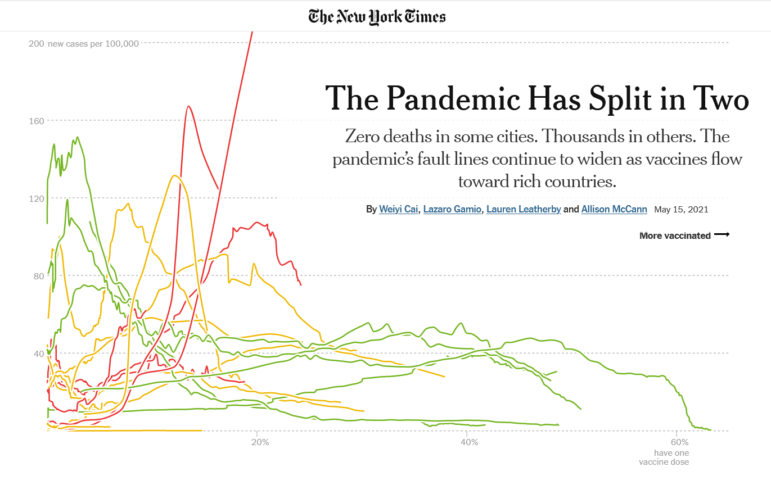
Our NodeXL #ddj mapping from June 7 to 13, which tracks the most popular data journalism stories on Twitter each week, focused in on this major investigation by ProPublica, which offers an unprecedented look inside the financial lives of US billionaires. In this edition, we also feature a detailed look at India’s faltering vaccination campaign, a data project exploring Argentina’s news deserts, and an investigation of The Gambia’s water paradox.

Data Journalism

Data Journalism Top 10: Deadly Russian Births, Pacific Mining Plunder, Toxic Dams, Cool Rocks, Extreme Rainfall, Analyzing Chess

Our NodeXL #ddj mapping from May 31 to June 6, which tracks the most popular data journalism stories on Twitter each week, found a project by the Guardian explaining who profits from the mass extraction of the region’s natural resources. In this edition, we also feature an investigation by IStories into maternal and infant mortality in Russia, a look into the toxic threat caused by aging dams in the US by Undark Magazine, and an analysis of wildlife trade in Southeast Asia by GIJN member Oxpeckers.

Data Journalism

Data Journalism Top 10: Tulsa Race Massacre, Canada’s Prison Bias, Colombia’s Police Violence, Football’s Big Money, Europe’s Lobbyists, Battling Misinformation

For inmates in Canada, risk assessments can determine which type of prison they are sent to and their chances of successfully reentering society. But an investigation by The Globe and Mail revealed that these assessments are biased against Indigenous and Black inmates. Our NodeXL #ddj mapping from May 24 to 30 also found an interactive project by The New York Times recreating the Black neighborhood in Tulsa, Oklahoma destroyed in 1921, and data-driven reporting on the influence of big money in soccer, the cost of Italy’s vaccination campaign, and police violence during the recent protests in Colombia.

Data Journalism

Data Journalism Top 10: Russia’s School Roads, Myanmar’s Rich Generals, Cameroon’s Deadly Gold Mines, Visualizing the Capitol Riot

In the wake of the terrorist attacks on September 11, 2001, the United States invaded Afghanistan to overthrow the Taliban. As the US prepares to withdraw its troops later this year, our NodeXL #ddj mapping found an interactive project by Al Jazeera showcasing the impact of a conflict that has directly claimed the lives of an estimated 241,000 people. In this edition, we also feature a story about the difficulties some Russian students have getting to school by IStories, an investigation into deaths related to gold mining holes by InfoCongo, and a visual vocabulary for data projects by the Financial Times.

Data Journalism

Data Journalism Top 10: Apartheid Architecture, Night Trains, Conflict Reporting, LGBTQ & Refugee Vaccines

Would you board a night train instead of a plane in order to help protect the environment? European policymakers hope more and more citizens will do so. Our NodeXL #ddj mapping from May 3 to 9, found an article by Bloomberg analyzing a plan to drastically cut greenhouse gas emissions by rolling out more cross-border rail lines. In this edition, we also feature a multimedia project looking at an architectural phenomenon linked to apartheid in South Africa, a Washington Post story about the true toll of the coronavirus pandemic in Mexico City, and a guide on using data in conflict reporting.

Data Journalism

Data Journalism Top 10: COVID’s Psychic Numbing, Disappearing Glaciers, Chemical Weapons, Homeschooling Fatigue, Basketball’s Three-Pointers

Homeschooling has presented many challenges to parents and legal guardians of children around the world, with many dissatisfied with the online learning experience. Our NodeXL #ddj mapping from April 26 to May 2 found a piece by Voxeurop highlighting that most people in Europe aren’t keen on their kids continuing to study remotely even if provided with the necessary materials and support. In this edition, we also feature an interactive project by the Guardian exploring disappearing glaciers, a look at Stephen Curry’s remarkable basketball records by The Washington Post, and an archive of publications using data sonification to tell stories.

Data Journalism

Data Journalism Top 10: The Rise of Big Tech, India’s Bad Vaccine Data, Why Data Journalists Need Safeguards

Four of the world’s most influential technology companies are based on the US West Coast. Amazon, Apple, Facebook, and Google have had an enormous impact on our daily lives. But how did Big Tech get so big? Our NodeXL #ddj mapping from April 19 to April 25 found a piece by The Washington Post showing how the success of these behemoths has been fueled by hundreds of acquisitions of smaller companies over the past decade. In this edition, we also feature an investigation into faulty vaccine data publicized by the Indian government, a list of the world’s top 1,000 climate scientists by Reuters, and a look at Europe’s growing rail network.

Member Profiles

The Nonprofit News Site Taking on Agribusiness in the US Heartland

From an investigation into a COVID-19 outbreak in the meatpacking industry to exposes on migrant worker housing, the Midwest Center for Investigative Reporting has made reporting of agribusiness through in-depth research, data analysis, and collaboration their core mission. This story tells how this small nonprofit has gone from a “one-man shop” to become a reliable source of watchdog reporting on an industry mostly discussed in daily business stories and trade magazines.