Accessibility Settings

color options

monochrome muted color dark

reading tools

isolation ruler

Posts

45 posts

Data Journalism

Data Journalism Top 10: Back to School, Australian Open Underdog, Amazon Oxygen Shortage, Big Tech & Green Energy

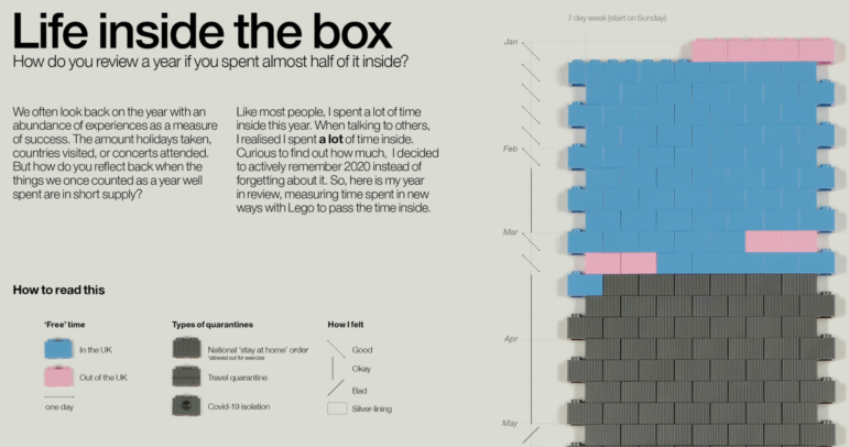
How can we get students and teachers safely back into classrooms? For many months, this has been a key question for public authorities, school leaders, and parents around the world. This topic and others topped the data journalism stories on Twitter from February 8 to 14. Check out #ddj stories from The New York Times, NPR, the Financial Times, FiveThirtyEight, and The Pudding.

Data Journalism

Data Journalism Top 10: Biometric IDs, Data Spaghetti, Eviction Avalanche, Remote Working

With countries around the world considering the safest ways to ease lockdown measures, alongside the deployment of COVID-19 vaccines in many places, some are finding reasons to be optimistic about the end of the coronavirus crisis. But returning to once conventional daily activities, such as going to restaurants and sports stadiums, is still a distant prospect. Our NodeXL #ddj mapping from February 1 to 7 found Voxeurop covering the dangers of adopting biometric IDs and health passports, a look at Europe’s COVID-19 divide by Reuters, an analysis of leaked smartphone data by The New York Times, and a Twitter thread collection of archived data visualizations in various languages.

Data Journalism

Data Journalism Top 10: Polarized America, Australia’s Pandemic, Poland’s Toxic Air, the Arab Spring, Life as Lego

Our NodeXL #ddj mapping from January 25 to 31 found interactive projects by the Australian Broadcasting Corporation and The Guardian analyzing these events. In this edition, we also feature environmental reporting by The New York Times and The Economist, a Wall Street Journal story on the GameStop Reddit mania that shook stock markets, and a visual representation of 2020 using Lego bricks.

Data Journalism

Data Journalism Top 10: A New President, Trump’s Twitter Insults, Germany’s Elections, Flying Green

As Joe Biden was sworn in as the 46th president of the United States, much of the international media coverage was focused on an inauguration like no other. Our NodeXL #ddj mapping from January 18 to 24 found a Washington Post analysis of the president’s first address to the nation and a Bloomberg project visualizing the enhanced measures put in place to deal with concerns about security and the coronavirus.

Data Journalism

Data Journalism Top 10: From Newsroom to Netflix, Inside the Capitol Riot, Vaccine Data, Facebook for News

As governments around the world continue vaccination efforts and extend lockdowns, some experts argue that more data is needed to evaluate the effectiveness of immunization campaigns and mobility restrictions. Our NodeXL #ddj mapping from January 11 to 18 found outlets in Germany and the United Kingdom analyzing government measures to reduce the impact of the COVID-19 pandemic. In this edition, we also feature an insightful interview with former Washington Post journalist Aaron Williams, an interactive timeline of the US Capitol riot by ProPublica, and a refreshing data visualization project by The Pudding.