Image: Screenshot, The New York Times
Data Journalism Top 10: Turkey-Syria Earthquake, Russian Censorship, Missing Snow, Energy Saving Tips
Read this article in

Step-By-Step Guide for Journalists on the Basics of Google Sheets

Tipsheet for Using Ocean Data in Your Investigations

No Coding Required: A Step-by-Step Guide to Scraping Websites With Data Miner

GIJC23 – The Future of Data Journalism: New Analytical Tools, Data Visualization, and AI
As the death toll from last week’s Turkey-Syria earthquake climbed rapidly (now having surpassed 40,000), there was heavy criticism leveled at both governments, accusing officials of mismanagement in the rescue response and for failing to implement adequate mitigation measures before the disaster struck. Data teams across the world have been gripped by the tragedy, analyzing, mapping, and visualizing the extent of the damage.
Our weekly NodeXL and human curation of the most popular data journalism stories on Twitter also features looks into Russia’s digital censorship apparatus, the alarming lack of snow on Swiss ski slopes, missing students who dropped out of US public schools during the pandemic, and a tool to help you save energy.
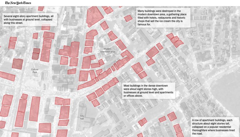
Mapping the Earthquake’s Destruction
The earthquake on February 6, one of the most powerful recorded in the region, devastated parts of southern Turkey and northwest Syria. A team of New York Times reporters mapped the destruction in the city of Kahramanmaras, which was near the quake’s epicenter and its aftershocks. Using satellite imagery from Planet Labs — a public Earth imaging company based in San Francisco — a team of reporters showed which major buildings and neighborhoods had been destroyed.
Related: Examining the fault zones that make this region of Turkey one of the most seismically active in the world, The New York Times charted earthquake deaths caused by around 70 serious earthquakes there since the 1900s. Also worth checking out: Reuters produced an illustrated explainer on the process and equipment used by search and rescue teams after an earthquake.
#RussianCensorFiles
A collaboration between Süddeutsche Zeitung and Russian investigative site IStories offers unprecedented insight into Russia’s digital censorship apparatus. In October 2022, Belarusian hackers attacked an obscure agency within Roskomnadzor — Moscow’s mass media regulator — responsible for policing Russia’s internet, leading to the biggest data leak in the agency’s history. The two outlets scoured 1.5 terabytes of data and, among other revelations, noted that the agency censored some 150,000 anti-war social media posts and plans to deploy a bot farm to amplify Russian state media content.
Missing Snow
Swiss broadcaster SRF uses a set of data and graphics, updated daily, to tell the story of the Swiss Alps’ alarming lack of snow this year — including area coverage, temperature trends, and how many slopes are relying on artificial snow. Climate change has contributed to one of the warmest Januarys on record in Europe, which will have far-reaching effects into the summer — such as reduced glacier runoff and water levels — as well as dreadful economic implications for the mountain communities that depend on winter tourism.
Missing Public School Kids
During the COVID-19 pandemic, hundreds of thousands of students dropped off the rolls of public schools across the United States. According to an analysis of student registration and census data across 21 states by the Associated Press, Stanford University’s Big Local News project, and Stanford education professor Thomas Dee, some of the decline in numbers could be explained by kids enrolling in private schools, opting for home-schooling, or moving out of state. But that still left some 230,000 students unaccounted for in the data — a worrisome number of kids who may not have resumed their studies elsewhere.
Demographics of European Capitals
Berlin’s daily Tagesspiegel, working with various media partners, researched the age composition of EU capitals and found huge variation and rapid changes in city demographics. London and Copenhagen grow ever younger; Rome has the highest average age. Budapest, Bucharest, and Warsaw have notable gender variations, with a larger number of women across various age groups. Each city’s demographic pyramid also shows how it measures up to the EU average. These charts reflect historical trends, but will also shape future politics.
State of the Union Address
Following President Joe Biden’s February 7, 2023 State of the Union Address — continuing a constitutional duty and tradition dating back to 1790 — The Washington Post had some data-driven fun with the State of the Union lexicon to note which words appeared for the first time in a “SOTU” speech. This year: drywall, McDonalds, overdraft; in previous years, Biden introduced the phrases Roe v. Wade, LGBTQ, cybersecurity, and insulin. Plus: Try your hand at this quiz to find out which presidents introduced the words pandemic, abortion, or loser — the answers may surprise you.
Tracing an Ancient Monastery’s History
Last month, the Ukrainian state finally regained control of parts of the ancient monastery Kyiv-Pechersk Lavra, also known as the Kyiv Monastery of the Caves, from the Russian Orthodox Church. Data journalism agency Texty dug into archives and historical records to trace the roots of the UNESCO World Heritage site from 1988 to current day. Journalists detailed how the ownership of the monastery had been previously transferred from state control to the church by a then pro-Russian Ukrainian government.
Examining Cause of Flooding
The Chitty Village in Malacca, a coastal state in southwestern Malaysia, is known for being a flood-prone area. In this interactive project, online news portal Malaysiakini utilized interviews and satellite imagery to help pinpoint the factors contributing to the heritage village’s risk of flash floods. It found one major reason: land reclamation projects along the coast were disrupting or narrowing major monsoon drains, resulting in a reduction in water discharge.
Canada’s Environmental Lobbying Battle
In Canada, environmental lobbyists are lagging behind their oil and gas counterparts. By analyzing data from the federal registry of lobbyists, Canada’s National Observer and the Investigative Journalism Foundation found that environmental groups had logged 961 meetings with the government in 2022, trailing far behind oil and gas lobbyists who met with government officials 1,372 times (40% more). Journalists also examined which ministries were approached by both camps and found significant inequities, with the environmental groups having less access to the most influential ministries.
Tips for Energy Saving
Good news for work-from-home converts: working remotely three days a week saves more on energy bills than switching to an electric car. El Pais, working with the Technological Research Institute at Comillas Pontifical University in Madrid, designed a tool that estimates how much energy — and money — can be saved per household for various energy-saving measures, such as covering cooking pots on the stove or using colder water for laundry loads. According to this tool, households can save up to €344 (US$ 368) per year by switching off the heating at night — 16 times more than switching to LED lightbulbs.
Valentine’s Bonus: Does Love Last on Reality Shows?
If you’re a fan of dating reality shows, you’ve probably heard of, or seen, The Bachelor, Love Island, or Too Hot to Handle. Plenty of relationships are formed during these shows, but how long do they actually last? Flourish’s social media specialist Annie Parker analyzed the numbers across eight seasons of Love Island and reported that just under 10% of contestants found long-lasting love. Also of note: Elliot Bentley, senior data visualization developer at Datawrapper, visualized wait times for UK partner visa applications, offering a sliver of hope for couples waiting on visa decisions from the UK Home Office.
Thanks again to Marc Smith and Harald Meier of Connected Action for gathering the links and graphing them. GIJN’s Data Journalism Top 10 list is curated weekly.
 Eunice Au is GIJN’s global team manager. Previously, she was a Malaysia correspondent for Singapore’s The Straits Times, and a journalist at Malaysia’s New Straits Times. She has also written for The Sun, Malaysian Today, and Madam Chair.
 Alexa van Sickle is an associate editor at GIJN. She was previously a senior editor for the foreign correspondence magazine Roads and Kingdoms. She has also been an editor at the International Institute for Strategic Studies and a publisher at an international law non-profit in London. She lives in Vienna, Austria.
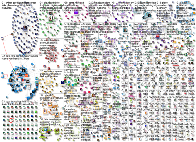
For a look at NodeXL’s mapping on #ddj and data journalism on Twitter, check out this map.
Step-By-Step Guide for Journalists on the Basics of Google Sheets
Tipsheet for Using Ocean Data in Your Investigations
No Coding Required: A Step-by-Step Guide to Scraping Websites With Data Miner
GIJC23 – The Future of Data Journalism: New Analytical Tools, Data Visualization, and AI

One Name at a Time: How Die Zeit Built a Searchable Database of Nazi Party Members

Visualizing a Trillion Dollars, India’s Warming Cities, Russian Mercenaries at Sea, and World Cup Player Physiques
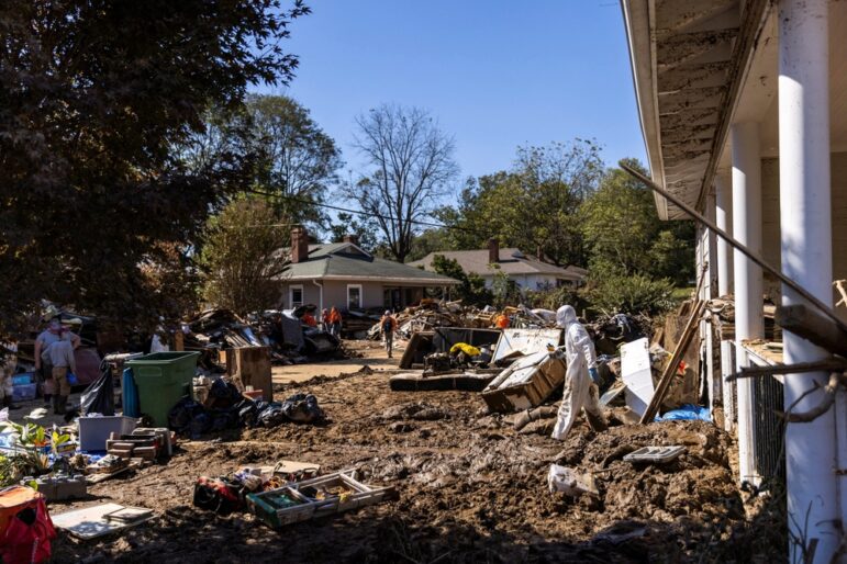
How The Washington Post Combined Data and Human Stories to Cover Hurricane Helene’s Aftermath

Rare Earth Rivalry, Falling Birth Rates, Violence in the Sahel, and 70 Years of Eurovision Lyrics

This work is licensed under a Creative Commons Attribution-NoDerivatives 4.0 International License
Republish our articles for free, online or in print, under a Creative Commons license.
Republish this article
This work is licensed under a Creative Commons Attribution-NoDerivatives 4.0 International License
Read Next
Data Journalism
One Name at a Time: How Die Zeit Built a Searchable Database of Nazi Party Members
An online tool set up by the German newspaper Die Zeit, in cooperation with archives in Germany and in the United States, allows people to search several million Nazi Party membership cards.
Data Journalism Top 10
Visualizing a Trillion Dollars, India’s Warming Cities, Russian Mercenaries at Sea, and World Cup Player Physiques
Also highlighting how films portray Ukrainians, increasing tree cover in Spain, and how couples meet.
Data Journalism
How The Washington Post Combined Data and Human Stories to Cover Hurricane Helene’s Aftermath
From Storybench, Washington Post climate reporter Brady Dennis is interviewed about his immersive story on Hurricane Helene and the importance of combining data and human experience.
Data Journalism Top 10
Rare Earth Rivalry, Falling Birth Rates, Violence in the Sahel, and 70 Years of Eurovision Lyrics
Also highlighting China’s squid fishing fleet off Argentina, how redistricting is shaping America’s midterms, and why 2.1 billion people still lack safe drinking water.