Data Journalism Top 10: Outlawing Abortion, Russian Disinformation, Dog Breeds, India Heat Wave
Read this article in


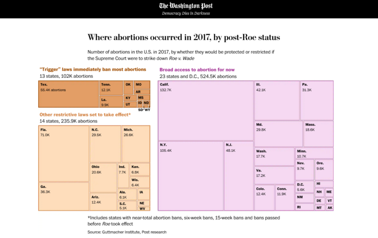
The Washington Post examines how overturning a judicial precedent protecting the right to abortion might affect child-bearing women in the country. Image: Screenshot.
A woman’s right to abortion is currently under threat in the United States. The Washington Post reports that 52% of women of childbearing age in the country live in states where their access to abortion might be reversed. Our weekly NodeXL and human curation of the most popular data journalism stories on Twitter also highlights an analysis by IStories showing that two-thirds of Russian soldiers killed in Ukraine come from poor areas, Axios’ visualization of one million COVID-19 deaths, The Wall Street Journal’s correlation of a dog’s breed to its behavior, and a list of suggestions to inspire data visualization.
Ripple Effects of Outlawing Abortion
Data journalists in the US have been busy analyzing and visualizing the potential blowback if the landmark Roe v. Wade decision — a judicial ruling that guarantees federal protection of abortion rights — is overturned by the Supreme Court. The Washington Post looked at how state abortion laws might change, and the number of abortions that would potentially become illegal if Roe is struck down. It also examined related laws and issues, including paid family leave, income for women, availability of child care, and maternal death rates.
War in Ukraine, as Spun on Russian TV
The Russian government criminalizes any mention of its country’s invasion of Ukraine as a “war” or an “invasion.” So how does its local media report on what’s happening? The New York Times reviewed more than 50 hours of Russian news footage, sourced from the Internet Archive’s TV News Archive, to find out how the war was being presented to Russian citizens within the country. The analysis discovered that Russian media spun different narratives of the war, ranging from downplaying Ukraine’s victories and Russia’s own casualties to dismissing incriminating events as hoaxes.
https://twitter.com/danielle_ivory/status/1522695562407350273
Deaths of Young Russian Soldiers
The Russian government has not been forthcoming in reporting on its military’s losses in the war on Ukraine. Its Ministry of Defense has only announced an official death toll twice, with the last estimate of 1,300-plus dead coming more than a month ago, on March 25. (NATO military officials estimated the number was up to 10 times higher.) Independent Russian news site IStories studied and verified messages about deceased Russian soldiers on the Telegram channel «Горюшко», and established at least 1,855 deaths. From its analysis, bluntly titled “Young, Poor, Dead,” IStories found that more than 80% of the deceased were between the ages of 18 and 35, and almost two-thirds were from small regional towns and villages with a below-average standard of living in Russia.
One Million COVID Deaths Visualized
It’s difficult to comprehend the magnitude of lives lost to the pandemic over the past two years, with the worldwide death toll having surpassed six million, and about one million of those deaths in the United States alone. The Axios Visuals team tried to capture the scale of loss by visualizing the rising death toll as a growing diamond that eventually expands beyond the borders of a webpage, and comparing COVID deaths to the number of casualties in notable events from US history.
Dog Breeds Dictate Behavior, Debunked
Do you think Rottweilers are naturally more aggressive? Or Labrador retrievers are always friendly? A team of researchers surveyed more than 18,000 dog owners and conducted genetic sequencing from more than 2,000 of their dogs — and revealed that a dog’s breed isn’t an accurate indicator of behavioral traits. Instead, the results suggest that socialization and experience play strong roles in shaping a dog’s nature and behavior. The Wall Street Journal visualized the research’s findings.
Canary Islands Tax Shelters
The Canary Islands Special Zone in Spain offers extensive tax exemptions, and is a tax haven for businesses. El Diario examined the fiscal mechanisms in the area that make such low tax rates possible. It looked at how much tax businesses were paying in relation to their profits, and reported that businesses have saved around €5 billion (US$5.2 billion) in taxes in the last decade, thanks to this favorable set-up.
High-Risk Dams
According to a data analysis by Deutsche Welle, about one million Brazilians live near high-risk dams. It reported that 1,220 such structures were potentially dangerous because they lacked proper maintenance or government oversight. In addition to neglected state infrastructure, Deutsche Welle also highlighted concerns about “orphaned” dams, where the person or organization responsible for the structure is unknown or no longer actively takes care of it. The journalists also looked at, and mapped, previous major dam incidents.
India Heat Wave
Temperatures in some parts of India reached record levels in recent weeks, with New Delhi hitting seven consecutive days above 40 degrees Celsius (104 degrees Fahrenheit) last month. Stats of India visualized the scorching temperatures across the country, and the estimated number of affected people.
Python Vs. R
Which programming language do you prefer: Python or R? Datajournalism.com intern Simona Bisiani wrote a comparison of both languages, highlighting the pros and cons of each, and offers her take on whether journalists should learn one, or both.
Dataviz Inspiration
Stephanie Evergreen, author of three books on data visualization, reached out to her followers on LinkedIn for suggestions of their favorite places to seek inspiration. She collated the responses in a Twitter thread, pointing out some great sites to monitor (The Pudding, FiveThirtyEight, and Information is Beautiful among them), as well as interesting individuals in the data visualization space to follow, such as Nathan Yau, Mona Chalabi, and Alberto Cairo.
Thanks again to Marc Smith and Harald Meier of Connected Action for gathering the links and graphing them. The Top Ten #ddj list is curated weekly.
 Eunice Au is GIJN’s program manager. Previously, she was a Malaysia correspondent for Singapore’s The Straits Times, and a journalist at the New Straits Times. She has also written for The Sun, Malaysian Today, and Madam Chair.
For a look at NodeXL’s mapping on #ddj and data journalism on Twitter, check out this map.

This work is licensed under a Creative Commons Attribution-NoDerivatives 4.0 International License
Republish our articles for free, online or in print, under a Creative Commons license.
Republish this article
This work is licensed under a Creative Commons Attribution-NoDerivatives 4.0 International License
Read Next

Data Journalism News & Analysis
Lessons Learned: 10 Common Mistakes in Data Journalism
GIJN asked speakers and attendees in the NICAR conference hallways for the data journalism gaps they see, and for under-covered topic areas and under-used skills that newsrooms can address.

Data Journalism News & Analysis
From Space to Story in Data Journalism
Over the past 10 years satellite imagery has become an important component of data journalism. In the next 10, it will likely evolve further, from a tool used primarily for illustrating stories to an integral part of research and investigative reporting.

Data Journalism
10 Outstanding Data Projects Win the 2024 Sigma Awards
There were 52 data journalism entries from 22 countries in shortlist for the 2024 Sigma Awards. Here are the top 10 winning projects.

Tipsheet Data Journalism Reporting Tools & Tips
Tipsheet for Using Ocean Data in Your Investigations
Investigations into what happens on, under, and around the ocean can often be answered thanks to the vast amount of data available online.