
Sigma Awards: 10 Lessons for Data Journalists Around the World
 From a graphic project looking at oppression in Myanmar to an in-depth data analysis of US race riots, the judges of the Sigma Awards recently published their 2022 list of the best data journalism from around the world.
This year, 12 winning data journalism projects were chosen from 603 entries from 76 countries.
During an appearance at the 2022 Perugia International Journalism Festival, three of the award’s founders took a deeper dive to present the best projects since the competition was launched three years ago, pointing out what journalists can learn from these data stories.
Here are 10 tips from Aron Pilhofer, of Temple University in the United States, Marianne Bouchart, from HEI-DA, a data-journalism focused nonprofit, and Gina Chua, until recently the executive editor at Reuters and the new executive editor of Semafor.
Data Journalism Is Not Only about Analysis, but Also about Storytelling
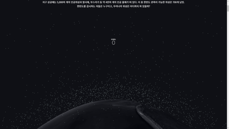
A scrolling data project that illustrates an intense satellite build-up over the Korean peninsula. Image: Screenshot
The Watchers Overhead is a South Korean data story published in March 2020 by Hankoo Kilbo. It explores the silent satellite war taking place in the skies above the Korean peninsula where satellites from global powers like the US, Russia, China, and Japan orbit above. The team analyzed 40,000 items of space surveillance data to map and simulate the scale of a surveillance project that can not be seen by the naked eye.
“We brought this example because it demonstrates that data journalism can present not only some statistical analysis but can also take some raw data [and convert it into something]… very visually and technologically appealing,” Bouchart explained during the IJF panel. “And it shows journalists that there’s a way to provide readers with new storytelling experiences on desktop and mobile using augmented reality.”
Sharing is Power
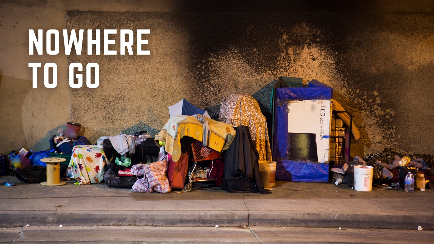
The Nowhere to Go Project. Image: Screenshot
“We are seeing more and more news organizations sharing ideas, knowledge, and content,” Pilhofer noted during a discussion of Nowhere to Go, a 2021 project by a team at the University of Maryland, which involved a collaboration among many different universities to report on homelessness. “Before, it never happened. When you had a dataset and you were working on a big project, you wanted to keep everything for yourself.”
This project required the teams to acquire substantial amounts of data and public documents at the local level. They built a collaborative dataset that they published through major local news sites. By virtue of this shared approach, they were able to tell a story about how homelessness is being criminalized at the local level, a story that couldn’t have been told in another way and which reflects a trend taking place across the entire United States. “The power of working together and sharing assets, sharing knowledge is what made this project stand out,” Pilhofer said.
Organization is Key
“We’re also seeing a lot of sharing, not just of data but tools that are being created and shared,” Pilhofer added. At IJF, he presented the open-source Associated Press Data Kit, which creates a folder structure for users and automatically generates a Github repository, allowing a team to more easily work together online. “Everyone knows where everything belongs, everybody’s project is consistent, everything is labeled, everybody can see the work of the others and have a good idea of where to find stuff,” Pilhofer pointed out. While he conceded that “this is the least sexy project that we’ve ever seen,” he emphasized that getting these building blocks right makes the fun stuff possible.
Working Together Enlarges the Pool of Data Journalists
The BBC Shared Data Unit was launched in the UK a few years ago, and Pilhofer explained that it allows data journalists to work alongside BBC reporters on data projects relevant to local news stories. “In the process, they gain a ton of skills,” he said. “It’s a way for the BBC to open its doors and help journalists who are working in smaller organizations and local journalists.”
The judges found much to like. “It’s a program that had a lot of success and impact over the years,” Pilhofer added. “There are many, many examples wherein the aggregate effort everybody wins and everybody can get a story at different scales, but in the act of sharing, working together, collaborating everybody does better.”
Stories are Stories No Matter When They Happened

The Real Estate Books of the German Occupiers. Image: Screenshot
The panelists presented several projects that used data journalism techniques to tell stories about historical events. “These are stories about inequities and about issues that have been around forever, and they’re stories that are in plain sight, that we don’t see, because they are the water that we live in,” said Chua. Instead of asking “What happened?,” Chua noted, “Journalists should be asking “Why is something the way it is?”
Among the projects highlighted were The Real Estate Books of the German Occupiers, a 2020 project from the Netherlands by Pointer, De Monitor, and Follow The Money. The organizations researched more than 7,000 transactions relating to Jewish property and told the stories of people who returned to their homes after World War II only to find them occupied by new families. “This exposed a long arc of inequity and theft,” commented Chua.
Land-Grab Universities is a project from High Country News, a nonprofit monthly that covers the American West. Published in 2021, the initiative exposed how expropriated Indigenous land became the foundation of the sprawling land-grant university system in the United States. The team went back 150 years to identify where much of this land came from, breaking the data right down to the parcels that were seized.
“This is an outstanding amount of work,” Chua explained. “The story was complex enough to say this is not a story about absolutely bad guys and good guys. Land grant universities have done fantastic work in terms of educating Americans and are a huge, important part of the American story, but it is built on a fundamental crime and inequality of just taking land that belongs to other people and to Native Americans… It’s a story that needs to be told.”
In a similar exposé of a past injustice, The Tulsa Race Massacre, by the New York Times, pulled up land records, photographs, and archive maps to examine a notorious 1921 incident in Tulsa, the main city of the US state of Oklahoma. The Times team mapped the hundred-year-old massacre in 3-D, bringing the story to life. “Sometimes the facts alone will not make the story and you have to tell the stories and understand what lives were destroyed,” Chua said. “That was the real power of this story. The Times brought to light something that was important, and that not enough people knew about.”
Understand the Benefits — and Drawbacks — of Statistical Models
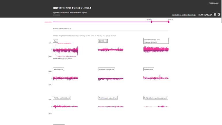
Hot Disinfo from Russia examines false messaging campaigns online. Image: Screenshot
Hot Disinfo from Russia was published in 2020 by Texty, an online Ukrainian data journalism site and GIJN member. The media team trained a computer to recognize Russian disinformation campaigns, flag them and look for patterns, track different kinds of texts and messaging, and search for them across different channels. “This is a really good application of these super advanced techniques, a clever application of technology to solve problems which would be impossible for human beings to solve,” said Pilhofer. But he also warned:
“When you apply these techniques to journalism, you have to understand what you’re doing, and viewers and readers have to understand it and understand the limitations. You have to be careful. The result of a statistical model is not a fact. Advanced techniques should be used in journalism but you have to be very careful when there is uncertainty and you have to be clear about that. As we’re moving to more advanced techniques there is still a margin of error. It’s critical not to lose the trust of our readers and be clear about what we don’t know.”
In 2021 project, Texty also applied advanced techniques to look for the frequency and location of wildfires around Ukraine.
Serve a Community

A crowded canal in Nigeria’s Makoko. Image: Rainer Wozny / Heinrich-Böll-Stiftung (Creative Commons)
Mapping Makoko, published in 2019, is a Nigerian project that reflects the hard work of journalists in places with difficult conditions and projects that can seem bigger than the sum of its parts. The mapping project was a collaboration among a number of organizations, including the Guardian, Code for Africa, and OpenStreetMap. Some 300,000 people live in the poor community of Makoko, Nigeria, but the area appears as a blank space on Google Maps. There was little information about the structure, the density, even the streets of this vast neighborhood, and it was impossible for people to track land ownership, plan infrastructure, deal with emergencies, or support development. The team of journalists combined satellite images, data, and underground multimedia journalism, and trained 15 people to map Makoko using drones and canoes. A thousand drone images were captured as a result.
“This project helped the community to fight for their land rights,” Bouchard explained. “In some countries, data journalism helps to put invisible communities into maps, into the foreground. In West Africa, Middle Eastern countries or South East Asia, data journalism can have an impact working with civil society and other communities and bring information to bring change to society. Sometimes municipalities, governments were not even suspecting the issues.”
Keep Updating Your Work
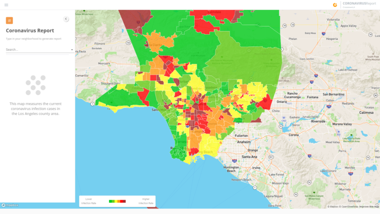
COVID-19 rates in the Los Angeles area, as illustrated on the Crosstown site. Image: Screenshot
“A lot of data projects tend to be one-off projects,” Chua explained. “You put in six months of work, 12 months of work, big important work that wins awards and then… you burn your notes and move on and do something else.” As an alternative, she said, there needs to be an all-team approach to data projects “so it’s not only the data team or the people who are working on the project who are using that data, but the entire newsroom.”
Chua mentioned Big Local News, a project started in 2018 by Stanford University in the US, as an example of a model that allows teams to build on stories from the data they aggregated and pulled together.
Crosstown — LA by the Numbers is a project available for everyone that constantly and automatically analyzes data about the Californian city of Los Angeles. “You don’t want to be using a lot of human power, you don’t have that many people to sit and analyze data. You want the machine to keep asking those questions,” Chua noted. “When they find something interesting, they flag it and they turn out automated newsletters in all the neighborhoods in LA. It industrializes the data journalism. It doesn’t always find some of the most hard-to-get information, but it adds incrementally to the insights you have on a geography.”
Be Tenacious

The IStories team. Image: Screenshot
The panelists also highlighted the organizations doing exceptional data journalism work in very difficult circumstances, such as the Post Data Club in Cuba and IStories from Russia. “They’re doing some of the most fearless reporting in countries where it can be very dangerous,” Pilhofer noted. He also expressed admiration for the data team at Argentine news outlet La Nación:
“An organization that year after year demonstrates a commitment to outstanding work. They’ve done creative work and shared the way that they do [it]. They are routinely open sourcing. In a country that doesn’t have a Freedom of Information (FOI) law, they still manage to liberate megabytes of data every single year. They have applied super-advanced techniques to data analysis, they’ve applied people power, they did many projects that do community-driven journalism. They are the example that we should all be striving for. It’s an example of the tenaciousness of journalists, a journalist team trying to harness some coding technology to scrape data on public websites.”
Think Outside the Box
A Song of Crowns and Tears is a project published in 2020 during the first coronavirus wave, using data and sound to portray the number of people who died from the virus. “It is a really beautiful piece, it’s art,” Pilhofer said, noting that the author of this project, a Swiss journalist, published it as a passion project, not as part of his daily job. “Why does everything have to look the same, why couldn’t it be part of his day job?” he asked.
That view was shared by Bouchard, who presented a project by The Pudding, which analyzed years worth of data on voices and pitch in pop music. “Data journalism doesn’t have to always be about super-heavy corruption projects,” she stressed. “And, thankfully, journalists can also have fun doing it.”
Additional Resources
GIJC21 Series: Video Resources for Data Journalism
GIJN’s Top 10 Data Journalism Projects of 2021
GIJN Resource Center: Data Journalism
 Marthe Rubio is GIJN’s French editor. After working for five years in Spain and Argentina, she is now based in her native France. She worked for two years on the data team of Argentina’s La Nacion, has published in Slate and Libération, and worked as a correspondent in Buenos Aires for Le Figaro and Mediapart.

Guide to Mapping Analysis Using QGIS

Investigating Latin America’s Global Reach Of Illicit Activities

Step-By-Step Guide for Journalists on the Basics of Google Sheets

Tipsheet for Using Ocean Data in Your Investigations

Turning the Threat to a Distant Glacier into a Local Story Through Data Visualization

One Name at a Time: How Die Zeit Built a Searchable Database of Nazi Party Members

Making Trillions Make Sense: How Reuters Visualized the AI Economy

From Toxic Supply Chains in Africa to Baltic Sabotage to Stolen Children in Syria: 10 Data Projects Win 2026 Sigma Awards

This work is licensed under a Creative Commons Attribution-NoDerivatives 4.0 International License
Republish our articles for free, online or in print, under a Creative Commons license.
Republish this article
This work is licensed under a Creative Commons Attribution-NoDerivatives 4.0 International License
Read Next
Climate Data Journalism
Turning the Threat to a Distant Glacier into a Local Story Through Data Visualization
New York Times climate and environmental graphics reporter Mira Rojanasakul discusses how her team visualized the sea level rise threat from the melting Thwaites Glacier in Antarctica.
Data Journalism
One Name at a Time: How Die Zeit Built a Searchable Database of Nazi Party Members
An online tool set up by the German newspaper Die Zeit, in cooperation with archives in Germany and in the United States, allows people to search several million Nazi Party membership cards.
Data Journalism
Making Trillions Make Sense: How Reuters Visualized the AI Economy
How do you make a trillion dollars feel real to someone who has never seen that much money? Vineet Khare and Mayank Bhatt faced that very challenge for their data-driven investigation into AI investment.
Data Journalism
From Toxic Supply Chains in Africa to Baltic Sabotage to Stolen Children in Syria: 10 Data Projects Win 2026 Sigma Awards
Ten outstanding data-driven journalism projects were chosen from among the 31 finalists – 26 individual projects and five portfolios — by a diverse prize committee of 17 judges.