Data Journalism Top 10: Misrepresenting Women, Bubble Tea, and India’s Nightingale

Step-By-Step Guide for Journalists on the Basics of Google Sheets

Tipsheet for Using Ocean Data in Your Investigations

No Coding Required: A Step-by-Step Guide to Scraping Websites With Data Miner

GIJC23 – The Future of Data Journalism: New Analytical Tools, Data Visualization, and AI
 How old are democracies in the world? Not as old as you might think, according to a piece by Our World in Data. Our weekly NodeXL curation of the most popular data journalism stories on Twitter also features a look at how women in the headlines can be used to perpetuate existing stereotypes, an examination of how large pockets of unvaccinated individuals are driving the pandemic in the US, and a fun make-your-own bubble tea interactive adventure.
Misrepresenting Women in the News
Women have generally been underrepresented in the news, and that hasn’t changed much in the past decade. The Pudding was curious to know how women are presented in the media when they do make the headlines. Using keywords associated with women, the long-form data journalism site analyzed 382,139 news headlines published between 2005 and 2021 from four countries — and analyzed the language used in women-centered headlines and how this language has (or has not) changed over time. Its visual essay suggests that headlines used to report women-centered news can be more biased and sensational, and can reinforce existing stereotypes. Read a summary in this tweet thread.
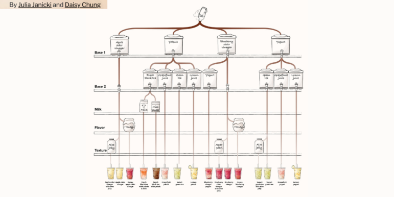
Bubble Tea Possibilities
Bubble tea (or boba tea) is a globally popular tea-based drink from Taiwan, typically made with tapioca balls. Fans of the drink delight in being able to customize it to their fancies. But how many possible bubble tea combinations are there? Data visualization designers Julia Han Janicki and Daisy Chung analyzed drink menus from the five most popular bubble tea shops in Taiwan, using data from YouTuber Data66 and Google Trends. The pair then created an interactive make-your-own drink adventure, featuring 157 unique drinks, three additional toppings, seven temperature levels, and five sweetness levels that allows for 12 million possible combinations of bubble tea. Chung takes you behind the scenes of the project in this tweet thread.
Waning Dominance of English-Language Songs
In this new era of digital music, it’s increasingly easy for non-English artists to gain global popularity. The Economist investigated the evolution of music tastes around the world by trawling through Spotify data. The team then created an interactive matrix showcasing the top 100 tracks in 70 countries. One trend emerged: the dominance of English-language songs is in decline. Interactive data journalist Olivia Vane shares the design process of this project in ‘Off the Charts’ — a data journalism newsletter by The Economist.
Analyzing Effects of Vaccine Coverage
The Financial Times conducted a detailed analysis on how varying vaccination rates could impact a country’s fight against COVID-19. According to the FT’s findings, large numbers of unvaccinated or partially vaccinated people in the US put more pressure on American hospitals during the Omicron wave compared to European countries with higher immunization rates. The analysis aligns with the findings of scientists and accounts of frontline healthcare professionals who say lower vaccination levels are perpetuating the pandemic in the US. Data journalist John Burn-Murdoch explains the piece in this tweet thread. Find the code here.
European Scholarship Inequality
Some 10 million individuals have participated in the European Union’s Erasmus student exchange program in the past 35 years. But the scheme suffers from unequal distribution and lack of access for economically disadvantaged students. El Confidencial and OBC Transeuropa examined the numbers in a two-part data investigation. Here’s part one, and part two.
How Old Are Democracies Worldwide?
How old are democracies across the globe? Our World in Data’s piece shows that dictatorships remain far from relics of the past. About half of all countries are currently not democracies — and the vast majority of democratic countries are younger than the span of a human lifetime. Researcher Bastian Herre summarizes his findings in a tweet thread. Find the code here. Editor’s update: The classification of countries as democracies is explained here.
Aging Russian Leaders
In 2022, Russian President Vladimir Putin will turn 70 years old. Investigative outlet IStories calculated the average age of senior officials in Russia, and how it has changed over the years. It also compared the age pattern of Russian leaders to those in several other countries. At the beginning of Putin’s presidency, the average age of senior Russian officials was 50.9 years, according to the project. It has now risen to 55 years. IStories also found that the closer the government body is to the president in power, the lower its rate of turnover. In fact, a third of the leaders in Putin’s presidential administration have now crossed the threshold of retirement age (61.5 for men; 56.5 for women). Also interesting: this IStories piece on data anomalies in Chechnya, a constituent republic of Russia. On the topic of aging, this Bloomberg piece on US Supreme Court justices — starting younger and departing older — is also worth a look.
Memorializing the Nightingale of India
Bharat Ratna Lata Mangeshkar, nicknamed the Nightingale of India, was a renowned Indian playback singer and occasional music composer. Her death last Sunday saw a surge of fans re-sharing a 2016 data journalism piece by the Hindustan Times charting the songbird’s 73 year career — in which she recorded at least 5401 Hindi songs. Find out how many solos she sang, which stars she frequently joined in duets, and which composers she worked with most often. The Indian English-language daily also published an interactive feature that allows readers to pick a mood and heroine to generate a relevant song sung by Mangeshkar. Note: The embedded YouTube videos no longer play due to copyright claims, but the interactive still offers up the related song titles.
Public Transport Fail in Indonesia
According to a graphical analysis by Indonesian national newspaper Kompas, as many as 8.8 million greater Jakarta residents have inadequate access to public transport. Public transportation in the area, known locally as ‘Jabodetabek,’ covers only 26.2 per cent of the population. The analysis was carried out by overlaying a population data map onto a map of the distribution of public stops and stations. The team also conducted simulations to determine the level of difficulty in residents’ mobility to reach central Jakarta, the capital city of Indonesia.
White House Chart: Mistake or Strategy?
The US White House recently published a chart that boasted of America’s strong economic growth during President Joe Biden’s first year in office. But sharp-eyed Twitter users quickly spotted an error, or worse, with its vertical, y-axis. The problem: the y-axis scale goes up in whole percentage points until it reaches 5.0, when it adds half-percentage points at the same intervals — giving the impression of an even greater jump in performance to the new 5.7% growth level for US gross domestic product (GDP) in 2021. On Twitter, there were many who accused the White House of deliberately manipulating the chart to exaggerate America’s economic growth. Visual communication researcher Robert Kosara weighed in on the controversy.
https://twitter.com/LaughlinPaul/status/1488823012480753668
Thanks again to Marc Smith and Harald Meier of Connected Action for gathering the links and graphing them. The Top Ten #ddj list is curated weekly.
 Eunice Au is GIJN’s program manager. Previously, she was a Malaysia correspondent for Singapore’s The Straits Times, and a journalist at the New Straits Times. She has also written for The Sun, Malaysian Today, and Madam Chair.
For a look at NodeXL’s mapping on #ddj and data journalism on Twitter, check out this map.
Step-By-Step Guide for Journalists on the Basics of Google Sheets
Tipsheet for Using Ocean Data in Your Investigations
No Coding Required: A Step-by-Step Guide to Scraping Websites With Data Miner
GIJC23 – The Future of Data Journalism: New Analytical Tools, Data Visualization, and AI

This work is licensed under a Creative Commons Attribution-NoDerivatives 4.0 International License
Republish our articles for free, online or in print, under a Creative Commons license.
Republish this article
This work is licensed under a Creative Commons Attribution-NoDerivatives 4.0 International License
Read Next

Data Journalism
One Name at a Time: How Die Zeit Built a Searchable Database of Nazi Party Members
An online tool set up by the German newspaper Die Zeit, in cooperation with archives in Germany and in the United States, allows people to search several million Nazi Party membership cards.

Data Journalism
How the Hindu Is Embedding AI Into Its Data Journalism
LLMs are quietly reshaping data journalism workflows at The Hindu, helping reporters process vast document sets, write scripts and build interactive tools.

Data Journalism
Developing a Data State Of Mind: Key Tips for Editors
Data is woven into how journalists cover everything from local government spending to global climate change patterns, but for editors without a specialist background, it can be daunting.

Data Journalism
2026 Sigma Awards for Data Journalism Open for Entries – Deadline Extended
The Sigma Awards celebrate the best data journalism from around the world. Submissions are now open for data projects published in 2025.