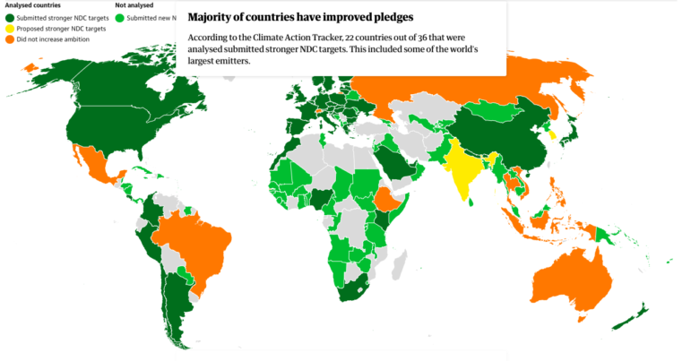
The Guardian analyzed countries' climate change pledges. Image: Screenshot
Data Journalism Top 10: Toxic Air, Hidden Emissions, Twitter’s Algorithm, Can Data Die?
Read this article in


The Guardian analyzed countries’ climate change pledges. Image: Screenshot
Rising fuel prices all across Europe have caused much concern among millions of households that are hoping for a mild winter. As countries try to bounce back from the pandemic, they are now faced with another crisis. Our weekly analysis of the most popular data journalism stories on Twitter highlights a story by the Financial Times into how Europe gets its natural gas and the geopolitics of this industry. In this edition, we also feature major investigations into poisonous air and underreported methane emissions by ProPublica and The Washington Post, as well as eight newsletters recommended by DataJournalism.com.
Poison in the Air
Industrial facilities are one of the biggest air polluters in the United States and the chemicals they release are contributing to a rising cancer risk in their communities. ProPublica analyzed five years of data from the Environmental Protection Agency and identified over 1,000 hotspots of cancer-causing air. An estimated quarter-million people may be constantly exposed to an unusually toxic environment, a major health concern. Using the data, ProPublica created a detailed map to show where the hotspots are and how many people may be affected.
Extreme Heat
Global temperatures have been rising for decades, but it may be difficult to feel this gradual change. Still, people around the world are experiencing the impact of the Earth becoming warmer. The consequences are most obvious during the summer when days often get extremely hot, threatening human health. The Associated Press examined a dataset by Columbia University’s Climate School spanning 33 years to find out and illustrate where people are most at risk from heat stress.
Climate Ambitions
The 2021 United Nations Climate Change Conference in Glasgow, also known as COP26, promised to be a tipping point in the global fight to slow down climate change. But how much has it actually affected the international effort to reduce carbon emissions? An analysis by the Guardian shows that 22 out of 36 countries at the conference have improved their pledges. But that still might not be enough to limit global heating to 1.5C.
Underreported Gas Emissions
A major investigation by the Washington Post found that many countries around the world are underreporting their greenhouse gas emissions. This means that their climate pledges are built on flawed data. The Post examined 196 country reports to the United Nations. The analysis revealed as much as 13.3 billion tons of emissions may be underreported every year. The newspaper highlights that the data we rely on to build a plan for saving the planet is inaccurate.
Going to the Movies
People rarely go to the cinema anymore. Instead, they stream movies in the comfort of their homes. This has become a reason for concern in the film industry. Some experts believe movies should not be released simultaneously in theaters and streaming platforms. The Financial Times analyzed box office data to examine which recent and pre-pandemic releases have been most successful.
Can Data Die?
As our presence in the digital world grows ever stronger, we are leaving data footprints every time we use social media like Facebook, YouTube, and TikTok. Often this data lives on the internet without our permission. That’s not a new phenomenon. One of the oldest photos on the web has been circulating for almost five decades without the consent of its subject Lena Forsén. The Pudding tracked how many times this image has appeared on the internet to dive into the issue of data rights.
The Price of Fuel
The prices of diesel and gasoline in Portugal have reached their highest levels in recent years. How has this affected customers in the country? Portuguese news outlet Público published an interactive piece to help readers find out how fuel prices are reflected in their pockets. After completing a short survey, the news platform generates an analysis for each user.
Twitter’s Algorithm
It’s well known that algorithmic bias affects users on social media and has a major impact on society. The content digital users get served often creates echo chambers and drives the spread of fake news. But rarely do we get an insight on how the algorithm actually works, especially by social media companies. In October, Twitter released a paper showing the platform favors conservative content. The company shared its data with The Economist, which showed the effects of this trend in several countries.
How Europe Gets Its Gas
Europe is highly dependent on natural gas, but prices have risen so much that they now threaten to slow down the economic recovery from the pandemic. With winter approaching, many households are worried about paying much more to heat their homes. Most of Europe’s gas doesn’t come from inside the European Union, but from Russia. The Financial Times’ visual storytelling team created a comprehensive map of the pipeline infrastructure and dived into the geopolitics of gas.
Newsletters for Data Journalists
Our weekly series on data journalism aims to highlight some of the best data-driven reporting on the Internet. But there are other ways for data journalists to explore what this field has to offer and learn how produce remarkable projects. DataJournalism.com curated must-read newsletters for data journalists, including ddj.news, Data Is Plural, The Economist’s Off the Charts, and more.
Thanks again to Marc Smith and Harald Meier of Connected Action for gathering the links and graphing them. The Top Ten #ddj list is curated weekly.
 Peter Georgiev is GIJN’s social media and engagement editor. Previously, he was part of NBC News’ investigative unit in New York. He also worked as a correspondent for Bulgarian National Television and his reporting has been published by the Guardian, Deutsche Welle, and other international outlets.
For a look at NodeXL’s mapping on #ddj and data journalism on Twitter, check out this map.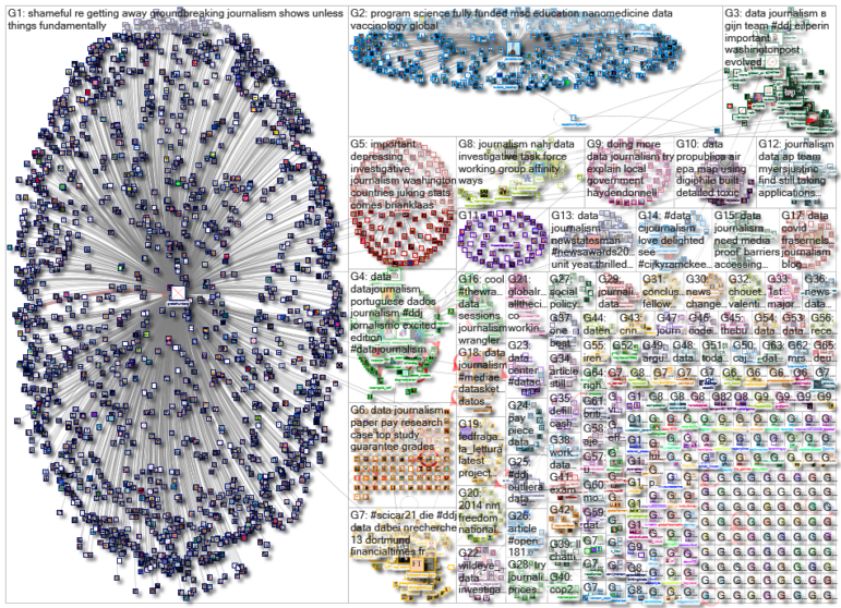

This work is licensed under a Creative Commons Attribution-NoDerivatives 4.0 International License
Republish our articles for free, online or in print, under a Creative Commons license.
Republish this article
This work is licensed under a Creative Commons Attribution-NoDerivatives 4.0 International License
Read Next

Data Journalism News & Analysis
Lessons Learned: 10 Common Mistakes in Data Journalism
GIJN asked speakers and attendees in the NICAR conference hallways for the data journalism gaps they see, and for under-covered topic areas and under-used skills that newsrooms can address.

Data Journalism
10 Outstanding Data Projects Win the 2024 Sigma Awards
There were 52 data journalism entries from 22 countries in shortlist for the 2024 Sigma Awards. Here are the top 10 winning projects.

Tipsheet Data Journalism Reporting Tools & Tips
Tipsheet for Using Ocean Data in Your Investigations
Investigations into what happens on, under, and around the ocean can often be answered thanks to the vast amount of data available online.

Data Journalism Reporting Tools & Tips
Best Practices for Working With Mass Shootings Data
There can be confusion among journalists about “mass shootings” data, which leads to wildly different numbers and deeper confusion among audiences.