Data Journalism Data Journalism Top 10
Data Journalism Top 10: Global Water Stress, Fentanyl Proliferation, Maui Fires
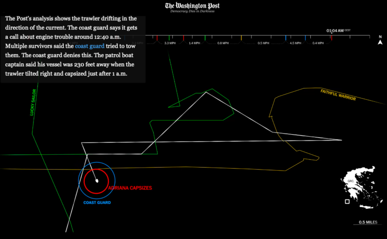
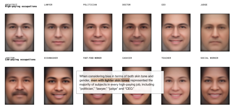
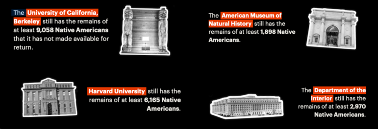
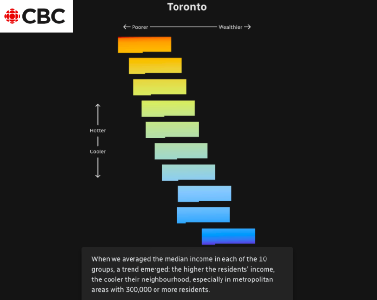
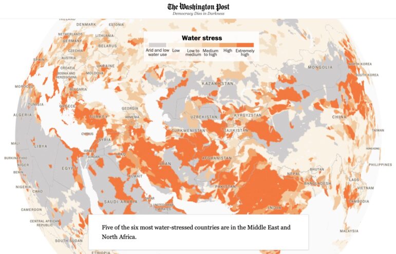
With stories about global water stress, the boom in fentanyl trafficking at the US-Mexico border, the devastating fires in Maui, and strategies for taking penalty kicks.