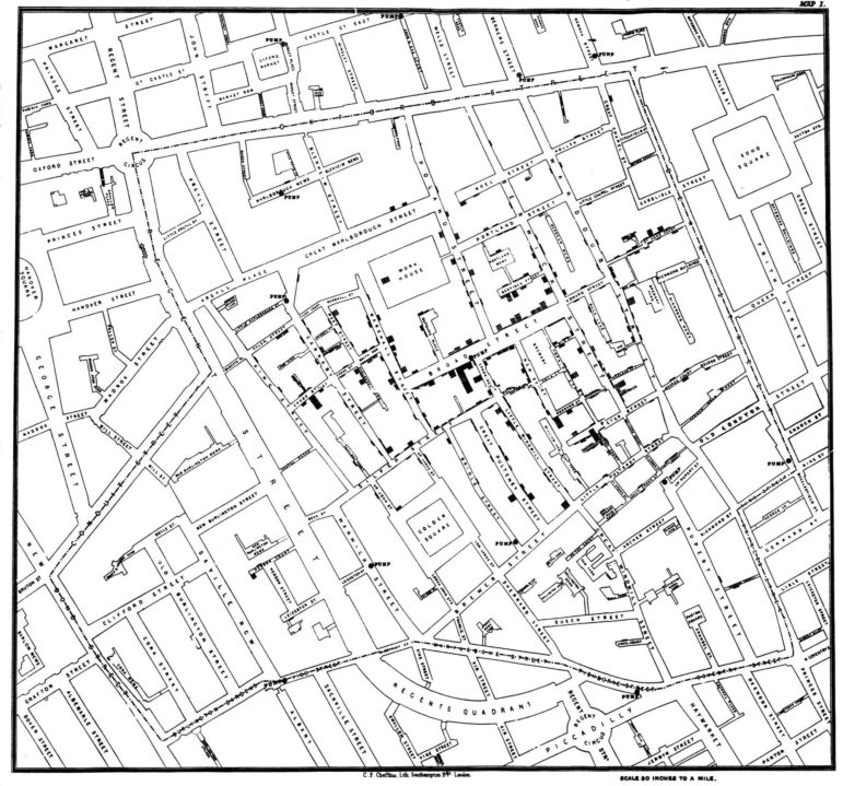
1854 Broad Street Cholera Outbreak Map
Think You Know Your Data Visualization? Take GIJN’s Quiz to Find Out
From WikiLeaks to the FinCEN files, huge stories have made use of data visualizations to engage their readers and simplify complicated topics.
Access to global databases and big data systems opens the door to new possibilities: using data to expose corruption, understanding leaks to understand where the powerful are hiding their money, and putting issues that might otherwise remain under-reported at the center of our lives.
But while data journalism is a powerful tool for investigative journalists, the vast possibilities of this world are wasted if reporters cannot effectively communicate the data they have found to the reader.
We have created an annotated quiz consisting of nine questions so readers can assess their current knowledge and understand the mistakes we all make while creating data visualizations.
Take our quiz here to test your knowledge.
Additional Resources
The Daily Quiz That Teaches Journalists How to Geolocate Images
My Favorite Tools: Alberto Cairo on Data Visualization
Explaining the Pandemic: 2020 Data and Visual Journalism Projects on COVID-19
 Pinar Dag is GIJN’s Turkish Editor. She is also a lecturer in the new media department of Kadir Has University and the co-founder of the Data Literacy Association (DLA), Data Journalism Platform Turkey, and DağMedya. Since 2012, Pinar has been organizing workshops for journalists on these issues and, for the past two years, has been on the pre-jury of Sigma Data Journalism Awards.

Basic Data Journalism Tips for Editors

My Favorite Tools: Venezuela’s Lisseth Boon on Design and Data Visualization

Document of the Day: Visual Vocabulary

Reporter’s Guide to Investigating Cryptocurrency
How a WhatsApp Community Is Bringing India’s Data Storytellers Together

Turning the Threat to a Distant Glacier into a Local Story Through Data Visualization

Making Trillions Make Sense: How Reuters Visualized the AI Economy

Summer Reading List for Data Journalists: For Those Who Believe in the Power of Storytelling with Numbers

This work is licensed under a Creative Commons Attribution-NoDerivatives 4.0 International License
Republish our articles for free, online or in print, under a Creative Commons license.
Republish this article
This work is licensed under a Creative Commons Attribution-NoDerivatives 4.0 International License
Read Next
Data Journalism
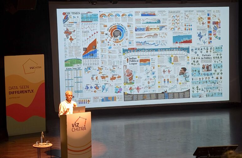
How a WhatsApp Community Is Bringing India’s Data Storytellers Together
Recently, more than 400 people gathered in the Indian city of Bengaluru for VizChitra 2026, a conference on data visualization and storytelling — but that is only a small part of the story.
Climate Data Journalism
Turning the Threat to a Distant Glacier into a Local Story Through Data Visualization
New York Times climate and environmental graphics reporter Mira Rojanasakul discusses how her team visualized the sea level rise threat from the melting Thwaites Glacier in Antarctica.
Data Journalism
Making Trillions Make Sense: How Reuters Visualized the AI Economy
How do you make a trillion dollars feel real to someone who has never seen that much money? Vineet Khare and Mayank Bhatt faced that very challenge for their data-driven investigation into AI investment.
Data Journalism
Summer Reading List for Data Journalists: For Those Who Believe in the Power of Storytelling with Numbers
Featuring books spanning four continents, these recommended reads provide a global perspective on data journalism.