Data Journalism Top 10: Animating COVID Masks, Mapping US Campaign Cash, Homeless Arrests, Berlin Protests
Read this article in
Research shows that masks are an essential defense against the coronavirus. Our NodeXL #ddj mapping from October 26 to November 1 finds The New York Times using animation and augmented reality to show just how masks work to filter and trap air particles that may carry the virus. This week’s Data Journalism Top 10 also includes several pieces on the US presidential election: FiveThirtyEight founder Nate Silver talks to Vox about polling errors and uncertainties, freelance journalist Betsy Mason explains common shortcomings of US election maps, and the NYT analyzed more than 25 million donations to the Trump and Biden presidential campaigns.
How Masks Work
As coronavirus cases keep mounting across the world, wearing a mask has never been more important. The New York Times created an animation to show how large respiratory droplets and smaller airborne particles that could carry the virus are trapped in the layers of fibers in masks. The team also produced an augmented reality component, which you can access on Instagram on mobile, that allows you to immerse yourself in the magnified fibers of an N95 respirator. Times Research and Development engineer Nick Bartzokas explains how they used Spark AR to build the animated AR sequences.
Analyzing Donations to US Presidential Campaigns
The New York Times mapped fund contributions to the Donald Trump and Joe Biden presidential campaigns down to each ZIP code. Its analysis of more than 25 million campaign donations from April 1 to October 14 this year revealed that financial support for the candidates was divided along class and education lines.
Arresting Homeless People
Two years ago, The Oregonian/OregonLive reported that more than half of police arrests made in 2017 in Portland, Oregon, were of homeless people. A new analysis by the newsroom found that this trend not only continued in the following years, but jail bookings for homeless people had skyrocketed. The investigation points to housing as a factor that could reduce the high rate of rearrests of people living on the streets. Journalist Molly Harbarger summarized the issue in this tweet thread. Read the investigation’s methodology here.
Italy: Preparing for a COVID-19 Second Wave
During the first wave of the coronavirus pandemic in Italy, Bergamo’s Papa Giovanni XXIII Hospital, in the Lombardy region, was overwhelmed by patients. Journalists Elena Zacchetti and Valentina Lovato, from Italian online news site Il Post, visited the hospital recently to see how it has better prepared itself to deal with the second wave of COVID-19 infections. Using Datawrapper, they also mapped the positive coronavirus cases in Lombardy from September 1 to October 25. (In Italian.)
Tracking COVID-19 US Hospitalizations
An increasing number of Americans are being hospitalized due to COVID-19. Bloomberg is tracking the surging numbers of hospitalizations and bed occupancy rates. The data is neatly visualized by state.
US Polling: 2016 versus 2020
Vox’s founder and editor-at-large Ezra Klein interviewed FiveThirtyEight founder Nate Silver about this year’s US presidential elections. Among the topics discussed, Silver talked about the differences between the 2016 elections compared to 2020, as well as polling errors and uncertainties.
Flaws in US Election Maps
US election maps are ubiquitous this campaign season, and many of them could mislead readers with bad design, geographical quirks, and perceptual illusions. Freelance journalist Betsy Mason explains some common shortcomings of existing maps and how color and contrast could influence viewers’ perceptions.
Germany: Mapping Rush Hour Traffic
Fear of the coronavirus is driving commuters from buses and trains into private vehicles — which in turn increases traffic jams. Using data from the navigation device maker TomTom, Der Spiegel created interactive maps to show commuters which locations in 10 major German cities suffer the worst traffic congestion. (In German.)
Smart Methods to Extract Data from Forms
Jonathan Stray, research fellow at Partnership on AI, writes about why form extraction is such a difficult and important problem, not just for journalism but also for climate science, medicine, and other fields. “The problem is not simply getting data off a form — there are lots of tools for doing that — but getting data off of every form, no matter the layout.” He introduces a project he is involved in that applies artificial intelligence and deep learning to solve the problem. More here.
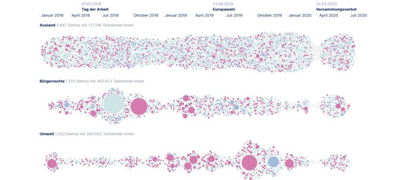
Germany: Protests in Berlin
Protesters often gather in Berlin, Germany’s capital, to take part in demonstrations on issues ranging from civil rights and to labor policies to the environment and coronavirus. German freedom of information portal FragDenStaat and data visualization agency webkid collected, analyzed, and visualized data on all 12,774 demonstrations recorded in Berlin from January 2018 to mid-July 2020, which saw the involvement of some 1.4 million people. (In German.)
Thanks again to Marc Smith and Harald Meier of Connected Action for gathering the links and graphing them. The Top Ten #ddj list is curated weekly.
 Eunice Au is GIJN’s program manager. Previously, she was a Malaysia correspondent for Singapore’s The Straits Times, and a journalist at the New Straits Times. She has also written for The Sun, Malaysian Today, and Madam Chair.
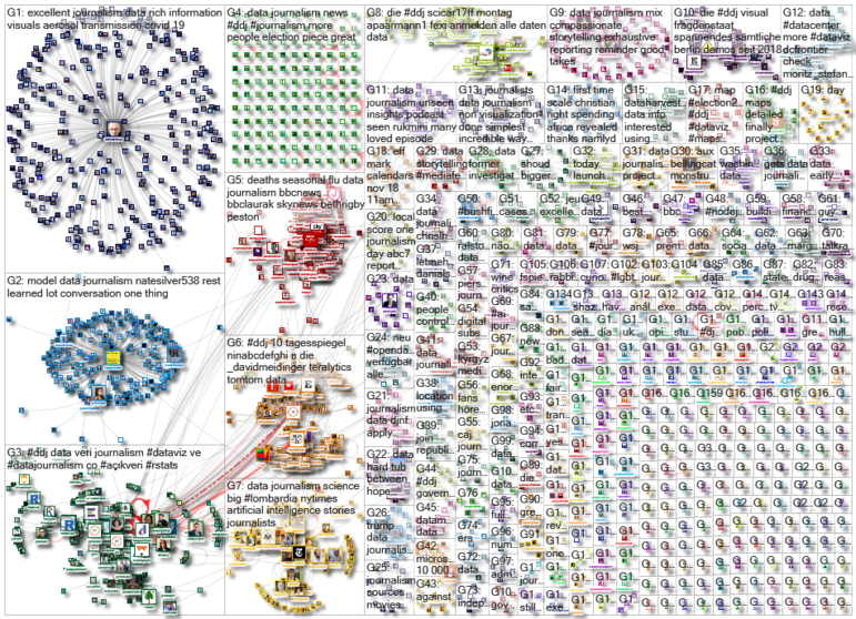
For a look at NodeXL’s mapping on #ddj and data journalism on Twitter, check out this map.

My Favorite Tools: Venezuela’s Lisseth Boon on Design and Data Visualization

Three “Musts” for Today’s Investigative Journalist

Tipsheet: Latest Tools for Investigating with Telegram

Investigating Elections: Threat from AI Audio Deepfakes
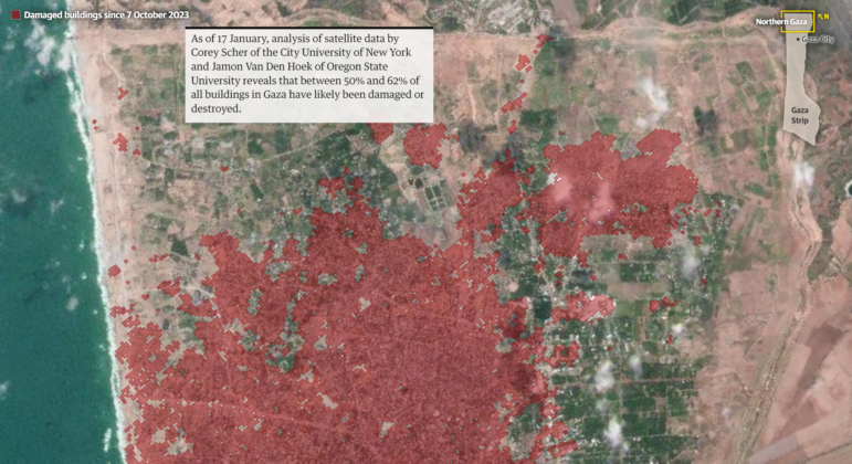
Mapping Conflict: Using Satellite Radar Data to Track the War Damage in Gaza
Airplane Accidents, 2024 Elections, Europe’s Lost Snowfall, and Recycling Movies

Data-Driven Journalism: Roundup of Recent Standout Stories
Data Journalism Top 10: Everest’s Deadly Legacy, Paris Metro Pollution, Migrant Worker Struggles in Singapore

This work is licensed under a Creative Commons Attribution-NoDerivatives 4.0 International License
Republish our articles for free, online or in print, under a Creative Commons license.
Republish this article
This work is licensed under a Creative Commons Attribution-NoDerivatives 4.0 International License
Read Next
Data Journalism Methodology
Mapping Conflict: Using Satellite Radar Data to Track the War Damage in Gaza
Gaza’s urban landscape has changed profoundly since the start of Israel’s military campaign. Researchers Jamon Van Den Hoek and Corey Scher have been mapping the impact.
Data Journalism Data Journalism Top 10
Airplane Accidents, 2024 Elections, Europe’s Lost Snowfall, and Recycling Movies
With pieces on the global campaign landscape, airplane accidents, European snowfall, and the toll of the ongoing Israel-Hamas conflict in Gaza.
Case Studies Data Journalism GIJC23
Data-Driven Journalism: Roundup of Recent Standout Stories
The best of modern data journalism tells powerful stories that test assumptions. At GIJC23, two experts discussed strong recent investigations and what makes them stand out.
Data Journalism Data Journalism Top 10
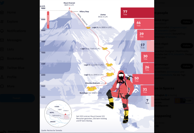
Data Journalism Top 10: Everest’s Deadly Legacy, Paris Metro Pollution, Migrant Worker Struggles in Singapore
This week, GIJN’s Top 10 in Data Journalism examines why the world’s tallest mountain has become increasingly deadly for those trying to climb it, pollution in Paris metro stations, US laws expanding gun access one year after the Uvalde mass shooting, and migrant worker struggles in Singapore.