
GIJN’s Data Journalism Top 10: Plastic Mountains, #SharpieGate, Stopwatch Analysis, Collaborative Software
What’s the global data journalism community tweeting about this week? Our NodeXL #ddj mapping from September 9 to 15 finds ProPublica open-sourcing its collaborative reporting software; CityLab interviewing Mark Monmonier, author of “How to Lie With Maps,” on Donald Trump’s deceptive hurricane map; Al Jazeera surveying South Sudan’s citizens on displacement; and Reuters visualizing just how bad the Earth’s problem is in terms of single-use plastics.
ProPublica’s Collaborative Reporting Software
ProPublica is no stranger to running large-scale collaborative projects, such as Electionland and Documenting Hate. To manage these projects, they’ve created software to help handle and share data among hundreds of newsroom partners. Now, they’ve released Collaborate, a free and open-source tool that is still in beta, so that other newsrooms can use it to work together around large datasets.
Drowning in Plastic
Plastic production has surged in the last 50 years, leading to widespread use of inexpensive disposable products that are having a devastating effect on the environment. Reuters visualized just how bad the problem is. Data expert Alberto Cairo comments on this piece here.
https://twitter.com/rosemaryhan_/status/1172518789755396097
#SharpieGate
United States president Donald Trump recently presented a doctored forecast map of Hurricane Dorian during a press conference. The map, which showed a black ink mark extending the forecast’s cone of uncertainty, quickly became known as #SharpieGate. Mark Monmonier, author of “How to Lie With Maps,” and who has seen a lot of misleading and deceptive maps, commented: “I have never seen anything like this.” Data visualization expert Alberto Cairo also writes about the furor here.
Surveying South Sudan’s Displacement on Mobile
Al Jazeera designed a mobile phone survey to understand the scale of displacement in South Sudan. The team matched the survey responses with the evidence of satellite images, public reports, photos, interviews, and research to verify the cases.
Visuals Style Guide
NZZ’s Visual Graphics team wanted to maintain a consistent look and feel in its visualizations for the newspaper. Check out their strategy to achieve visual harmony in their public Style Guide. Read more about why they created this guide.
https://twitter.com/marvinmilatz/status/1171337714144284672
Stopwatch Debate Analysis
The Washington Post tracked approximately how much time each candidate spent talking in the third Democratic Debate and analyzed how each candidate fared.
Five Types of Visualization Users
Data visualization specialist Dan Gastineau categorizes data visualization users into five types: the Doer, the Analyzer, the Decider, the Casual Learner, and the Museum Goer. He writes that by understanding the needs of these five audience types, data visualization designers could be able to better and more effectively approach custom-designing for each audience.
Analyzing German Parliament Debates
More than 200 million words have been written down by the stenographers of Germany’s parliament since 1949. Zeit Online has now created an interactive graphic where you can search for terms debated in parliament and discover the frequency of it being mentioned in a certain year. See how the focus of the Bundestag has changed over the years.
Data Journalism Reading
What should aspiring data journalists include in their must-read list? Data journalist Paul Bradshaw recommends several books that cover data analysis, data visualization and interactivity, and data cleaning, as well as data validity and statistics.
On Kickstarter: New DataViz Apps
Datasketch aims to help close the gap between those who can process and communicate data and those who cannot. They are raising funds on Kickstarter to build web-based data apps so that users can wrangle data via a simple point-and-click interface.
https://twitter.com/nicolaskb/status/1167805308837793793
Thanks, once again, to Marc Smith of Connected Action for gathering the links and graphing them. The Top Ten #ddj list is curated weekly.
 Eunice Au is GIJN’s program coordinator. Previously, she was a Malaysia correspondent for Singapore’s The Straits Times, and a journalist at the New Straits Times. She has also written for The Sun, Malaysian Today and Madam Chair.
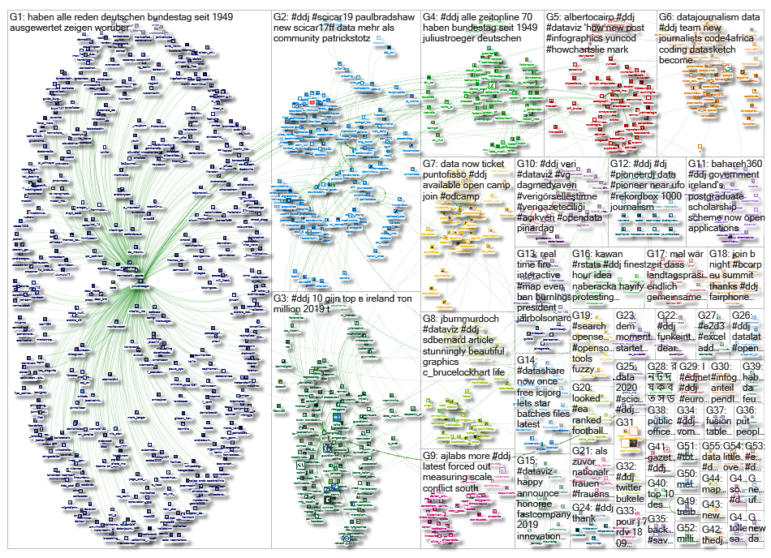
For a look at Marc Smith’s mapping on #ddj on Twitter, check out this map.

Basic Data Journalism Tips for Editors

My Favorite Tools: Venezuela’s Lisseth Boon on Design and Data Visualization

Document of the Day: Visual Vocabulary

How To Create a Data Journalism Team

From Space to Story in Data Journalism

Investigating India: How Smaller, Independent News Outlets Are Digging into Politics in a Key Election Year

10 Outstanding Data Projects Win the 2024 Sigma Awards

Trump’s Disappearing Donors, Tracking the Mars Rover, and the Ongoing Wars in Gaza and Ukraine

This work is licensed under a Creative Commons Attribution-NoDerivatives 4.0 International License
Republish our articles for free, online or in print, under a Creative Commons license.
Republish this article
This work is licensed under a Creative Commons Attribution-NoDerivatives 4.0 International License
Read Next
Data Journalism News & Analysis
From Space to Story in Data Journalism
Over the past 10 years satellite imagery has become an important component of data journalism. In the next 10, it will likely evolve further, from a tool used primarily for illustrating stories to an integral part of research and investigative reporting.
Data Journalism Investigating Institutions News & Analysis
Investigating India: How Smaller, Independent News Outlets Are Digging into Politics in a Key Election Year
Smaller investigative news outlets in India have been finding ways to do the most challenging and impactful accountability reporting leading up to the country’s key parliamentary elections in 2024.
Data Journalism
10 Outstanding Data Projects Win the 2024 Sigma Awards
There were 52 data journalism entries from 22 countries in shortlist for the 2024 Sigma Awards. Here are the top 10 winning projects.
Data Journalism Data Journalism Top 10
Trump’s Disappearing Donors, Tracking the Mars Rover, and the Ongoing Wars in Gaza and Ukraine
Our column of the best in data journalism also features stories on AI’s ability to forecast the weather, analyzing the Argentine president’s Tweetstorms, and apathetic EU voters.