GIJN’s Data Journalism Top 10: Zero Privacy, Hurricane Maps, Water Stress, Russian Judges


What’s the global data journalism community tweeting about this week? Our NodeXL #ddj mapping from August 26 to Sept 1 finds The New York Times examining the massive amount of digital trackers that follow an individual’s web activity, The Washington Post looking at the stress on global water resources, Data Visualization Society announcing the first #VizRisk challenge winners, and Datajournalism.com sharing tips on how journalists can learn to code.
Zero Web Privacy
Farhad Manjoo, opinion columnist for The New York Times, agreed to have his digital activity tracked and examined for journalism. His internet activity and corresponding digital trackers he gathered were visualized by data visualization designer Nadieh Bremer. “The big story is as you’d expect,” concluded Manjoo, “that everything you do online is logged in obscene detail, that you have no privacy.”
Visualizing Risk
The first-ever VizRisk Challenge asked data visualization professionals, designers, developers, and researchers how we could use maps and data viz techniques to more creatively and effectively communicate the risk of natural hazards and disasters. Briane Paul V. Samson and Unisse C. Chua won the grand prize for their piece focused on Marikina City in the Philippines. Read their story here and check out the other winners here.
Mapping Stress on Water Resources
The World Resources Institute’s Aqueduct Water Risk Atlas draws from 50 years of data to estimate the typical water supply of 189 countries compared to their demand. Researchers used hydrological models to calculate the scale of “water stress” — how close a country comes to draining its annual water stores in a typical year. The Washington Post took a closer look at the water stress in some of the most precarious countries and several states in the United States.
https://twitter.com/chiquiesteban/status/1158799994159280130
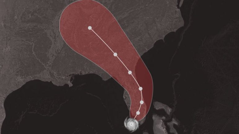
Hurricane Cone of Uncertainty
Cones are commonly used to visualize forecasts of the potential path of hurricanes. They look deceptively simple but they have some nuances that many people do not understand. Data visualization expert Alberto Cairo explains just how people misinterpret these hurricane maps.
Learn to Code Like a Journalist
Coding has become an essential skill for newsroom journalists. So how can you get started? Datajournalism.com gathered practical advice from a group of global experts in their Conversations with Data newsletter. They are also always on the look out for data longform write-ups. Pitch details here.
Search Engine for Charts
A team of former journalists, engineers, consultants, and researchers built Grafiti — a search engine for charts, graphs, infographics, and soon datasets. The platform indexes the best data-driven insights from credible publications, organizations, businesses, and its community of users.
Russia’s Judiciary
Who is eligible to be appointed as a judge in Russia, and can they be considered independent? Proekt Media took a deep dive into the history of Russia’s selection of judges. The newsroom analyzed how the education and previous work experiences of the members of the court influence their decisions.
https://twitter.com/wwwproektmedia/status/1166637727351214082
Spousal Homicide
France’s Libération newspaper maintains a database of women killed by their spouses, husbands or ex-husbands. The data, collected from January 2017, lists the women’s first names, their stories, and the collateral victims. Every year, more than 100 women are killed. (In French.)
“Data Essay” versus “Data Story”
Fullstack developer and information designer Eric William Lin tweeted his preference for using the term “data essay” rather than “data story” to refer to data visualization-driven pieces. Other visual designers chimed in with their thoughts on Twitter.
The Journalism of Things
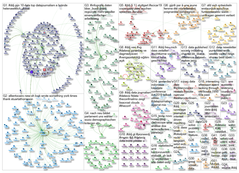
Journalism meets the Internet of Things. The first Journalism of Things Conference will be held on November 5, 2019 in Stuttgart, Germany. The event intends to promote journalistic experiments using sensors and devices, as well as figure out how the technology and the data gleaned from it can be used for journalism. More information here. (In German.)
https://twitter.com/vicari/status/1166251193829658624
Thanks, once again, to Marc Smith of Connected Action for gathering the links and graphing them. The Top Ten #ddj list is curated weekly.
 Eunice Au is GIJN’s program coordinator. Previously, she was a Malaysia correspondent for Singapore’s The Straits Times, and a journalist at the New Straits Times. She has also written for The Sun, Malaysian Today and Madam Chair.
For a look at Marc Smith’s mapping on #ddj on Twitter, check out this map.

This work is licensed under a Creative Commons Attribution-NoDerivatives 4.0 International License
Republish our articles for free, online or in print, under a Creative Commons license.
Republish this article
This work is licensed under a Creative Commons Attribution-NoDerivatives 4.0 International License
Read Next

Data Journalism News & Analysis
From Space to Story in Data Journalism
Over the past 10 years satellite imagery has become an important component of data journalism. In the next 10, it will likely evolve further, from a tool used primarily for illustrating stories to an integral part of research and investigative reporting.

Data Journalism
10 Outstanding Data Projects Win the 2024 Sigma Awards
There were 52 data journalism entries from 22 countries in shortlist for the 2024 Sigma Awards. Here are the top 10 winning projects.

Data Journalism Data Journalism Top 10
Trump’s Disappearing Donors, Tracking the Mars Rover, and the Ongoing Wars in Gaza and Ukraine
Our column of the best in data journalism also features stories on AI’s ability to forecast the weather, analyzing the Argentine president’s Tweetstorms, and apathetic EU voters.

Data Journalism
Updating the Inverted Pyramid of Data Journalism
Data journalist and instructor Paul Bradshaw has updated the Inverted Pyramid of Data Journalism — and brought together resources for every stage.