GIJN’s Data Journalism Top 10: Data Complexity, Forking Paths, Post-Brexit
What’s the global data journalism community tweeting about this week? Our NodeXL #ddj mapping from August 12 to 18 finds information designer Giorgia Lupi discussing how to embrace data complexity, New York Times Opinion building a forked-path visualization to predict an individual’s political leanings, the Guardian visualizing Brexit’s potential impact on UK food imports, and El Universal Mexico looking at the incidences of crime claiming young victims.
Embracing Data Complexity
Giorgia Lupi talks to the Data Visualization Society about embracing complexity in data visualizations and building them in a way that people are able to focus on one aspect at a time but are also able to understand the big picture.
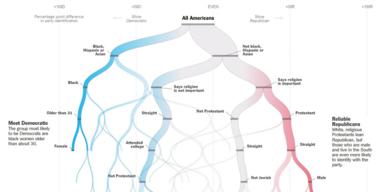
Quiz: Are You a Democrat or a Republican?
The New York Times created a quiz to predict whether someone is more likely to identify as a Democrat or a Republican. Answer a series of yes-or-no questions and watch the forking paths visualization appear. The article also explains its predictions based on existing demographic data from the 2016, 2017, and 2018 Cooperative Congressional Election Study. For more, check out Alberto Cairo’s write-up about the forking paths visualization here.
Food Shopping Post-Brexit
The Guardian looks at how a no-deal Brexit could impact the United Kingdom’s food imports. Around 30% of all food consumed in the UK is imported from the European Union, but for some foods, such as olives and spinach, the EU is practically the UK’s sole supplier.
Immersive Analytics
Tim Dwyer, Data Visualization and Immersive Analytics professor at Monash University, explains what immersive analytics is and its potential for use in the real world on the Data Stories podcast.
Mexico’s Young Murder Victims
El Universal analyzes the data of murders in Mexico and finds that the victims in two out of ten murders committed in the country are young men between 15 and 24 years old. Chihuahua, Sinaloa, Guerrero, Nayarit, and Nuevo León were murder hotspots for people in this age range. (In Spanish.)
Free EuroStat Webinar
Sign up for Eurostat’s free hour-and-a-half webinar on September 24, 2019 to understand the European Commission’s data.
Data Points Are People
Data visualization expert Alberto Cairo writes about a Reuters Graphics project from 2017 that tries to show the scale of the Rohingya exodus from Myanmar to Bangladesh.
Moscow Court’s Sentencing “Templates”
Protesters took to the streets in Moscow on July 27 after election authorities barred several opposition candidates from running for Moscow’s city council. More than 1,300 protesters were detained that day. The Moscow City Court later published 153 sentences for some of the cases. Novaya Gazeta analyzed these decisions from more than 10 courts and found that parts of the text were copied verbatim, suggesting a central production of these “template” court decisions.
Berlin Rental Market Profiteers
Of the 1.9 million homes in Berlin, 1.5 million are rented (81.5%). Who are the biggest profiteers from Berlin’s rental market? Tagesspiegel and Correctiv took a deep dive into the rental market data for the past eight months.
Data Journalism Survey
Lindita Camaj, associate professor at the University of Houston’s Valenti School of Communication, invites data journalists to take part in this survey to help investigators better understand how data journalism is evolving.
Thanks, once again, to Marc Smith of Connected Action for gathering the links and graphing them. The Top Ten #ddj list is curated weekly.
 Eunice Au is GIJN’s program coordinator. Previously, she was a Malaysia correspondent for Singapore’s The Straits Times, and a journalist at the New Straits Times. She has also written for The Sun, Malaysian Today and Madam Chair.
For a look at Marc Smith’s mapping on #ddj on Twitter, check out this map.

Basic Data Journalism Tips for Editors

My Favorite Tools: Venezuela’s Lisseth Boon on Design and Data Visualization

Document of the Day: Visual Vocabulary

GIJN Guide to Investigating Foreign Lobbying

From Data to Storytelling: Concept and Design Tips from the Financial Times’ John Burn-Murdoch

Data Don’ts: Expert Tips to Avoid Misleading Audiences With Numbers

How The Pudding Used Data Visualizations to Recontextualize the Story of Climate Change

How Data Journalism Is Changing the Face of Africa

This work is licensed under a Creative Commons Attribution-NoDerivatives 4.0 International License
Republish our articles for free, online or in print, under a Creative Commons license.
Republish this article
This work is licensed under a Creative Commons Attribution-NoDerivatives 4.0 International License
Read Next
Data Journalism
From Data to Storytelling: Concept and Design Tips from the Financial Times’ John Burn-Murdoch
The chief data reporter for the Financial Times discusses how he considers the use of text, color, and annotation to aid visual storytelling through charts and graphics.
Data Journalism
Data Don’ts: Expert Tips to Avoid Misleading Audiences With Numbers
At a NICAR 2025 panel, data journalism experts discussed nuanced number errors that watchdog reporters often make that can confuse readers and disrupt story angles.
Climate Data Journalism
How The Pudding Used Data Visualizations to Recontextualize the Story of Climate Change
What does climate change feel like? How will your city’s climate shift, 50 years from now? Data scientist Derek Taylor explains his latest piece.
Africa Focus Data Journalism
How Data Journalism Is Changing the Face of Africa
Data journalism in Africa has made a powerful impact, from holding leaders accountable to refuting myths around domestic violence. But the field faces formidable challenges.