Accessibility Settings

color options

monochrome muted color dark

reading tools

isolation ruler

Tag

Brexit

6 posts

Data Journalism

GIJN’s Data Journalism Top 10: Dealing Brexit, Following the Money, Swiss Greens, and a Kyrgyz Park Scam

What’s the global data journalism community tweeting about this week? Our NodeXL #ddj mapping from October 21 to 27 finds a panel of leading data visualization practitioners discussing the practice of visualization in an age of disinformation, Kloop exposing how Kyrgyzstani authorities privatized large swaths of a public park with no oversight, and The Guardian highlighting the minimal changes between former British prime minister Theresa May’s Brexit deal with current PM Boris Johnson’s new deal.

Data Journalism

GIJN’s Data Journalism Top 10: 3D Animation, Brexit Borders, Bad Research, NY Subway

What’s the global data journalism community tweeting about this week? Our NodeXL #ddj mapping from September 2 to 8 finds Folha de São Paulo’s beautiful 3D animation of the Brazil National Museum’s restoration efforts, Guardian’s real-time visualization of Irish border crossings, NZZ’s look at China’s bad research impacting scientists worldwide, and The New York Times calculating the variability of New York City’s subway commute times.

Data Journalism

GIJN’s Data Journalism Top 10: Data Complexity, Forking Paths, Post-Brexit

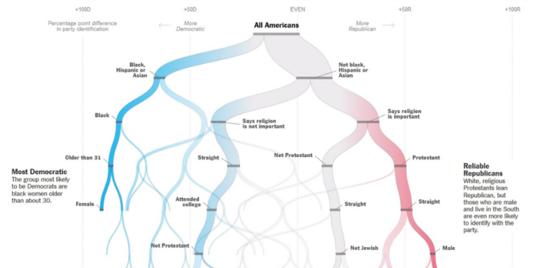
What’s the global data journalism community tweeting about this week? Our NodeXL #ddj mapping from August 12 to 18 finds information designer Giorgia Lupi discussing how to embrace data complexity, The New York Times Opinion building a forking path visualization to predict an individual’s political leanings, the Guardian visualizing Brexit’s potential impact on the UK’s food imports, and El Universal Mexico looking at the incidences of crime claiming young victims.

Data Journalism

GIJN’s Data Journalism Top 10: FT’s Chart Quiz, 65 Years of Human Rights Data, Build a Brexit Voter

What’s the global data journalism community tweeting about this week? Our NodeXL #ddj mapping from February 18 to 24 finds a fun @FinancialTimes quiz that tests your ability to read charts, the creation of a @DataVizSociety to foster engagement in the data visualization community and data viz designer @fedfragapane’s analysis of Human Rights Protection data from 1950 to 2014.

Data Journalism

GIJN’s Data Journalism Top 10: Number Jungles, Gender Gaps, Uber Maps, Brexit Woes

What’s the global data journalism community tweeting about this week? Our NodeXL #ddj mapping from November 5 to November 11 finds employment problems in the UK from @FinancialTimes, Polish data counter-narratives with @gazeta_wyborcza, cool geospatial analysis toys from @Uber, plus the launches of new data labs with @AlterEco_, data articles with @fstalph and @eborgesrey and data newsletters with @voydorg_en.

Data Journalism

GIJN’s Data Journalism Top 10: Rio’s Militias, OCCRP’s Database and Brexit’s Brits

What’s the global data journalism community tweeting about this week? Our NodeXL #ddj mapping from April 2 to 8 finds an alarming piece by @iamdylancurran on how much data Facebook and Google have actually gleaned from us, @OCCRP’s powerful database of public records and leaks, @davidottewell’s take on the evolution of data journalism and an investigation by @TheInterceptBr into the militias in Rio de Janeiro.