
GIJN’s Data Journalism Top 10: Hong Kong Protests, Migration Waves, Democratizing Dataviz
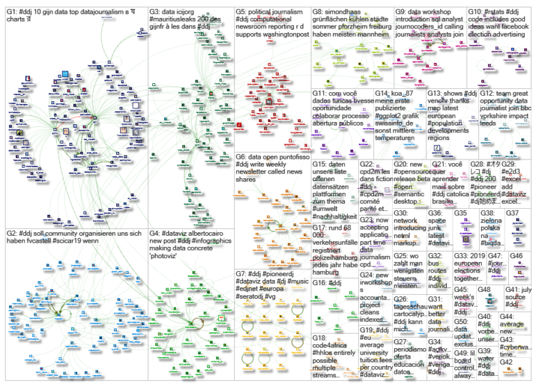
What’s the global data journalism community tweeting about this week? Our NodeXL #ddj mapping from July 22 to 28 finds The New York Times analyzing the catalyst behind Hong Kong’s recent protests, National Geographic visualizing human migration in the past 50 years, Ellery Studio’s fun and informative renewable energy coloring book, and The Economist’s findings that Hillary Clinton could have won the 2016 US election if all Americans had turned up to vote.
Fuel Behind Hong Kong’s Protests
Anger over the increasing hold of mainland China on Hong Kong’s political sphere has triggered hundreds of thousands of Hong Kong residents to protest in the streets. The New York Times writes that underlying all that rage is the people’s deep anxiety over miserable economic fortunes, housing in-affordability, and major income inequality.
Migration Waves
“Three percent of humanity worldwide are migrants, and this figure has held for 50 years.” National Geographic visualized the ebb and flow of people across borders over the past five decades to help us understand why people leave their countries.
Democratizing Visualization
Google News Lab data editor Simon Rogers and Knight Chair in Visual Journalism at the University of Miami Alberto Cairo have collaborated with data visualization experts over the past three years to push the boundaries of the field. These collaborations not only created creative visualizations but also resulted in the launch of freemium data viz tool Flourish and data sonification tool TwoTone, with more open-source tools in the pipeline. Also, look out for a new massive open online course this fall.
Infographics Coloring Book on Climate
The Infographic Energy Transition Coloring Book (IETCB) is an activity book that uses infographics to engage and educate people of all ages on climate change and renewable energy. The team behind the award-winning book launched a Kickstarter campaign to fund a second edition, which will have updated facts and figures. Also mentioned on Fast Company and by Alberto Cairo on his blog.
What If?
What if all Americans had turned out to vote in the 2016 US elections? Would Hillary Clinton be president? The Economist sought to answer this question using a statistical method, popular among leading quantitative social scientists, called “multi-level regression and post-stratification.” G. Elliott Morris explains the team’s methodology in this Medium post and Twitter thread. Data on Github.
Facebook’s Ad Library
Here’s an attempt by Roland Schmidt to analyze political campaign data from Facebook’s ad library using R. He explains how he retrieved the data for selected Austrian electoral candidates who ran campaigns on the social network platform, and described the limitations of the data and how he tried to address some of these shortcomings.
Interactive Election Game
Ahead of Ukraine’s extraordinary elections of people’s deputies on July 21, the Nikolaev Center for Investigative Journalism produced an interactive game based on facts and data to test the public’s knowledge on the electoral candidates and its readiness to vote. (In Russian.)
Stunted Growth in Pakistan
Datastories.pk visualized data from Pakistan’s 2018 National Nutrition Survey. The results reveal alarming statistics: The national average for the prevalence of stunting in children under 5 years old is 40.2%.
What Makes a Chart ‘Bad’?
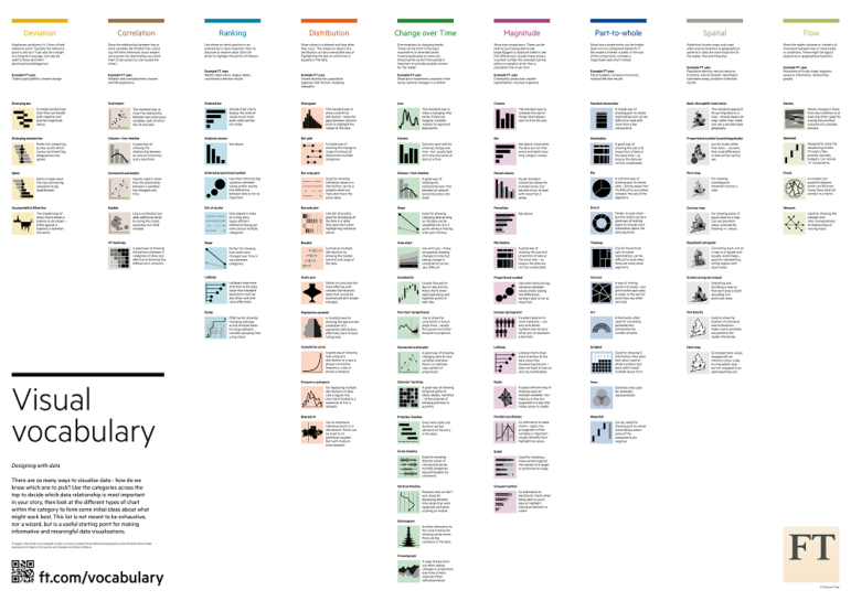
Business analytics and data visualization expert Kaiser Fung expands his thoughts on what makes a bad chart, following Conversations with Data’s newsletter on bad charts. He divides bad charts into two categories: misleading and misinterpreted, and offers a checkup method to help determine that data graphics sync with the intended message.
European Data Journalism Survey
The European Data Journalism Network (EDJNet) is gathering information about the practices of newsrooms, data teams, and individual journalists with regard to the use of data techniques in their reporting, in particular when covering European and cross-border issues. Fill in the survey here.
Thanks, once again, to Marc Smith of Connected Action for gathering the links and graphing them. The Top Ten #ddj list is curated weekly.
 Eunice Au is GIJN’s program coordinator. Previously, she was a Malaysia correspondent for Singapore’s The Straits Times, and a journalist at the New Straits Times. She has also written for The Sun, Malaysian Today and Madam Chair.


