GIJN’s Data Journalism Top 10: FT’s Chart Quiz, 65 Years of Human Rights Data, Build a Brexit Voter
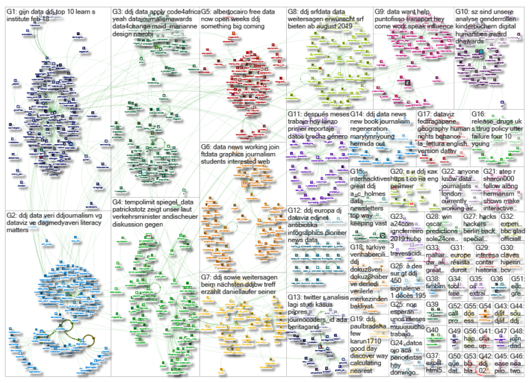
What’s the global data journalism community tweeting about this week? Our NodeXL #ddj mapping from February 18 to 24 finds a fun @FinancialTimes quiz that tests your ability to read charts, the creation of a @DataVizSociety to foster engagement in the data visualization community, @fedfragapane‘s analysis of 65 years of human rights data, and The Economist builds a Brexit voter.
Quiz: How Well Can You Read Charts?
The Financial Times came up with a fun quiz to test visual perception and whether readers can accurately interpret data. If you nailed those bar charts and even got lucky with the pie chart questions, wait till you get to the spheres. The team aptly demonstrates that introducing greater visual complexity than needed in your charts could lead to the reader misinterpreting your data.
DataViz Society
Amy Cesal, Mollie Pettit and Elijah Meeks just launched the Data Visualization Society to create a community for data viz professionals. The society acts as a place to foster constructive engagement and learning within the community, a resource and jobs board as well as an engine to push maturation of the field. Become a member here.
Visualizing Human Rights
Human rights violations are more prevalent in countries in Asia, Africa and the Middle East compared to nations in Europe. This is starkly evident in Federica Fragapane’s visualization of the Human Rights Protection data from 1950 to 2014 and the 2014 Human Rights Violations index. She highlights the top 25 countries with the least human rights violations and the bottom 25 countries with the most violations.
Tips on Data Collaborations
The Global Editors Network held a live Slack chat with several data journalism experts who offered tips on useful tools, common mistakes to avoid, and what to consider before collaborating on data journalism projects.
Speed Limit in Germany?
German Minister of Transport Andreas Scheuer had earlier dismissed a proposal to introduce a 130km/hour speed limit for highways by saying it is “against all common sense.” To find out whether he is right, Spiegel Online’s data team did some calculations on the effects of a speed limit. The results? It found that establishing a speed limit could prevent up to 140 deaths per year.
Pizza, Press and Politics
Elections analyst Nathaniel Rakich shared his story of how he ended up working in journalism through his love for baseball, and talked about his work at FiveThirtyEight. His sharing was part of “Pizza, Press & Politics,” a speaker series hosted by the Northeastern University School of Journalism.
Learning Data Basics
Are you just starting to work with data? The simple web tools provided by DataBasic provides a fun way to learn how to use data to tell stories. It’s got a WTFcsv tool to tell you WTF is going on in your data spreadsheet, while ConnectTheDots shows you how your data is connected by analyzing it as a network. Read about it in Turkish here.
Build a British Voter
The Economist built an interactive tool to calculate what an individual would likely vote for in a second Brexit referendum: no deal, May’s deal or stay in the EU deal. Readers can select different British profiles by changing the fields of gender, sexual identity, age, level of education, household income, home ownership and more. (Note: The article is behind a paywall.)
Dangers of Antibiotic Resistance
Vox Europ, in partnership with the European Data Journalism Network, highlighted the problems European health systems are facing with the extent of antimicrobial resistance to antibiotic treatment across Europe.
German Companies Open Data
After months of work in data modeling, coding, testing and analysis, OpenCorporates has now donated its cleaned data of 5 million German companies and over four million associated officers from the official German company gazette notices and register to the Open Knowledge Foundation Deutschland. The data is available to download under an open license at OffeneRegister.de.
Thanks, once again, to Marc Smith of Connected Action for gathering the links and graphing them.
 Eunice Au is GIJN’s program coordinator. Previously, she was a Malaysia correspondent for Singapore’s The Straits Times, and a journalist at the New Straits Times. She has also written for The Sun, Malaysian Today and Madam Chair.
For a look at Marc Smith’s mapping on #ddj on Twitter, check out this map.

Basic Data Journalism Tips for Editors

My Favorite Tools: Venezuela’s Lisseth Boon on Design and Data Visualization

Document of the Day: Visual Vocabulary

A Call for Debate: Taking Open Data and Government to the Next Level

From Data to Storytelling: Concept and Design Tips from the Financial Times’ John Burn-Murdoch

Data Don’ts: Expert Tips to Avoid Misleading Audiences With Numbers

How The Pudding Used Data Visualizations to Recontextualize the Story of Climate Change

How Data Journalism Is Changing the Face of Africa

This work is licensed under a Creative Commons Attribution-NoDerivatives 4.0 International License
Republish our articles for free, online or in print, under a Creative Commons license.
Republish this article
This work is licensed under a Creative Commons Attribution-NoDerivatives 4.0 International License
Read Next
Data Journalism
From Data to Storytelling: Concept and Design Tips from the Financial Times’ John Burn-Murdoch
The chief data reporter for the Financial Times discusses how he considers the use of text, color, and annotation to aid visual storytelling through charts and graphics.
Data Journalism
Data Don’ts: Expert Tips to Avoid Misleading Audiences With Numbers
At a NICAR 2025 panel, data journalism experts discussed nuanced number errors that watchdog reporters often make that can confuse readers and disrupt story angles.
Climate Data Journalism
How The Pudding Used Data Visualizations to Recontextualize the Story of Climate Change
What does climate change feel like? How will your city’s climate shift, 50 years from now? Data scientist Derek Taylor explains his latest piece.
Africa Focus Data Journalism
How Data Journalism Is Changing the Face of Africa
Data journalism in Africa has made a powerful impact, from holding leaders accountable to refuting myths around domestic violence. But the field faces formidable challenges.