
GIJN’s Data Journalism Top 10: London’s Murder Hotspots, Hungary’s Media Monopoly, Data Journalism’s Fallacies
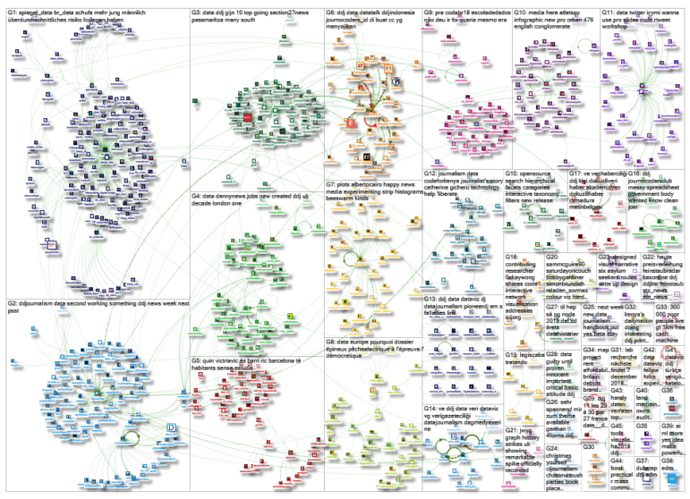
What’s the global data journalism community tweeting about this week? Our NodeXL #ddj mapping from November 26 to December 2 finds @VRCCrimCam mapping London’s medieval murder hotspots, @geckoboard illustrating common data fallacies to avoid, @ddjournalism teases the beta launch of the Data Journalism Handbook 2.0, and @GoogleNewsInit displays its data journalism courses.
Mapping London’s Medieval Murders
Prof Manuel Eisner, who directs the Violence Research Centre at the University of Cambridge’s criminology department, took nine years to pore over surviving Coroners’ Rolls from the first four decades of the 14th century to figure out the trend of crimes way back when. Among the murders, one man was killed for throwing eel skins on the street for sale and another was killed for stealing a tunic.
Google’s Data Journalism Lessons
The Google News Initiative’s Training Center has 15 lessons on data journalism, ranging from learning how to diagram a disaster and its response to using tilegrams to visualize data. Have fun exploring!
Data Fallacies to Avoid
This illustration on common mistakes when studying, analyzing and interpreting data may have been produced earlier in March but the advice is evergreen. Explore more on these common fallacies and real-life examples here. Want to pin up the poster in your workspace? Download it here.
Beta Launch: Data Journalism Handbook 2.0
Looks like the beta version of the Data Journalism Handbook (Second Edition), by the European Journalism Centre in partnership with the Google News Initiative, will be launched online soon. Watch this space.
Hungarian Media Monopoly
Last week, 476 media outlets became parts of a new Hungarian media holding controlled by pro-government forces. Center for Media, Data & Society fellow at the Central European University, Attila Bátorfy prepared an infographic to show how the ownership of these outlets have changed. (In English and Hungarian)
UK: Uncounted Homeless
An investigation by HuffPost UK showed that the government was providing data on nationwide levels of homelessness by using a rough count on just one night of the year in autumn, resulting in largely inaccurate data.
https://twitter.com/jessbrammar/status/1065208360264454144
AI and Journalism
In an era where artificial intelligence is becoming more and more a part of communication processes and decisions, journalism has to cope with adopting automated processes in news production and using AI responsibly. Hans-Bredow-Institut researcher Wiebke Loosen writes about the advances in robot journalism. (In German)
Turkey: Educating Syrian Kids
The European Union has been promoting the integration of Syrian children into the Turkish education system since the influx of Syrian refugees in Turkey. Dokuz8haber analyzes the data to gauge the success of these efforts. (In Turkish)
Barcelona’s Economic Inequality
Barcelona’s two districts Pedralbes and Ciutat Meridiana may only be a bit more than 10 kilometres apart, but their economic wealth has a gap as wide as New York’s compared to Medellin. Fundació Periodisme Plural shows the state of economic inequality in Spain’s capital city using infographics. (In Catalan).
German Judicial Districts
Spiegel Online’s Marcel Pauly uploaded data on the judicial districts in Germany that have existed since 2013, which had been used for a story looking into which district hosted Germany’s toughest judges.
Thanks, once again, to Marc Smith of Connected Action for gathering the links and graphing them.
 Eunice Au is GIJN’s program coordinator. Previously, she was a Malaysia correspondent for Singapore’s The Straits Times, and a journalist at the New Straits Times. She has also written for The Sun, Malaysian Today and Madam Chair.
For a look at Marc Smith’s mapping on #ddj on Twitter, check out this map.

Guide to Mapping Analysis Using QGIS

Basic Data Journalism Tips for Editors

My Favorite Tools: Venezuela’s Lisseth Boon on Design and Data Visualization

Document of the Day: Visual Vocabulary

Making Trillions Make Sense: How Reuters Visualized the AI Economy

Summer Reading List for Data Journalists: For Those Who Believe in the Power of Storytelling with Numbers

From Data to Storytelling: Concept and Design Tips from the Financial Times’ John Burn-Murdoch

Tracking US Migrant Detention Data: What Journalists Need to Understand

This work is licensed under a Creative Commons Attribution-NoDerivatives 4.0 International License
Republish our articles for free, online or in print, under a Creative Commons license.
Republish this article
This work is licensed under a Creative Commons Attribution-NoDerivatives 4.0 International License
Read Next
Data Journalism
Making Trillions Make Sense: How Reuters Visualized the AI Economy
How do you make a trillion dollars feel real to someone who has never seen that much money? Vineet Khare and Mayank Bhatt faced that very challenge for their data-driven investigation into AI investment.
Data Journalism
Summer Reading List for Data Journalists: For Those Who Believe in the Power of Storytelling with Numbers
Featuring books spanning four continents, these recommended reads provide a global perspective on data journalism.
Data Journalism
From Data to Storytelling: Concept and Design Tips from the Financial Times’ John Burn-Murdoch
The chief data reporter for the Financial Times discusses how he considers the use of text, color, and annotation to aid visual storytelling through charts and graphics.
Data Journalism News & Analysis
Tracking US Migrant Detention Data: What Journalists Need to Understand
The US government’s detained immigrant population flatlined in April, but there’s more to the numbers than meets the eye. Here’s what journalists need to know about the data.