
GIJN’s Data Journalism Top 10: Faking Climate Change Data and in WEB Du Bois’ Black Americ
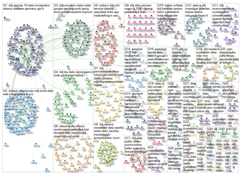
What’s the global data journalism community tweeting about this week? Our NodeXL #ddj mapping from Aug 6 to 12 finds @sciam profiling a new color scale for the color blind, @EDudinskij‘s fun dissertation on dataviz in science fiction movies, @morgenpost using satellite imagery to show the consequences of droughts, and @gregladen and Grant Foster calling bull on a climate change denier’s flawed graphs.
The Problem with Rainbow Color Scales
Data visualizations using rainbow color scales can sometimes be misleading and, for those with color blindness, are completely unintelligible. Now scientists at a US Department of Energy lab have developed a color scale — Cividis — that is mathematically optimized to be accurate for both color blind people and those with normal vision.
My Big Screen DataViz Dissertation
Here’s a fun dissertation idea by Edvin Dudinskij: analyzing incidences of data visualizations that appeared in science fiction movies.
Visualizing W.E.B Du Bois’ Black America
The colorful charts, graphs and maps presented at the 1900 Paris Exposition by famed sociologist and black rights activist W.E.B. Du Bois offered a view into the lives of African Americans, conveying a literal and figurative representation of “the color line.” Reserve your copy here.
https://twitter.com/albertocairo/status/1026812035085082626
Using Satellite Images to Show Drought
The consequences of the recent drought in Germany are very visible from space. See how Germany’s landscape has changed before and after the heat wave in this satellite-imagery piece from Berliner Morgenpost.
Climate Change: Tricking People with Bad Graphs
There’s a graph going around the internet from climate change denier Steve Goddard, aka Tony Heller, claiming to show that temperature in the US has been declining over the years. Both statistician Grant Foster and evolutionary biologist Greg Laden wrote blog posts calling bull on Goddard’s use of flawed data parameters to prove his point.
ICIJ’s Weapons of Choice
A look at the International Consortium of Investigative Journalists’ favorite data journalism tools, ranging from simple spreadsheets to software designed especially to tackle “big data” such as the #PanamaPapers and #ParadisePapers.
Significant DataViz Developments
Andy Kirk’s biannual round up of significant visualization developments is full of gems. This edition, covering the first half of 2018, includes data visualizations that are in the form of fun play-doh, that tackle important social issues and that showcase remarkable ingenuity.
Mapping Google Trends Data in R
Cognitive scientist Peer Christensen writes a short tutorial on how to get and visualize Google search data with both time and geographical components using the R packages gtrendsR, maps and ggplot2.
Free Mapping Course
Texas Tribune’s Darla Cameron and Chris Essig will teach a free online course on mapping for journalists from August 27 to September 23, organized by the Knight Center for Journalism in the Americas at the University of Texas.
Future of Journalism in Open Data
The second episode of Colombia’s Canal Trece #ElDato program focuses on taking advantage of open data to turn them into complete investigations. It highlights the data journalism work by La Silla Vacía and Connectas and speaks to journalists Claudia Báez and Mariana Santos about this journalism discipline.
Thanks, once again, to Marc Smith of Connected Action for gathering the links and graphing them.
 Eunice Au is GIJN’s program coordinator. Previously, she was a Malaysia correspondent for Singapore’s The Straits Times, and a journalist at the New Straits Times. She has also written for The Sun, Malaysian Today and Madam Chair.
For a look at Marc Smith’s mapping on #ddj on Twitter, check out this map.

Guide to Mapping Analysis Using QGIS

Basic Data Journalism Tips for Editors

My Favorite Tools: Venezuela’s Lisseth Boon on Design and Data Visualization

Document of the Day: Visual Vocabulary

Making Trillions Make Sense: How Reuters Visualized the AI Economy

Summer Reading List for Data Journalists: For Those Who Believe in the Power of Storytelling with Numbers

From Data to Storytelling: Concept and Design Tips from the Financial Times’ John Burn-Murdoch

Data Don’ts: Expert Tips to Avoid Misleading Audiences With Numbers

This work is licensed under a Creative Commons Attribution-NoDerivatives 4.0 International License
Republish our articles for free, online or in print, under a Creative Commons license.
Republish this article
This work is licensed under a Creative Commons Attribution-NoDerivatives 4.0 International License
Read Next
Data Journalism
Making Trillions Make Sense: How Reuters Visualized the AI Economy
How do you make a trillion dollars feel real to someone who has never seen that much money? Vineet Khare and Mayank Bhatt faced that very challenge for their data-driven investigation into AI investment.
Data Journalism
Summer Reading List for Data Journalists: For Those Who Believe in the Power of Storytelling with Numbers
Featuring books spanning four continents, these recommended reads provide a global perspective on data journalism.
Data Journalism
From Data to Storytelling: Concept and Design Tips from the Financial Times’ John Burn-Murdoch
The chief data reporter for the Financial Times discusses how he considers the use of text, color, and annotation to aid visual storytelling through charts and graphics.
Data Journalism
Data Don’ts: Expert Tips to Avoid Misleading Audiences With Numbers
At a NICAR 2025 panel, data journalism experts discussed nuanced number errors that watchdog reporters often make that can confuse readers and disrupt story angles.