Accessibility Settings

color options

monochrome muted color dark

reading tools

isolation ruler

Tag

graphs

2 posts

Data Journalism

GIJN’s Data Journalism Top 10: Faking Climate Change Data and in WEB Du Bois’ Black Americ

What’s the global data journalism community tweeting about this week? Our NodeXL #ddj mapping from Aug 6 to 12 finds @sciam profiling a new color scale for the color blind, @EDudinskij’s fun dissertation on dataviz in science fiction movies, @morgenpost using satellite imagery to show the consequences of droughts, and @gregladen and Grant Foster calling bull on a climate change denier’s flawed graphs.

Data Journalism

America’s Cultural Landscape, Germany’s Record Summer, Spain’s Immigration Boom, Google’s Data Search

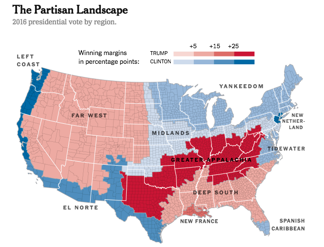
What’s the global data journalism community tweeting about this week? Our NodeXL #ddj mapping from July 30 to Aug 5 finds practical advice from @junkcharts for conference presenters to showcase their graphics, @Google making data in data journalism pieces more searchable, @funkeinteraktiv displaying the ways Germany is breaking records this summer, @eldiarioes examining Spain’s immigration boom and author Colin Woodard breaking down America’s regional cultures in The New York Times.