GIJN’s Data Journalism Top 10: Trump Country, Conga Lines and the Nerds in the Corner
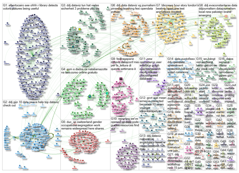
 What’s the global data journalism community tweeting about this week? Our NodeXL #ddj mapping from May 7 to 13 finds @adamrpearce brilliantly illustrating the problem and causes of backed up trains along the New York subway, @Textyorgua_Eng highlights the destruction of Ukraine’s landscape due to illegal amber mining, and @duc_qn analyzes which university gives you the best bang for your buck.
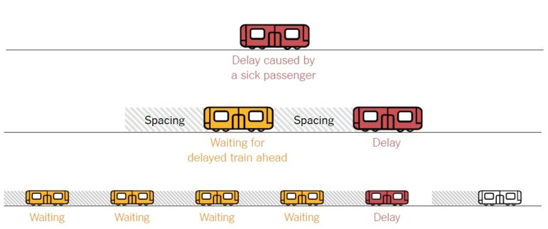
Backed-Up Train Conga Lines
New York subway commuters are familiar with the wait, with rising ridership and overcrowding supposedly to blame. But The New York Times is busting this myth with some compelling interactive visualizations, showing that decisions by the transport authority to change worker safety rules and the trains’ signal system is the cause of backed up train conga lines.
The visualizations in this article on New York City subway delays are so elegant, and a nice nod to the 19th-century train timetables that Edward Tufte has highlighted https://t.co/FuSwCFcZXT pic.twitter.com/mQKdQwkAso
— Dan Cohen (@dancohen) May 9, 2018
Digging Out Illegal Amber Mining
The golden years for amber diggers in Ukraine were between 2014-2016, which led to environmental disaster in thousands of acres of land. Texty.org.ua shows the places mutilated by illegal mining using machine learning to find satellite image evidence.
Our project about illegal amber is in English now! (and with methodology) Let me remind about interesting trick we used to make a transition between static images and interactive map: https://t.co/6Ky487STd7 pic.twitter.com/vfsVfIsj5v
— Anatoliy Bondarenko (@dvrnd) May 7, 2018
Bang for Your Higher Education Buck
Swissinfo.ch combined three well-known international rankings of higher education institutions and analyzed them alongside tuition fee data in an attempt to find the best universities which also offer the best value for your money.
Why university ranking sucks. Or more PC, a visual consensus summary of #university ranking https://t.co/FWUoMk0mtQ Spoiler: #Switzerland, for once, offers some the best value for the?. First use of @f_l_o_u_r_i_s_h #ddj #dataviz #HigherEducation @swissinfo_en @ETH_en @EPFL pic.twitter.com/oa9hEZbvMg
— Duc Quang Nguyen (@duc_qn) May 11, 2018
Mapping Routes of Asylum Seekers
At this week’s Open Vis Conf in Paris, France, a lot of good data visualizations have surfaced. One notable visualization is “The Stories Behind A Line” — a visual narrative of six asylum seekers’ routes.
Abstracted stories of flight—from tragedy, from war, from Ebola https://t.co/Um1LJ4Swmo @fedfragapane #OpenVisConf pic.twitter.com/ScRMsbJkO2
— Rob Simmon (@rsimmon) May 15, 2018
Not Just for the Nerds in the Corner
Reach (formerly Trinity Mirror) data unit head David Ottewell believes the danger with data journalism is if it is seen as a niche only for “the nerds in the corner.” He says there are a lot of important statistics put out by the government that aren’t properly analyzed, so there’s scope for more journalists to do that.
Interesting interview with @davidottewell on the growing use of data journalism in newsrooms https://t.co/c3bourGnR3 pic.twitter.com/GVoqWoD5VF
— Richard Frost (@richardfrosty) May 11, 2018
Traveling Through Trump Country
In the first 15 months of Donald Trump’s presidency, The Washington Post traveled through the midwest and surveyed how attitudes and feelings towards Trump have changed gradually over time.
Great visualization of 2016 vote: last time each Trump County went GOP https://t.co/shb0r6cccl pic.twitter.com/SkQiSiEXb9
— Will Jordan (@williamjordann) May 11, 2018
Color Palette R Package
PaletteR is an R package which lets you extract, from any image, a custom number of representative colors. It is a young package with a lot more work to be done — contributions are welcome.
Ohhh, an R library that detects colors in pictures. I can see this being useful for many projects https://t.co/m2TPshm5e0 #dataviz #infographics #ddj pic.twitter.com/yL5DbwygFc
— Alberto Cairo (@albertocairo) May 8, 2018
Data Visualization Catalog
The Data Visualization Catalogue ranging from arc diagram to word cloud is available in English, Chinese, Spanish, Russian and Turkish. Find out how to use circle packing or marimekko chart with its useful description and suggestions of tools to generate such data visualization.
Türkçe #VeriGörselleştirme Kataloğu|| Pasta Grafik Nedir? Nasıl kullanılır? Fonksiyonları nelerdir? #dataviz #ddj #tool #verigazeteciliği #vg https://t.co/PwgiHZjfbN https://t.co/WHBV5dx8Tn pic.twitter.com/SGhzGKYzGg
— Veri Gazeteciliği Platformu (@DagmedyaVeri) May 15, 2018
Tracking Colombia’s Peace Progress
“La Paz en el Terreno,” the journalism project tracking Colombia’s progress towards peace sure is attracting a lot of attention. This is the third consecutive time it made the Top 10 #ddj, this time with a piece by the International Center for Journalists.
Reporters behind #LaPazEnElTerreno or “Peace in the Field” – help break through “the fog” of peace using data. Check out their #ddj project: https://t.co/7cOjg3pbkw @rutasconflicto @eecolombia2020 @fabiolatorres pic.twitter.com/dlY5WYNXT8
— ICFJ (@ICFJ) May 10, 2018
Fast vs. Slow Charts
Netflix senior data visualization engineer Elijah Meeks discusses the benefits and pitfalls of “fast charts” versus “slow charts”.
How making data visualization quickly is damaging our ability to get analytics insights https://t.co/alKrNc6egF #datavisualization #analytics
— Openbridge (@openbridgeinc) May 16, 2018
Thanks, once again, to Marc Smith of Connected Action for gathering the links and graphing them.
 Eunice Au is GIJN’s program coordinator. Previously, she was a Malaysia correspondent for Singapore’s The Straits Times, and a journalist at the New Straits Times. She has also written for The Sun, Malaysian Today and Madam Chair.
For a look at Marc Smith’s mapping on #ddj on Twitter, check out this map.

Basic Data Journalism Tips for Editors

My Favorite Tools: Venezuela’s Lisseth Boon on Design and Data Visualization

Document of the Day: Visual Vocabulary

Tipsheet on Partnering with Civil Society Organizations and Non-Governmental Organizations
How a WhatsApp Community Is Bringing India’s Data Storytellers Together

Turning the Threat to a Distant Glacier into a Local Story Through Data Visualization

Making Trillions Make Sense: How Reuters Visualized the AI Economy

Summer Reading List for Data Journalists: For Those Who Believe in the Power of Storytelling with Numbers

This work is licensed under a Creative Commons Attribution-NoDerivatives 4.0 International License
Republish our articles for free, online or in print, under a Creative Commons license.
Republish this article
This work is licensed under a Creative Commons Attribution-NoDerivatives 4.0 International License
Read Next
Data Journalism
How a WhatsApp Community Is Bringing India’s Data Storytellers Together
Recently, more than 400 people gathered in the Indian city of Bengaluru for VizChitra 2026, a conference on data visualization and storytelling — but that is only a small part of the story.
Climate Data Journalism
Turning the Threat to a Distant Glacier into a Local Story Through Data Visualization
New York Times climate and environmental graphics reporter Mira Rojanasakul discusses how her team visualized the sea level rise threat from the melting Thwaites Glacier in Antarctica.
Data Journalism
Making Trillions Make Sense: How Reuters Visualized the AI Economy
How do you make a trillion dollars feel real to someone who has never seen that much money? Vineet Khare and Mayank Bhatt faced that very challenge for their data-driven investigation into AI investment.
Data Journalism
Summer Reading List for Data Journalists: For Those Who Believe in the Power of Storytelling with Numbers
Featuring books spanning four continents, these recommended reads provide a global perspective on data journalism.