Data Journalism
GIJN’s Data Journalism Top 10: Thanksgiving Travel, Visualization Art, Bad Charts, Dataharvest
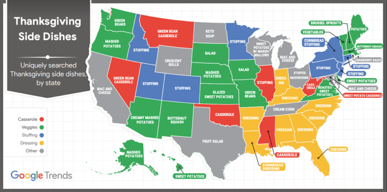
What’s the global data journalism community tweeting about this week? Our NodeXL #ddj mapping from November 18 to 24 finds Google Trends mapping the busiest places and times for Thanksgiving, Al Jazeera profiling the work of data journalist Mona Chalabi and her hand-drawn visualizations, the Tow Center for Digital Journalism examining the use of machine learning and artificial intelligence in journalism, and the Investigative Reporting Workshop collating useful public datasets in one place.