
Resource Video
The Investigative Agenda for Climate Change
In this panel, leading climate change journalists and experts shared perspectives on the top priorities for investigative journalism on climate change.
In this panel, leading climate change journalists and experts shared perspectives on the top priorities for investigative journalism on climate change.
The police shooting of Jacob Blake, a 29-year-old African American man, in the United States has reignited national unrest just months after the death of George Floyd. Our NodeXL #ddj mapping from August 24 to 30 finds ProPublica documenting police violence against Black Lives Matter protesters and tracking police accountability. The New York Times shows how the process of redlining, or denying mortgage finance to predominantly Black neighborhoods from the 1930s onwards, has resulted in heat disparities among cities, and BuzzFeed News uncovers scores of new internment camps in Xinjiang, China, by analyzing satellite data.
What’s the global data journalism community tweeting about this week? Our NodeXL #ddj mapping from October 22 to 28 finds @NateSilver538 talking about election forecasting, @BBCNews highlighting the prevalence of fast food outlets in the UK, @washingtonpost comparing how tough it is for Americans to vote by state, and @business and @HowWeGetToNext on battling for fresh air in India and Europe.
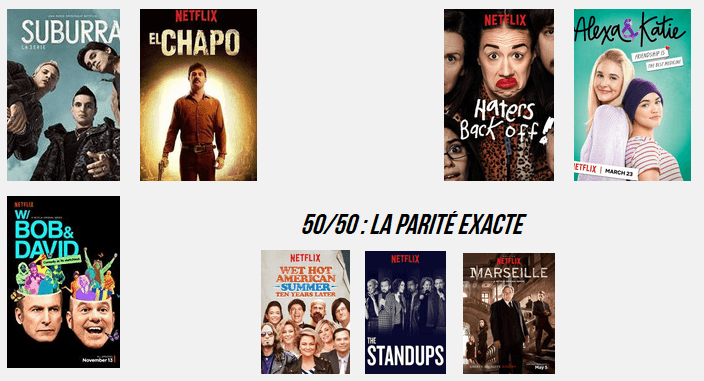
What’s the global data journalism community tweeting about this week? Our NodeXL #ddj mapping from Aug 20 to 26 finds @Numerama analyzing the representation of women in @netflix series and finds it lacking, @AJEnglish creating an interactive explainer on how 2 million Muslims make the pilgrimage to Mecca every year, @FT readers brainstorming air pollution solutions for London, and @Bastamag digging into data of @Airbnb — a cash cow for home renters.
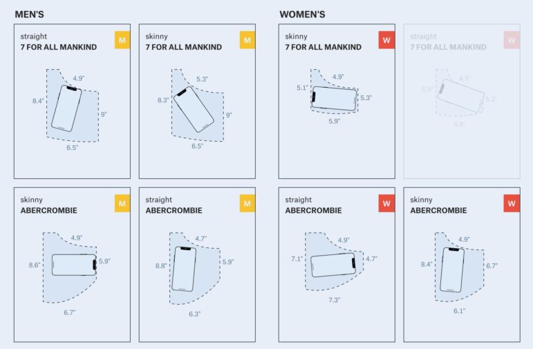
What’s the global data journalism community tweeting about this week? Our NodeXL #ddj mapping from Aug 13 to 19 finds @puddingviz proving that women’s pockets are inferior to men’s once and for all, @vizzuality pondering the impact cartographers have on our understanding of the world by presenting nocturnal activity in daytime maps, @InfoTimes_ discovering the bots behind the political debate in Egypt and @hnrklndbrg’s visualizations on everything from loner jobs to knife emergency room visits.
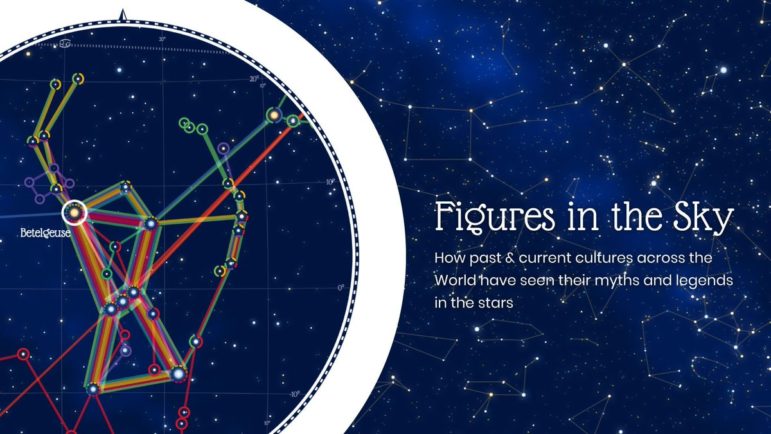
What’s the global data journalism community tweeting about this week? Our NodeXL #ddj mapping from July 23 to 29 finds @NadiehBremer visualizing beautiful constellations imagined by different cultures, @mslima diving deep into why we love pie charts, @leigh_tami18 explaining the various methods of joining datasets and the Reuters Graphic’s team visualization of the dam disaster in Laos.
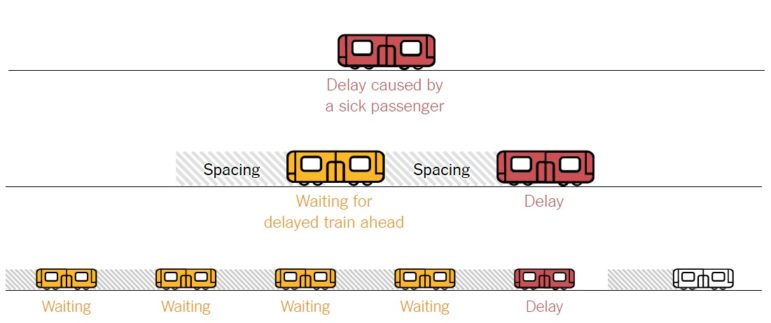
What’s the global data journalism community tweeting about this week? Our NodeXL #ddj mapping from May 7 to 13 finds @adamrpearce brilliantly illustrating the problem and causes of backed up trains along the New York subway, @Textyorgua_Eng highlights the destruction of Ukraine’s landscape due to illegal amber mining and @duc_qn analyzes which university gives you the best bang for your buck.
What’s the global data journalism community tweeting about this week? Our NodeXL #ddj mapping from March 19 to 25 finds a sobering study on income inequality between black and white males visualized by @nytimes, a cool time-lapse graphic of snow fall in the United States by @PostGraphics and peak baby-making seasons by country by @VismeApp and @ddjournalism.
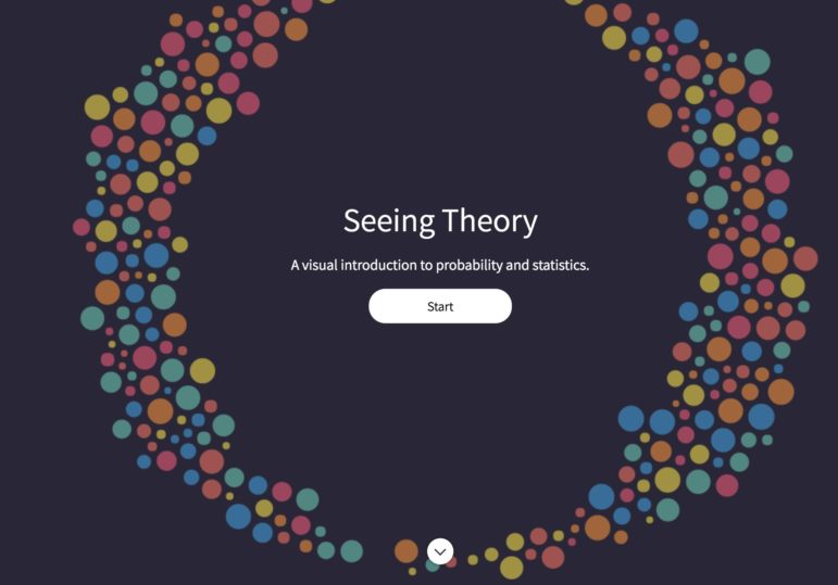
What’s the global data journalism community tweeting about this week? Our NodeXL #ddj mapping from March 12 to 18 finds disturbing news from @NASAEarth about low Arctic sea ice and temperature anomalies in the North Pole, @seeingtheory ‘s redesigned educational website on probability and statistics and top ten ways to clean your data by @Microsoft.

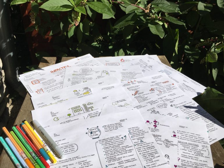
The Choqueyapu River investigation was initially intended for the Bolivian newspaper, Página Siete. A three-month reporting project resulted in the publication of two 16-page newspaper specials. But the challenge was to transform it into an innovative digital story.