This Week’s Top 10 in Data Journalism
 What’s the global data journalism community tweeting about this week? Our NodeXL #ddj mapping from January 29 to February 4 finds an @UpshotNYT analysis of the influence of Trump’s tweeting on Republicans’ attitudes towards the NFL, a new font typeface made out of human silhouettes created by @albertocairo, and a fun Graphic Continuum card set by @jschwabish and @dataviz_catalog to use in the classroom.
Trump’s Tweeting Influence
The New York Times analyzed the influence Trump’s tweets attacking the National Football League had among his voters, and showed that how Republicans say they feel about the NFL depends a lot on how long it’s been since Trump last put the issue of player protests in the national spotlight.
Asymmetric political tribalism: how Trump rapidly changed Republican attitudes toward the NFL | https://t.co/mIJoZXd70s pic.twitter.com/DsPCczhSC8
— Jay Van Bavel (@jayvanbavel) February 3, 2018
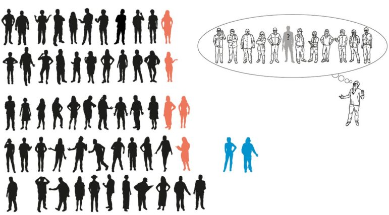
Wee People Font
Alberto Cairo created a font made out of human silhouettes. See how you can use it in a data visualization to illustrate a story.
Nice human silhouette font from @albertocairo and @ProPublica (Use @PowerPoint intersect tool to turn into shapes for your presentation…) https://t.co/jGriniQngM pic.twitter.com/iMiaotuH8X
— Nolan Haims (@NolanHaims) January 30, 2018
Fun with Cards
The Graphic Continuum Card Set is a set of 52 flash cards which are grouped into six categories: distribution, time, comparing categories, geospatial, part-to-whole and relationships. Use them for teaching, researching or spurring your imagination.
Very creative. Going to use them while teaching #dataviz & #ddj >The Graphic Continuum – Cards Set https://t.co/9AQ86aoK2S #vg pic.twitter.com/yLGLqjAB7j
— Pınar DağⓋ (@pinardag) January 30, 2018
Text-Data-Driven Stories
Current John S Knight fellow Barbara Maseda is asking for your help in creating a public database of stories based on the analysis of text collections. She hopes the details about the production of these stories, especially the software and approaches used, could be a valuable reference for other journalists.
Can you help @barbaramaseda create a public database of text-data-driven stories? https://t.co/nNPyjDO6cx #textdata #ddj
— JSK Fellowships (@JSKstanford) February 4, 2018
Wire Service for Charts
The Datawrapper River platform is a collection of charts that newsrooms can use in their publications, for free. Data sources like statistics organizations can publish their findings for easy reuse by potentially hundreds of news sites. Think of it as a wire service for charts.
and also literally blown away by the craft and the thoughtfulness that went into @Datawrapper, which I’ve revisited since the River announcement https://t.co/qiZEkn8D6z. so good
— Jerome Cukier (@jcukier) February 3, 2018
Flourish DataViz Tool
Have you tried Flourish yet? It’s a a platform for non-coders to easily make compelling infographics. After playing with Flourish’s beta for a few weeks, dataviz expert Alberto Cairo liked it so much he recorded an informal video tutorial. Check out his recommendation post below.
Suggestion: Give @f_l_o_u_r_i_s_h a try: https://t.co/vrn8JG3bkl Here’s an intro and video tutorial to get you started: https://t.co/YfnY4QBaeQ #dataviz #infographics #ddj pic.twitter.com/zM5cXM37Ak
— Alberto Cairo (@albertocairo) February 5, 2018
Data New Year Resolutions
Marianne Bouchart from the Global Editors Network gathered 12 data experts to put together a list of resolutions for 2018, from the essential — mastering Excel — to things to try out.
Some great points in this #ddj blog post by @Maid_Marianne. I like this comment on geospatial data by @datentaeterin:https://t.co/aIhTTgrKYg pic.twitter.com/M417AGUNNN
— Giuseppe Sollazzo (@puntofisso) February 2, 2018
Visual Vocabulary
The Financial Times’ Visual Vocabulary chart is an evergreen. It assists designers and journalists with selecting “optimal symbology” for data visualizations, making them more effective alongside text. The poster is also available in Japanese and both traditional and simplified Chinese.
This #dataviz overview table is used by the @FT team around @martinstabe to decide which visualization to use. It’s a handy starting point. Highly recommend looking at this. High-res version (if you want to print this) can be found here: https://t.co/JioXOveFnO pic.twitter.com/l8lyrNFEIO
— Simon Kuestenmacher (@simongerman600) January 31, 2018
Security Tools
ICIJ’s Spencer Woodman lists five security tools that are most commonly recommended for reporters, news organizations as well as their sources.
5 #digital #security tools to protect your work and sources by the @ICIJorg. With many helpful recommendations for journalists, academics as well as the average user e.g., Signal, VeraCrypt, KeePass etc.#cryptoparty #cybersecurity #infosecurity #privacy https://t.co/E3lDkVrvyt
— Leonie Tanczer (@leotanczt) February 2, 2018
Offshore Leaks Database Tutorials
ICIJ’s Offshore Leaks Database, with data on more than 680,000 entities and 600,000 directors and shareholders, is a starting point for investigating activities offshore. ICIJ has written three tutorials on how to search and maximize the use of its database.
How to investigate companies found in the Offshore Leaks Database –
Tips by @csgallego a @BrownInstitute Magic Grantee ’14 https://t.co/2r8r2PJJWB via @icijorg— Columbia Journalism (@columbiajourn) February 2, 2018
Thanks, once again, to Marc Smith of Connected Action for gathering the links and graphing them.
For a look at Marc Smith’s mapping on #ddj on Twitter, check out this map.


Document of the Day: Visual Vocabulary

Three “Musts” for Today’s Investigative Journalist

GIJN Guide to Investigating Foreign Lobbying

Guide to Investigating Caste

The Secret Sauce of NINA, El CLIP’s Data Community Tool for Latin America

Harnessing the Power of Global Forest Watch for Data-Driven Reporting on Land Cover Change

Spill-Tracking Data Sources to Help Cover Hazmat Events and Environmental Disasters

Data Journalism Top 10: Wagner’s Corporate Network, Barbie’s Career History, and Spain’s Election Results

This work is licensed under a Creative Commons Attribution-NoDerivatives 4.0 International License
Republish our articles for free, online or in print, under a Creative Commons license.
Republish this article
This work is licensed under a Creative Commons Attribution-NoDerivatives 4.0 International License
Read Next
Data Journalism Databases
The Secret Sauce of NINA, El CLIP’s Data Community Tool for Latin America
CLIP developed a collaborative database that empowers journalists to access public documents, contracts, and datasets across Latin America.
Data Journalism Reporting Tools & Tips
Harnessing the Power of Global Forest Watch for Data-Driven Reporting on Land Cover Change
A Mongabay senior editor shares tips for unlocking the full capabilities of Global Forest Watch, a free-to-use online platform that she says has been instrumental in her reporting.
Data Journalism Reporting Tools & Tips
Spill-Tracking Data Sources to Help Cover Hazmat Events and Environmental Disasters
Environmental journalists should check out the new database tool Spill Tracker, but should also bookmark these other resources for reporting on hazmat events.
Data Journalism Data Journalism Top 10
Data Journalism Top 10: Wagner’s Corporate Network, Barbie’s Career History, and Spain’s Election Results
GIJN’s weekly round-up of the Top 10 in Data Journalism looks at the Wagner Group’s vast corporate network in Russia, the many careers of Barbie, and Spain’s surprising election results.