Mapping Toolbox: 10+ Tools Worth Checking Out
Read this article in
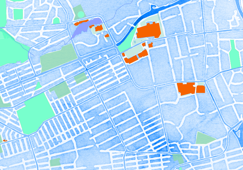
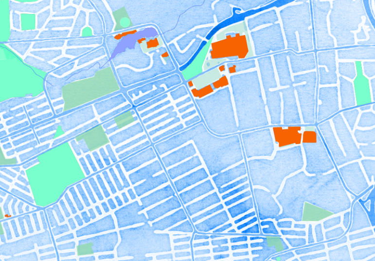
MapStack: Making maps beautiful.
Maps are one of the most popular ways to visualize data and are an easy way to add context to geographically-based datasets. They can also be beautiful and offer a different view of our world. Learning to make appealing and informative maps to support stories is a great skill to learn.
Over the past few years I’ve experimented with dozens of mapping tools and libraries. Here’s my shortlist based on the tools I find myself using most often.
Some of these tools are easy to use: add some data, choose your preferred settings and you create your map. Some of them (mostly toward the end of the list) require some programming knowledge, but if you’re willing to invest the time you can create some excellent custom data visualizations with them.
1 — My Maps
Ease of use: Easy
This is a great place to start if you’re new to mapping. If you have a dataset that includes columns for addresses or GPS coordinates then you’re set. In MyMaps, create a new map, import your dataset and select the column you want to use as the marker location and you’re done. You can also draw polygons on the map to indicate areas of interest or even add direction information. It’s easy to use and versatile.
2 — BatchGeo
Ease of use: Easy
BatchGeo does a pretty simple job but it does it well. Again, if you have a dataset with columns indicating addresses or GPS coordinates then you can paste this into BatchGeo and it will automatically look up these positions and add them to a map. It has fewer features than My Maps but if you’re just after a map with multiple, labelled points of interest then BatchGeo is worth taking a look at.
3 — MapJam
Ease of use: Easy
MapJam is another really easy-to-use mapping tool. It also has a fairly unique look for its maps, which are really nicely styled. Adding information to MapJam maps is really simple and it’s also easy to add annotations to the maps. MapJam produces either flat image maps or interactive, embeddable maps.
4 — Fusion Tables

Fusion Tables: Murder rate in South Africa by province.
Ease of use: Easy/Medium
Fusion Tables is part of the Google Drive suite of tools. At first it may not seem obvious what this tool does but it is pretty powerful once you get used to it. Fusion Tables imports most common file formats such as CSV, Excel and KML. Fusion Tables is excellent at geocoding your data, so long as you’ve got a decent location column. One of its most useful features is its ability to merge datasets. Mapping with FT is relatively simple and there are options for creating your own color buckets to illustrate your data. If you want to learn more about Fusion Tables take a look at my Fusion Tables and KML files primer.
5 — CartoDB
Ease of use: Easy/Medium
CartoDB is a lot like Fusion Tables but with loads more styling options. CartoDB can use different basemap styles and can handle multiple layers of information. Creating a basic, attractive map in CartoDB is pretty easy. It imports most common formats and can geocode country-level data. CartoDB has an extensive set of tools for making data-rich maps but it can take a little while to master all the options. The ability to export datasets in multiple formats makes this a go-to tool for me. I tend to do some initial planning work in CartoDB and then export the data as geoJSON files for use in a mapping library like Leaflet.js.
6 — MapShaper.org

Mapshaper: World’s undersea communication cables.
Ease of use: Easy
MapShaper is brilliantly simple. It does only a couple of things but it does them extremely well, which makes it an essential part of my toolset. MapShaper opens most mapping formats such as shapefiles, geoJSON and topoJSON and renders those for you. This makes it really easy to quickly investigate the map data you have. There’s also an option to simplify the contour lines of your map which is essential in reducing your eventual file sizes. The inspector makes it easy to see the data that’s attached to all your map points and polygons. Maps can then be exported in a range of formats to use in other mapping tools.
8 — Leaflet.js

Leaflet.js: Using the marker cluster plugin.
Ease of use: Medium/Hard
Leaflet is a JavaScript library for mapping and it’s my go-to-tool whenever I need something more customized than what most other mapping tools offer. You do need to be able to program to get the best out of Leaflet but once you do get the hang of it there’s no going back. Being JavaScript-based, Leaflet also works well with most other libraries which makes the options for customizing your maps endless. Combine those with this handy basemap chooser and your maps will be unique.
9 — Mapbox
Ease of use: Medium/Hard
Mapbox is for when you’re looking for that completely unique map, something that no one else has. And this is where you enter mapping geekdom. With Mapbox you can design your own maps from the ground up: things like customizing road colors, or boundary lines or place names is done in Mapbox studio. You can then save your own unique map styles and use those in other applications such as Leaflet or CartoDB. Mapbox also has its own JavaScript-based mapping library which you could use to build your own custom maps.
10 — A few other tools

Color Brewer tool
There are tons of other mapping or map-related tools available. The top image on this post was made with MapStack, an easy-to-use tool from Stamen which makes beautiful map styles. Some of the ones I also use include Color Brewer, which is great for finding a color scheme for your maps; QGIS, which is great for more high-end map manipulations, though it quite daunting at first, Tableau Public, which is great for general visualization, including maps; and Google’s Tour Builder, which is an interesting way to tell a story visually by using a combination of maps and multimedia.
This is far from a comprehensive list of mapping tools but it is hopefully a useful starting place and overview for anyone getting into mapping. If you think there is a mapping tool I ought to try out, send me an email or find me on Twitter. And if you found this useful, consider signing up for my weekly media and journalism newsletter for more tips.
This piece was originally published on the Media Hack website. It is part two of an occasional series on useful tools for journalists. Part one was Essential Tips and Tools for Beginning Data Journalism.
 Alastair Otter is the managing partner of Media Hack Collective, a data journalism and data visualization initiative based in Johannesburg. He is the former editor and head of editorial innovation at Independent Online, one of Africa’s largest online news sites. At Media Hack, he handles data visualization and the development of online media products.

Guide to Mapping Analysis Using QGIS

My Favorite Tools: Venezuela’s Lisseth Boon on Design and Data Visualization

Three “Musts” for Today’s Investigative Journalist

Tipsheet on Partnering with Civil Society Organizations and Non-Governmental Organizations
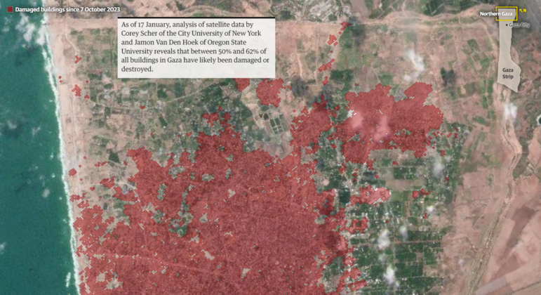
Mapping Conflict: Using Satellite Radar Data to Track the War Damage in Gaza
Data Journalism Top 10: Organ Donations, EU Drug Use, Layoffs Language, and Russian Censorship
Video Resources for Mapping, Satellites, Storytelling, Testing, Tracking, and Disinformation

Sigma Awards: 10 Lessons for Data Journalists Around the World

This work is licensed under a Creative Commons Attribution-NoDerivatives 4.0 International License
Republish our articles for free, online or in print, under a Creative Commons license.
Republish this article
This work is licensed under a Creative Commons Attribution-NoDerivatives 4.0 International License
Read Next
Data Journalism Methodology
Mapping Conflict: Using Satellite Radar Data to Track the War Damage in Gaza
Gaza’s urban landscape has changed profoundly since the start of Israel’s military campaign. Researchers Jamon Van Den Hoek and Corey Scher have been mapping the impact.
Data Journalism Data Journalism Top 10
Data Journalism Top 10: Organ Donations, EU Drug Use, Layoffs Language, and Russian Censorship
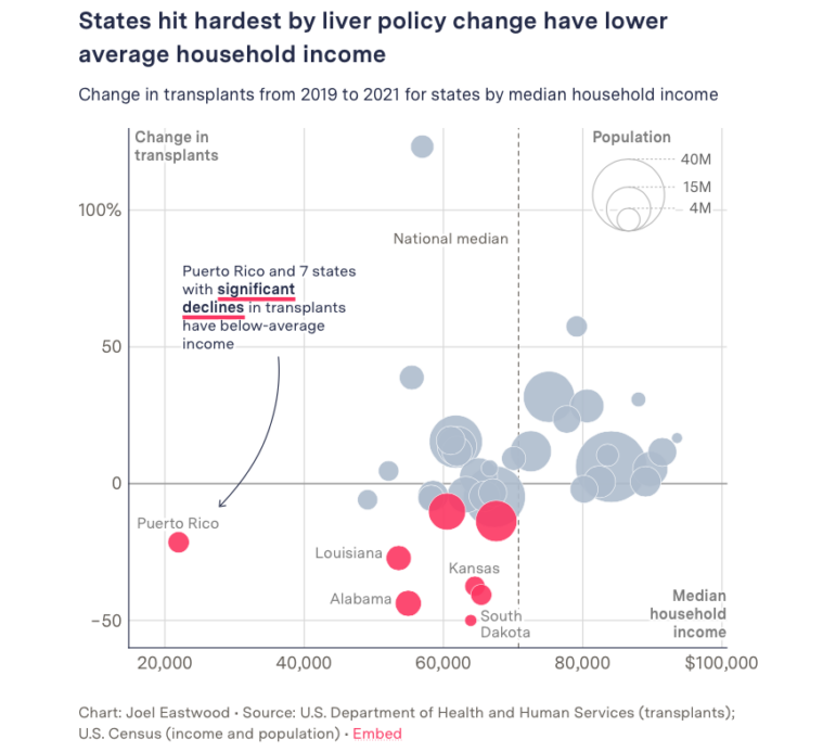
GIJN’s weekly curation of the most popular data journalism stories on Twitter features a look the impact of changes to organ donation rules in the US, drug usage in Europe based on wastewater analysis, a text analysis of layoff memos written by tech industry chief executives, and an examination of protests across Russia in 2022.
Reporting Tools & Tips
Video Resources for Mapping, Satellites, Storytelling, Testing, Tracking, and Disinformation
To share best practices from our most recent global conference, GIJC21, we are releasing a series of videos from the event’s many seminars, panels, and workshops. This latest installment focuses on investigative tips and tools for using satellite imagery, flight tracking, and exposing disinformation.
Data Journalism News & Analysis
Sigma Awards: 10 Lessons for Data Journalists Around the World
The Sigma Awards celebrate the best in data journalism from around the world. Speaking at the Perugia International Journalism Festival, three of the founders of the award highlighted the best projects of recent years and pointed to what journalists can learn from these data stories.