GIJN’s Data Journalism Top 10: The NYT’s Data Curriculum, Space Junk, Parents vs. Non-Parents
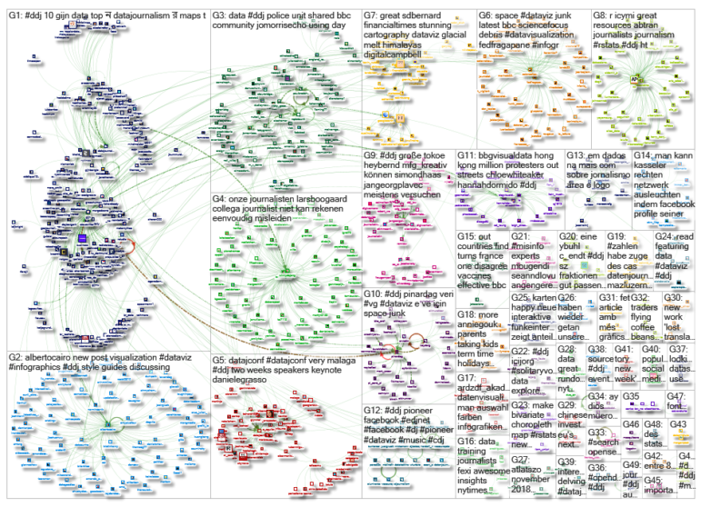
What’s the global data journalism community tweeting about this week? Our NodeXL #ddj mapping from June 17 to 23 finds Federica Fragapane visualizing space debris and their distance from earth, The New York Times open-sourcing its in-house data curriculum, Nathan Yau visualizing what time is lost for people once they have children, and Guns & America quantifying gunshot incidents within 300 meters of Washington, DC, schools.
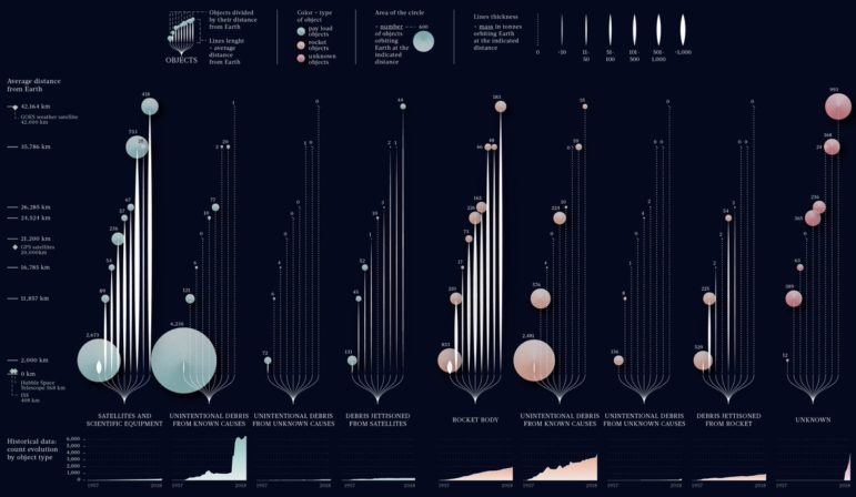
Visualizing Space Junk
Space junk has been accruing over decades and collisions could increase if the problem is not kept in check. Here’s another cool visualization by Federica Fragapane for BBC Science Focus that explores the amount of debris in space, the type of object, and their average distance from Earth.
The NY Times’ Data Curriculum
The New York Times developed an in-house data curriculum to empower its reporters to find data stories lurking in the hundreds of thousands of databases maintained by governments, academics, and think tanks. And they have now made that curriculum public!
Time Spent: Parents Versus Non-Parents
Statistician Nathan Yau visualized data from the American Time Use Survey from 2013 to 2017 and found, unsurprisingly, that time spent for relaxation, playing games, and other personal activities take the biggest hit for those with children.
Visualization Style Guide
The City Intelligence unit at London’s City Hall just released a set of data design guidelines that its team uses to improve the clarity, consistency, and accessibility of its data visualization output.
Gunshots and School Lockdowns
Guns & America published a story that quantifies gunshots occurring within 1,000 feet (300 meters) of Washington, DC schools. Data visualization expert Alberto Cairo commends the authors for increasing transparency and accountability by including a detailed methodology section as part of the article instead of relegating it to sidebars or a separate page.
Is Europe Moving to the Right?
Using a slider, Der Standard visualizes the nuances of how European Union member states have shifted to the left or right since 1996.
Estimating the Visual Potential of Stories
Neue Zürcher Zeitung’s visuals team receives a lot of requests from its newsroom to produce custom-made graphics for stories. To make sure the limited resources are spent where it matters most, the team came up with a simple tool with six criteria to estimate the visual potential of a story and the resources needed. (In English here.)
Beauty Ideals
If you missed this piece last September, it just won the Data Journalism Awards’ Public Choice Award. NOS collected the hip sizes of more than a thousand models from 25 model agencies and analyzed the average hip size needed to be a model, which turned out to be 34 centimeters. The average hip size of Dutch women? 42 centimeters.
Data Journalism Taster
Data journalist Paul Bradshaw, who runs the MA in Data Journalism at Birmingham City University, shares a snippet of what the course offers. He introduces what data journalism is and the types of stories you can tell with data.
More on Hong Kong’s Protests
Last week, we featured a Financial Times animation that used Google Earth to show how the recent Hong Kong protests against an extradition bill progressed. This week, Bloomberg’s use of infographics, GIFs, videos, and 360 degree video gives a different perspective on the massive demonstrations.
Thanks, once again, to Marc Smith of Connected Action for gathering the links and graphing them. The Top Ten #ddj list is curated weekly.
 Eunice Au is GIJN’s program coordinator. Previously, she was a Malaysia correspondent for Singapore’s The Straits Times, and a journalist at the New Straits Times. She has also written for The Sun, Malaysian Today and Madam Chair.
For a look at Marc Smith’s mapping on #ddj on Twitter, check out this map.

Basic Data Journalism Tips for Editors

My Favorite Tools: Venezuela’s Lisseth Boon on Design and Data Visualization

Document of the Day: Visual Vocabulary

Tipsheet on Partnering with Civil Society Organizations and Non-Governmental Organizations

Turning the Threat to a Distant Glacier into a Local Story Through Data Visualization

Making Trillions Make Sense: How Reuters Visualized the AI Economy

Summer Reading List for Data Journalists: For Those Who Believe in the Power of Storytelling with Numbers

From Data to Storytelling: Concept and Design Tips from the Financial Times’ John Burn-Murdoch

This work is licensed under a Creative Commons Attribution-NoDerivatives 4.0 International License
Republish our articles for free, online or in print, under a Creative Commons license.
Republish this article
This work is licensed under a Creative Commons Attribution-NoDerivatives 4.0 International License
Read Next
Climate Data Journalism
Turning the Threat to a Distant Glacier into a Local Story Through Data Visualization
New York Times climate and environmental graphics reporter Mira Rojanasakul discusses how her team visualized the sea level rise threat from the melting Thwaites Glacier in Antarctica.
Data Journalism
Making Trillions Make Sense: How Reuters Visualized the AI Economy
How do you make a trillion dollars feel real to someone who has never seen that much money? Vineet Khare and Mayank Bhatt faced that very challenge for their data-driven investigation into AI investment.
Data Journalism
Summer Reading List for Data Journalists: For Those Who Believe in the Power of Storytelling with Numbers
Featuring books spanning four continents, these recommended reads provide a global perspective on data journalism.
Data Journalism
From Data to Storytelling: Concept and Design Tips from the Financial Times’ John Burn-Murdoch
The chief data reporter for the Financial Times discusses how he considers the use of text, color, and annotation to aid visual storytelling through charts and graphics.