Accessibility Settings

color options

monochrome muted color dark

reading tools

isolation ruler

Tag

mapping

78 posts

Data Journalism

This Week’s Top 10 in Data Journalism

What’s the global data journalism community tweeting about this week? Our NodeXL #ddj mapping from March 5 to 11 finds everyone keenly sharing data tipsheets from @IRE_NICAR’s NICAR18 conference, @texifter discussing how to identify bots versus humans online and @EdjNet talking to @culukaya about the shocking rates of femicide in Turkey.

Case Studies

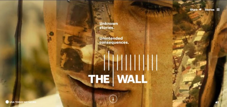
How They Did It: Inside a Mega-Collaboration on the US-Mexico Wall

More than 30 journalists set out to film and observe every foot of the border with Mexico, from Texas to California. The result was a fully interactive map with about 20 hours of aerial footage of the border, a seven-chapter story about the journey, 14 additional stories about the consequences of the wall, 14 mini-documentaries and an explanation of the history of the border itself. Here’s how they did it.

Data Journalism

This Week’s Top 10 in Data Journalism

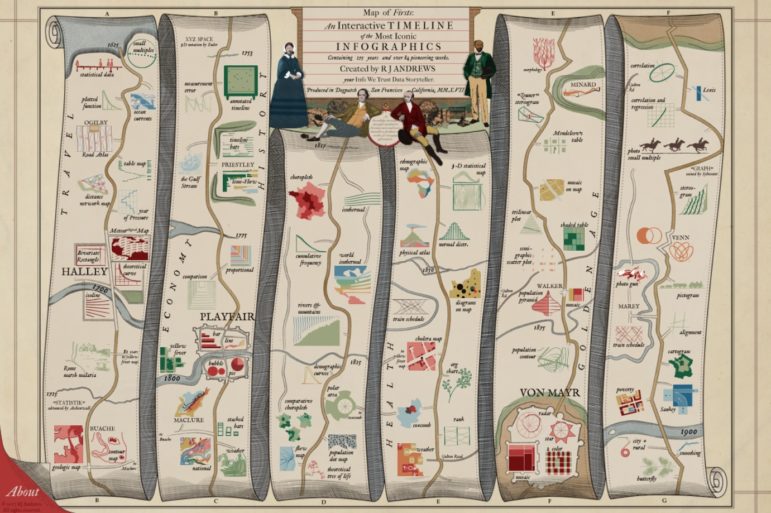
What’s the global data journalism community tweeting about this week? Our NodeXL #ddj mapping from February 19 to 25 finds economist @SethS_D analyzing Spotify data to find the correlation between our birth year and our music influences, @infowetrust illustrates three centuries of iconic infographics in a beautiful 17th century-styled dataviz and @EdjNet’s Stats Monitor gives you #ddj news leads on European data.

Data Journalism

This Week’s Top 10 in Data Journalism

What’s the global data journalism community tweeting about this week? Our NodeXL #ddj mapping from January 15 to 21 finds an interactive @voxdotcom piece on American districts which are reducing or perpetuating racial segregation in schools, several data-related good book recommendations by @stephencredmond and @Gapminder and a podcast discussion of memorable visualizations between @michelle_borkin and @datastories.

GIJN’s Top Reads for 2017

It’s been a year of great reads on GIJN, from “how they did it” to the best tips and tools on everything from mojo to mapping. Here’s a curated list of top ten reader favorites from stories published in 2017.

Data Journalism

This Week’s Top Ten in Data Journalism

What’s the global data journalism community tweeting about this week? Our NodeXL #ddj mapping from November 27 to December 3 has @journocode’s festive data-driven advent calendar with tutorials and interviews, @FT mapping cities at risk of natural disasters affecting property prices, and a #VisualizationUniverse by Google News Lab and Adioma.

Data Journalism

This Week’s Top Ten in Data Journalism

What’s the global data journalism community tweeting about this week? Our NodeXL #ddj mapping from September 25 to October 1 has @FT mapping the route in a day of a London Uber driver, #NICAR18 registration opening up, @Lattif charting Africa’s internet shutdowns using @atlascharts and loads of German election data visualizations.

Data Journalism

Data Journalism’s Top Ten

What’s the global data journalism community tweeting about this week? Our NodeXL #ddj mapping from Sept 4 to 10 has @FastCoDesign bringing the #EndtheRainbow argument to the fore, @puddingviz analyzing driving times to abortion clinics in the US and @nsuwatch dissecting a trial involving a German terrorist organization by the numbers.

Data Journalism

Data Journalism’s Top Ten

What’s the global data journalism community tweeting about this week? Our NodeXL #ddj mapping from August 14 to 20 has @Forbes mapping six years of American television news, the looming Kantar @infobeautyaward’s submission deadline and @sarahslo’s list of women in the field of data visualization.

Reporting Tools & Tips

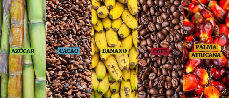
How They Did It: Enslaved Land Investigation

More than 20 journalists worked across four countries to uncover the hidden abuses behind the production of sugar, cacao, bananas, coffee and African palm with slave-like conditions for workers, illegal business practices and sustained environmental damage. Here’s how they did it.