Data Journalism Top 10: AI Bias, Targeted Ad Labeling, Remote Work Trends, and Korea’s Space Industry

Step-By-Step Guide for Journalists on the Basics of Google Sheets

Tipsheet for Using Ocean Data in Your Investigations

No Coding Required: A Step-by-Step Guide to Scraping Websites With Data Miner

GIJC23 – The Future of Data Journalism: New Analytical Tools, Data Visualization, and AI
Recent developments in the use of generative artificial intelligence has raised many concerns: among them ethical implications, legal issues, and claims of bias. Bloomberg investigates the extent of gender and racial discrimination that such AI platforms can amplify. This week, GIJN’s Top 10 in Data Journalism also explores how advertisers label and target consumers, the declining trend in remote jobs, the space industry in Korea, and the profits made by businesses that remained in Russia after that country’s invasion of Ukraine.
Generative AI Bias
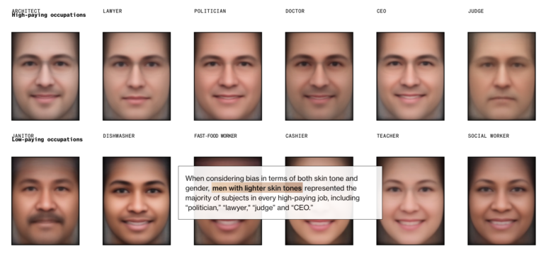
Experts warn that the biggest threat from artificial intelligence is the potential for widening inequalities. Bloomberg asked Stable Diffusion, an open source platform for AI-generated images, to create thousands of images of workers for 14 jobs and three crime-related categories. Journalists analyzed the results and found that the text-to-image AI not only replicated gender stereotypes and racial disparities that exist in the real world but amplified them. For example, the AI generated only three percent of female images for the keyword “judge” when, in fact, 34 percent of US judges are women. Data visualization reporter Leonardo Nicoletti also summarized the key takeaways of the investigation in a Twitter thread.
How Targeted Advertising Labels You
It is no secret that digital advertisers are constantly collecting data about internet users and following up with targeted ad messaging based on the users’ profiles. But how exactly do these advertisers label and categorize users? The Markup analyzed a file listing 650,000 of these audience segments, discovered by Wolfie Christl, a privacy researcher at Cracked Labs who found the database on Microsoft’s ad platform Xandr. The journalists identified a plethora of questionable categorizations of people including many medical- and health-related segments as well as psychological profiles. German digital rights news site netzpolitik.org also reported on these audience segments in cooperation with The Markup. Read a couple of their articles in German here, and here.
Work-From-Home Jobs
The COVID-19 pandemic reshaped the way many companies required their employees to work and ushered in an era of work-from-home arrangements. The Wall Street Journal analyzed more than 250 million job listings collected by WFH Map since 2014 to assess whether the trend of remote work is here to stay. Journalists found that flexible working options seem to be declining across much of the South, Midwest, and parts of the West in the United States.
Korean Space Industry
South Korea recently launched eight small satellites into space using Nuri, its first fully homegrown rocket. SBS, a private Korean broadcaster, took a look at the history of the nation’s space launch vehicles, the government’s budget for the sector over the years, and compared the local budget to other countries’ expenditure on the space industry.
Businesses That Stayed — and Profited — in Russia
When Russia invaded Ukraine in February 2022, many foreign and multinational companies announced their intention to leave — and while some did, a far smaller number actually pulled out. The data team at Novaya Gazeta Europe, with assistance from the Kyiv School of Economics, investigated the Western businesses who stayed — and profited — in Russia. Takeaways: dozens of foreign companies have made “excess profits” in Russia during the war, and 41% of foreign businesses present in Russia before the invasion are still there.
New York City Air Pollution
Last week, traditional and social media featured countless photographs and videos of a smoky, orange haze over New York City — a by-product of unseasonably early, major wildfires in Canada and an unusual jet stream path. The New York Times’ The Upshot dug into the numbers — in this case, particles — based on data from the New York City Community Air Survey and the state’s Department of Environmental Conservation to reveal just how bad the pollution was (spoiler: historically bad!). Also check out this visual look at the air pollution and air quality tracker.
Taiwan’s Airline Industry Recovery
With the COVID-19 pandemic winding down, people are starting to return to air travel. According to flight data analyzed by the Commonwealth Magazine, Taiwan’s aviation industry is recovering, with airlines resuming flights on previous routes while adding new flight destinations. The Taiwanese news outlet mapped a year’s worth of flight trajectories on a rotating globe and visualized the changes in number of outbound flights pre- and post-pandemic using an animated bar chart race graph.
Mapping Affordable Homes
As rental costs in Switzerland reach an all-time high, the data and interactive team at the Swiss newspaper Tages-Anzeiger visualized 400,000 housing ads across Switzerland, creating a personalizable map where readers can adjust budget and number of bedrooms to see what kind of housing — and where — they can still afford. Rent in Zurich, Geneva, and Lausanne, as well as their suburbs, are “exorbitantly high;” smaller towns in Jura canton and Bernese Jura — the French-speaking part of Bern canton — are most affordable. Helpfully, the paper has removed the paywall for this article. Also, don’t miss Bloomberg’s look at Singapore’s spiking rentals.
Global Warming, Visualized
A comprehensive interactive video from Le Monde visualizes the data of the history of global warming. From millennia of stable earth temperatures to the Industrial Revolution’s increased carbon emissions to the 20th-century reliance on fossil fuels, it makes clear that man-made activities, rather than natural fluctuations and radiation, are to blame for our rapidly warming planet. The scientific consensus is well-established — but how did we get here?
Coping with Heat Waves
When temperatures reach extreme levels in Southeast Asian countries, as they have this spring — with effective high temperatures of 46 degrees C (115 degrees F) — it falls upon individuals to adapt where the government can’t help. CNN analyzed Copernicus Climate Change Service data and visualized extreme temperatures across Cambodia, Laos, Thailand, Vietnam, Malaysia, and Myanmar, and asked people engaged in the informal economy — the hardest-hit community, who often have no choice but to work outdoors — how they coped with heat and dangerous humidity.
GIJN’s Data Journalism Top 10 list is curated weekly. Send your suggestions to us.
 Alexa van Sickle is an associate editor at GIJN. She was previously a senior editor for the foreign correspondence magazine Roads and Kingdoms. She has also been an editor at the International Institute for Strategic Studies and a publisher at an international law non-profit in London. She lives in Vienna, Austria.
 Eunice Au is GIJN’s global team manager based in Budapest, Hungary. Previously, she was a Malaysia correspondent for Singapore’s The Straits Times, and a journalist at Malaysia’s New Straits Times. She has also written for The Sun, Malaysian Today, and Madam Chair.
Step-By-Step Guide for Journalists on the Basics of Google Sheets
Tipsheet for Using Ocean Data in Your Investigations
No Coding Required: A Step-by-Step Guide to Scraping Websites With Data Miner
GIJC23 – The Future of Data Journalism: New Analytical Tools, Data Visualization, and AI

Turning the Threat to a Distant Glacier into a Local Story Through Data Visualization

One Name at a Time: How Die Zeit Built a Searchable Database of Nazi Party Members
Visualizing a Trillion Dollars, India’s Warming Cities, Russian Mercenaries at Sea, and World Cup Player Physiques
‘Super’ El Niño Threat, Myanmar Villages Razed, California’s Billionaire Tax Bill, and South Africa’s Murder Rate

This work is licensed under a Creative Commons Attribution-NoDerivatives 4.0 International License
Republish our articles for free, online or in print, under a Creative Commons license.
Republish this article
This work is licensed under a Creative Commons Attribution-NoDerivatives 4.0 International License
Read Next
Climate Data Journalism
Turning the Threat to a Distant Glacier into a Local Story Through Data Visualization
New York Times climate and environmental graphics reporter Mira Rojanasakul discusses how her team visualized the sea level rise threat from the melting Thwaites Glacier in Antarctica.
Data Journalism
One Name at a Time: How Die Zeit Built a Searchable Database of Nazi Party Members
An online tool set up by the German newspaper Die Zeit, in cooperation with archives in Germany and in the United States, allows people to search several million Nazi Party membership cards.
Data Journalism Top 10
Visualizing a Trillion Dollars, India’s Warming Cities, Russian Mercenaries at Sea, and World Cup Player Physiques
Also highlighting how films portray Ukrainians, increasing tree cover in Spain, and how couples meet.
Data Journalism Top 10
‘Super’ El Niño Threat, Myanmar Villages Razed, California’s Billionaire Tax Bill, and South Africa’s Murder Rate
Also highlighting exploitation of journalists in Egypt, Argentina’s returning World Cup squad, and the strain on Singapore’s aging caregivers.