Accessibility Settings

color options

monochrome muted color dark

reading tools

isolation ruler

Tag

ddj

96 posts

Data Journalism

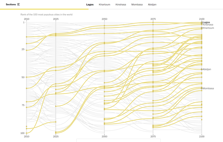
Data Journalism Top 10: Rise of Omicron, Africa’s Growing Cities, Tech’s Glass Ceiling, and Honeybees Self-Quarantining

Our weekly analysis of the most popular data journalism stories on Twitter highlights a story by Spanish newspaper El País analyzing early data on the omicron variant, plus stories on fake news and disinformation in Thailand, climate data, and a story on how artificial intelligence can judge your music taste.

Data Journalism Reporting Tools & Tips

Interpreting Data: Tips to Make Sure You Know How to Read the Numbers

When using data for investigative stories, it is important to learn how to obtain and clean the information. But it is also vital that you interpret your findings correctly and extract the right conclusions from the numbers, filters, and spreadsheets. If you do the math correctly but fail to read the answers properly, you may end up misleading your audience.

Data Journalism

12 Tips to Make Data Come Alive in Radio Reporting

Without a primary visual medium, radio reporting has trailed other media formats in data journalism. But creative data solutions for radio are emerging — and experts shared a dozen tips to help radio reporters broaden their storytelling repertoires, populate digital versions of their stories with data, and empower listeners to visualize without visuals.

Data Journalism

How We Built the Data Visualization That Brought Brazil’s COVID Deaths Close to Home

When the COVID-19 pandemic first hit Brazil, a team of data journalists set out to illustrate what the death toll looked like by creating a data visualization that presented something beyond the numbers. The team considered various ways of displaying the story. Here’s a behind-the-scenes look at how they created At the Epicenter.

Data Journalism

Data Journalism Top 10: Polarized America, Australia’s Pandemic, Poland’s Toxic Air, the Arab Spring, Life as Lego

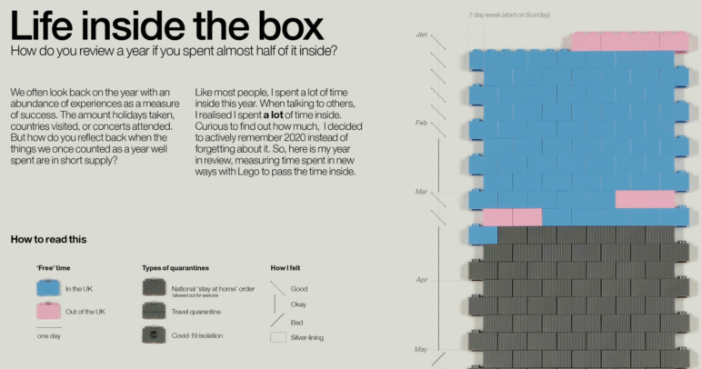
Our NodeXL #ddj mapping from January 25 to 31 found interactive projects by the Australian Broadcasting Corporation and The Guardian analyzing these events. In this edition, we also feature environmental reporting by The New York Times and The Economist, a Wall Street Journal story on the GameStop Reddit mania that shook stock markets, and a visual representation of 2020 using Lego bricks.

Data Journalism

GIJN’s Data Journalism Top 10: Number Jungles, Gender Gaps, Uber Maps, Brexit Woes

What’s the global data journalism community tweeting about this week? Our NodeXL #ddj mapping from November 5 to November 11 finds employment problems in the UK from @FinancialTimes, Polish data counter-narratives with @gazeta_wyborcza, cool geospatial analysis toys from @Uber, plus the launches of new data labs with @AlterEco_, data articles with @fstalph and @eborgesrey and data newsletters with @voydorg_en.