Data Journalism
Data Journalism Top 10: Humanizing COVID Deaths, Coronavirus Searches, Climate Change Songs, Brazil’s Cursing Cabinet
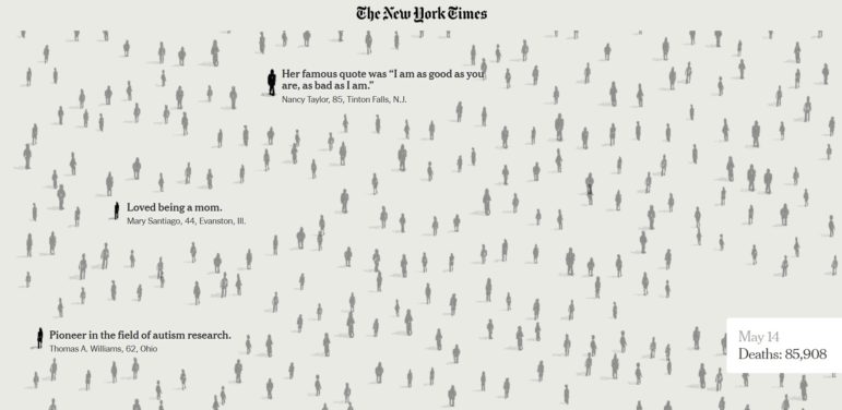
The devastating consequences of the coronavirus pandemic can get lost in the mass of numbers presented. Journalists are working hard to humanize the data. Our NodeXL #ddj mapping from May 18 to 24 finds The New York Times with a moving tribute to lives lost to COVID-19; Schema Design, the Google News Initiative, and Axios visualizing coronavirus-related Google searches; and The Atlantic revealing the US CDC conflated results of two types of coronavirus tests.