Accessibility Settings

color options

monochrome muted color dark

reading tools

isolation ruler

Tag

data visualization

215 posts

Data Journalism

This Week’s Top 10 in Data Journalism

What’s the global data journalism community tweeting about this week? Our NodeXL #ddj mapping from March 12 to 18 finds disturbing news from @NASAEarth about low Arctic sea ice and temperature anomalies in the North Pole, @seeingtheory ‘s redesigned educational website on probability and statistics and top ten ways to clean your data by @Microsoft.

Data Journalism

This Week’s Top 10 in Data Journalism

What’s the global data journalism community tweeting about this week? Our NodeXL #ddj mapping from March 5 to 11 finds everyone keenly sharing data tipsheets from @IRE_NICAR’s NICAR18 conference, @texifter discussing how to identify bots versus humans online and @EdjNet talking to @culukaya about the shocking rates of femicide in Turkey.

Data Journalism

This Week’s Top 10 in Data Journalism

What’s the global data journalism community tweeting about this week? Our NodeXL #ddj mapping from February 26 to March 4 finds @morgenpost setting Germany’s poll data to music, @A_agadjanian showing Google Trends data on people’s general interest in gun control a week after deadly shootings in the US and @puntofisso rounding up an interesting list of #ddj and #opendata newsletters.

Data Journalism

This Week’s Top 10 in Data Journalism

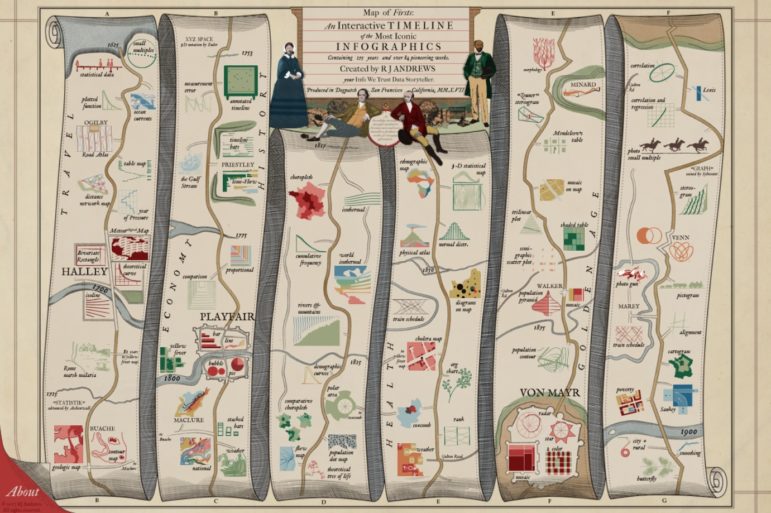
What’s the global data journalism community tweeting about this week? Our NodeXL #ddj mapping from February 19 to 25 finds economist @SethS_D analyzing Spotify data to find the correlation between our birth year and our music influences, @infowetrust illustrates three centuries of iconic infographics in a beautiful 17th century-styled dataviz and @EdjNet’s Stats Monitor gives you #ddj news leads on European data.

Data Journalism

This Week’s Top 10 in Data Journalism

What’s the global data journalism community tweeting about this week? Our NodeXL #ddj mapping from February 5 to 11 finds @flowingdata’s tips to visualizing missing or incomplete data, statistics of women’s challenges in journalism by @abraji and @generonumero and a cool income inequality interactive by @EconomicPolicy.

Data Journalism

This Week’s Top 10 in Data Journalism

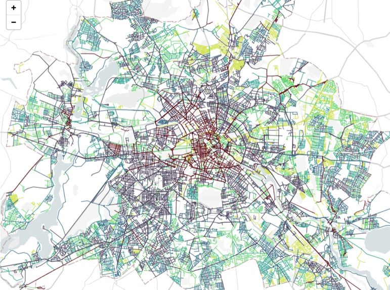
What’s the global data journalism community tweeting about this week? Our NodeXL #ddj mapping from January 22 to 28 finds a gorgeous data visualisation of German streets by @zeitonline, a detailed data analysis of Roger Federer’s tennis career by @srfdata and a look at eight alternatives in redistricting US voting boundaries by @FiveThirtyEight.

Data Journalism

This Week’s Top 10 in Data Journalism

What’s the global data journalism community tweeting about this week? Our NodeXL #ddj mapping from January 15 to 21 finds an interactive @voxdotcom piece on American districts which are reducing or perpetuating racial segregation in schools, several data-related good book recommendations by @stephencredmond and @Gapminder and a podcast discussion of memorable visualizations between @michelle_borkin and @datastories.

Data Journalism

How They Did It: Developing a Data-Driven Navigator on Gun Laws

Last August, Everytown for Gun Safety, a non-profit research and advocacy group for gun control, launched the Gun Law Navigator, an exploratory data visualization tool explaining how states in America regulate guns. The project, developed by the Boston-based creative digital studio Upstatement, received lots of attention not only for examining such a sensitive topic, but also for successfully telling a visual, data-driven story about a complex subject: legislation.

Data Journalism

This Week’s Top 10 in Data Journalism

What’s the global data journalism community tweeting about this week? Our NodeXL #ddj mapping from January 1 to 7 has data journalism and data visualization roundups by @ddjournalism and @flowingdata, podcasts by @datastories and @fabrider, as well as an analysis on prices corresponding with ski resort altitudes by @duc_qn.