Data Journalism
Data Journalism Top 10: COVID-19’s Spread, Death Rates, and Curve Flattening; The Shape of Dreams; Transphobia Tracking
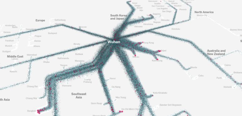
The attention of the global data journalism community remains very much tuned in to the developing COVID-19 pandemic, which is reflected in our NodeXL #ddj mapping from March 16 to 22. The New York Times mapped the movements of millions of people to trace how the virus spread out from China, The Financial Times tracked how coronavirus case trajectories compare among countries, while Robert Kosara explains the brilliance of a “Flatten the Curve” cartoon.