Accessibility Settings

color options

monochrome muted color dark

reading tools

isolation ruler

Tag

data analysis

37 posts

Data Journalism

Data Journalism Top 10: COVID’s Psychic Numbing, Disappearing Glaciers, Chemical Weapons, Homeschooling Fatigue, Basketball’s Three-Pointers

Homeschooling has presented many challenges to parents and legal guardians of children around the world, with many dissatisfied with the online learning experience. Our NodeXL #ddj mapping from April 26 to May 2 found a piece by Voxeurop highlighting that most people in Europe aren’t keen on their kids continuing to study remotely even if provided with the necessary materials and support. In this edition, we also feature an interactive project by the Guardian exploring disappearing glaciers, a look at Stephen Curry’s remarkable basketball records by The Washington Post, and an archive of publications using data sonification to tell stories.

Data Journalism

Data Journalism Top 10: Musical Taste by Politics, Podcasts, Polling Problems, COVID Tweet Analysis

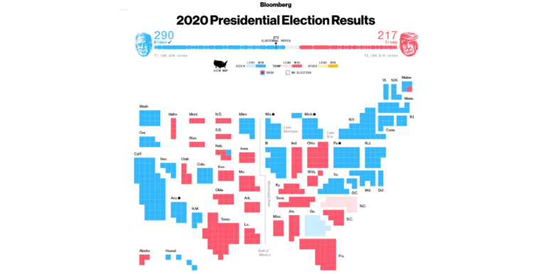
The US presidential election dominated the Twitter chat waves last week. Our NodeXL #ddj mapping from November 2 to 8 found data journalists sharing live election results trackers by Bloomberg, The Washington Post, and The New York Times, while The Atlantic and Slate weighed in on the problems of polling. Elsewhere open source platform Mapbox is organizing an election mapping contest, and Lazer Lab created a dashboard to explore 29 million tweets related to COVID-19 shared by over half a million Americans.

New GIJN Online Series Starts September 2020

Since the start of the pandemic, GIJN has produced more than 40 free webinars in 7 languages designed for journalists covering the COVID-19 crisis. Come September, GIJN will expand its online offerings on a range of new topics, with continued coverage of the pandemic.

Reporting Tools & Tips

Using Geospatial Technology during a Pandemic

Geospatial technologies and data can be used to contain and respond to the spread of a disease, but can also help in pre-empting and preventing them. Looking at outbreaks of malaria, SARS, H1N1 and Zika, among other viruses, Avneep Dhingra explores how maps and geospatial technology have helped during different outbreaks.

News & Analysis

South African Investigative Awards: Diverse Subjects, Nonprofit Surge, and Thanks to Whistleblowers

Outstanding investigative stories on subjects from land reform and roads to sexual abuse and corruption were among the finalists at this year’s Taco Kuiper Award for Investigative Journalism. Panel convener Anton Harber said the diversity of stories and media showed the core strength of South African investigative reporting, which was now being deployed to tackle the coronavirus pandemic fallout.

Data Journalism

Data Journalism Top 10: Bill Gates Conspiracies, COVID-19 Excess Mortality, Home Deaths Spike, Test Kits

Misinformation has grown ubiquitous during the COVID-19 pandemic, so much so that World Health Organization Director-General Tedros Adhanom Ghebreyesus proclaimed: “We’re not just fighting an epidemic; we’re fighting an infodemic.” Microsoft co-founder Bill Gates has emerged as a favorite target of disinformation actors, according to The New York Times, that we discovered through our NodeXL #ddj mapping from April 13 to 19. We also found The Economist and ProPublica examining the true impact of the pandemic by looking into “excess mortalities” such as home deaths, the Associated Press releasing and updating a coronavirus public dataset for the United States.

Data Journalism

Data Journalism Top 10: COVID-19 Data Viz, Brazil President’s Tweets, Beach Erosion, India’s Influencers, London by Bike, Syllabi

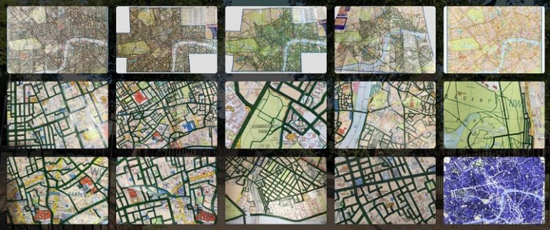
What’s the global data journalism community tweeting about this week? Our NodeXL #ddj mapping from March 2 to 8 finds a list of COVID-19 related data visualizations selected by health activist Joel Selanikio, Folha De S. Paulo analyzing Brazilian President Jair Bolsonaro’s tweets, VoxEurop highlighting the potential disappearance of the world’s beaches due to climate change, and Davis Vilums mapping every central London street over four years by cycling.

Data Journalism

GIJN’s Data Journalism Top 10: Women and the Oscars, February’s Sad Songs, Hollywood’s Franchises, Moscow’s Elite Owners

What’s the global data journalism community tweeting about this week? Our NodeXL #ddj mapping from February 3 to 9 finds UOL highlighting the lack of gender equality among Oscar winners and G1 looking into problems of ageism in the Best Actress category. This edition also has The Economist analyzing Spotify data to find the most depressing month for listeners, Proekt Media investigating property owners in a prestigious residential area in Russia, and The Financial Times spotlighting the lack of innovation in the movie industry.

Data Journalism

GIJN’s Data Journalism Top 10: Moscow Garbage, Mexican Homicide, EU Ideologies

What’s the global data journalism community tweeting about this week? Our NodeXL #ddj mapping from May 13 to 19 finds a preview snippet on sensible charts from @albertocairo’s upcoming book “How Charts Lie,” @ladatamx’s report on homicides in Mexico, @RepublikMagazin’s analysis on the changing ideologies of political parties in the European Union, and a recap of the Data Journalism UK conference by @paulbradshaw.