Data Journalism
Data Journalism Top 10: COVID-19 Data Viz, Brazil President’s Tweets, Beach Erosion, India’s Influencers, London by Bike, Syllabi
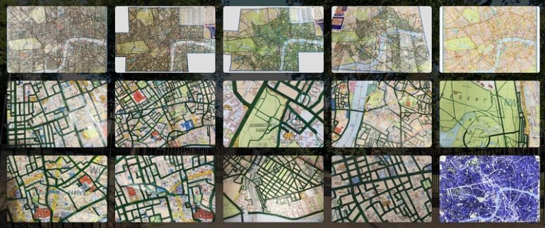
What’s the global data journalism community tweeting about this week? Our NodeXL #ddj mapping from March 2 to 8 finds a list of COVID-19 related data visualizations selected by health activist Joel Selanikio, Folha De S. Paulo analyzing Brazilian President Jair Bolsonaro’s tweets, VoxEurop highlighting the potential disappearance of the world’s beaches due to climate change, and Davis Vilums mapping every central London street over four years by cycling.