EARLY BIRD TICKETS - Online Investigative Journalism Week (IJ WEEK)
July 31, 2026 • 23:59
-
day
days
-
hour
hours
-
min
mins
-
sec
secs

Accessibility Settings

color options

monochrome muted color dark

reading tools

isolation ruler

Tag

data analysis

40 posts

Data Journalism

This Week’s Top 10 in Data Journalism

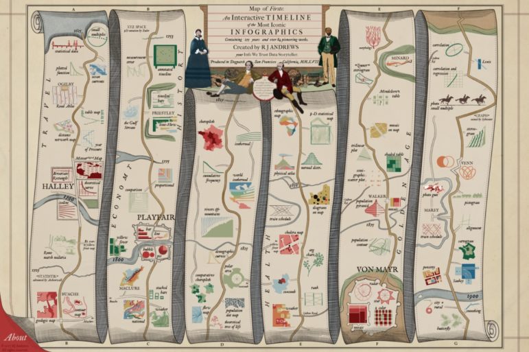
What’s the global data journalism community tweeting about this week? Our NodeXL #ddj mapping from February 19 to 25 finds economist @SethS_D analyzing Spotify data to find the correlation between our birth year and our music influences, @infowetrust illustrates three centuries of iconic infographics in a beautiful 17th century-styled dataviz and @EdjNet’s Stats Monitor gives you #ddj news leads on European data.

Data Journalism

This Week’s Top 10 in Data Journalism

What’s the global data journalism community tweeting about this week? Our NodeXL #ddj mapping from February 5 to 11 finds @flowingdata’s tips to visualizing missing or incomplete data, statistics of women’s challenges in journalism by @abraji and @generonumero and a cool income inequality interactive by @EconomicPolicy.

Resource

How To Create a Data Journalism Team

You don’t need the resources of The New York Times to create a data journalism team in your newsroom. But you do need to think out the structure. Here are 10 things you should consider if you are considering setting up your own team.

Data Journalism

Best of Data Journalism for Video Storytelling

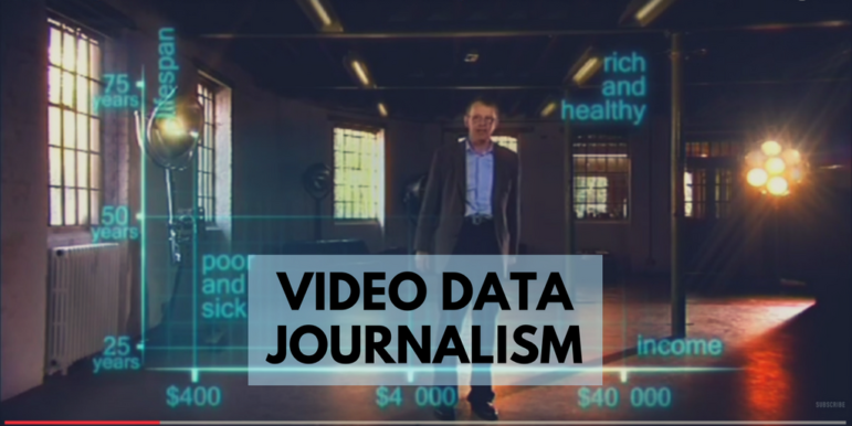
Wondering how to best adapt data journalism for broadcast? UK online journalism expert Paul Bradshaw has done a round-up of impressive examples from five countries — a primer on exploring data storytelling for video and television.

Data Journalism

Top Ten #ddj: This Week’s Top Data Journalism

What’s the global #ddj community tweeting about? Our NodeXL mapping from June 5 to 11 includes #VisualTrumpery from @mcrosasb, analysis of Theresa May’s election disaster by @GuardianVisuals, dataviz structuring strategies from @eagereyes, and school enrollment woes in Delhi from @htTweets.

Data Journalism Methodology

La Nación Maps Pollution on Argentina’s Matanza River

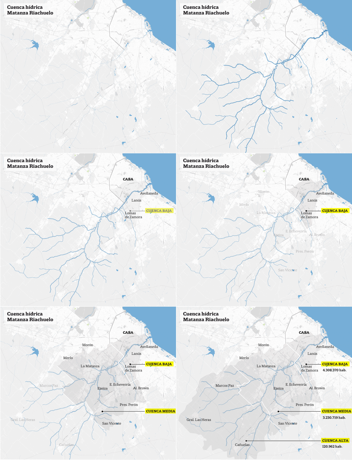
There is a huge amount of data available on pollution and disease caused by the Matanza River – widely known as River Riachuelo – the problem was transforming it into information that those affected could easily understand. In a special multimedia report, La Nación used open data and data visualization to illustrate the extent of the problem.

Data Journalism

Top Ten #ddj: The Week’s Most Popular Data Journalism Links

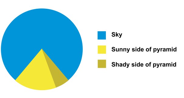
What are the hot data journalism tweets? Here are top links for Dec. 5-11: pie chart abuse (@johngrimwade); transit data tool (@ddjournalism); big data stories (@BigDataGirl); US diversity map (@PostGraphics); ddj survey (@Bahareh360); Swiss sprawl (@srfdata); dataviz types (@pol_ferrando); more.

Data Journalism

Top Ten #ddj: The Week’s Most Popular Data Journalism Links

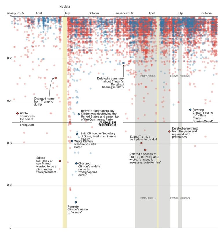
What’s the data-driven journalism crowd tweeting? Here are top links for Oct 24-30: Clinton/Trump facial analysis (@benheubl ); 10K edits to Clinton/Trump Wikipedia pages (@chrisalcantara); Amnesty 36-year dataviz (@jwyg); Latinos in office (@UnivisionData); open source tools (@M_Mandalka); & more.

Data Journalism Research

Top Ten #ddj: The Week’s Most Popular Data Journalism Links

What’s the data-driven journalism crowd tweeting? Here are top links for Sept 5-10: America’s shrinking middle class (@FT); Latino voters & Trump (@UniNoticias); iPhone7 rave (@newyorker); DocumentCloud (@SchoolOfData); Chicago’s sensor net (@arrayofthings); Visual Vocab (@MartinStabe); and more.

Resource

Data Journalism: GIJN’s Global Guide to Resources

As our governments and businesses become increasingly flush with information, more and bigger data are becoming available from across the globe. Increasingly, investigative reporters need to know how to obtain, clean, and analyze “structured information” in this digital world. Otherwise, they and the news organizations they work for will miss some of the most important […]