Data Journalism
Data Journalism Top 10: Bitcoin Mining, Ida’s Torrential Rains, and the Pandemic’s True Death Toll
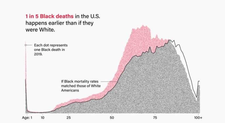
Tracking the most popular data journalism stories on Twitter from August 30 to September 5, using NodeXL mapping and our own human curation, we found a series of infographics by Al Jazeera illustrating the scale of the looming crisis. In this edition, we also feature a New York Times investigation into Bitcoin’s energy use, an examination of the Black mortality gap in the United States by The Marshall Project, and a look at the varying successes of the actors who have played James Bond by The Times (UK).