Accessibility Settings

color options

monochrome muted color dark

reading tools

isolation ruler

Tag

charts

50 posts

Data Journalism

This Week’s Top 10 in Data Journalism

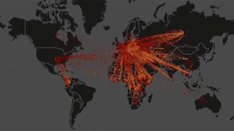
What’s the global data journalism community tweeting about this week? Our NodeXL #ddj mapping from February 12 to 18 finds @MattLWilliams discussing the ethics of publishing Twitter content, @MaryJoWebster explaining several common “dirty data” problems and @MediaShiftOrg showing examples of the powerful impact of small data teams in newsrooms.

Data Journalism

This Week’s Top 10 in Data Journalism

What’s the global data journalism community tweeting about this week? Our NodeXL #ddj mapping from January 29 to February 4 finds an @UpshotNYT analysis of the influence of Trump’s tweeting on Republicans’ attitudes towards the NFL, a new font typeface made out of human silhouettes created by @albertocairo and a fun Graphic Continuum card set by @jschwabish and @dataviz_catalog to use in the classroom.

Data Journalism

This Week’s Top 10 in Data Journalism

What’s the global data journalism community tweeting about this week? Our NodeXL #ddj mapping from January 1 to 7 has data journalism and data visualization roundups by @ddjournalism and @flowingdata, podcasts by @datastories and @fabrider, as well as an analysis on prices corresponding with ski resort altitudes by @duc_qn.

Data Journalism

This Week’s Top 10 in Data Journalism

What’s the global data journalism community tweeting about this week? Our NodeXL #ddj mapping from December 4 to 10 has @Reuters documenting the deplorable living conditions at refugee camps in Bangladesh, Financial Times’ @theboysmithy transforming bad charts into useful ones and the impressive work of the 2017 @infobeautyaward winners.

Data Journalism

This Week’s Top Ten in Data Journalism

What’s the global data journalism community tweeting about this week? Our NodeXL #ddj mapping from Sept. 18 to 24 features Wikipedia of Data Visualization, the State of Data Journalism, Dear Data Postcard Kit, and German election data.

Data Journalism

Behind the First Arab Data Journalists’ Network

In 2012, Amr Eleraqi launched a data visualization website to introduce the concept of data visualization to the Arabic-speaking world. Earlier this year, Eleraqi and team of nine launched the first Arab Data Journalists’ Network. Here’s how the group plans on changing the data journalism scene in the region.

Data Journalism

Data Journalism’s Top Ten

What’s the global data journalism community tweeting about this week? Our NodeXL #ddj mapping from July 31 to August 6 has @nytimes charting increasingly hot summers, @qz on Wannacry ransomware hackers cashing out their ill-gotten gains and @tagesanzeiger mapping lightning prone areas in Switzerland.

Data Journalism

Top Ten #ddj: This Week’s Top Data Journalism

What’s the #ddj community tweeting about? Our NodeXL mapping from May 29 to June 4 includes research on social media’s fake propaganda from @ddjournalism, mapping global refugee flow from @FastCompany and the tax bracket racket from @voxdotcom.

Data Journalism

Top Ten #ddj: The Week’s Most Popular Data Journalism Links

Here are the top data journalism tweets for March 6-12, per our NodeXL mapping: ski resorts & climate (@SPIEGELONLINE); science reporting grants (@ddjournalism); chart chooser (Andrei Pandre); #Tapestryconf recap (@catmule); scraping MP data (@marcelpauly); US middle class fail (@nytimes); & more.

Data Journalism

Top Ten #ddj: The Week’s Most Popular Data Journalism Links

Here are the hottest data journalism tweets for Jan 23-29, per our NodeXL mapping: 100 Years of infographics (@NatGeoMag); Trump’s wall size (@thetruesize); Women’s March (@womensmarch); journocoding (@journocode); dataset viz 25 ways (@flowingdata); dataviz stocktake (@eagereyes); & more.