My Favorite Tools: Geo-Journalist Gustavo Faleiros
Read this article in
For GIJN’s “My Favorite Tools” series, we spoke with Brazilian journalist Gustavo Faleiros, editor of environmental investigations at the Pulitzer Center, where he leads the Rainforest Investigations Network (RIN). The RIN initiative seeks to create stories at the intersection of climate change, corruption, and government in the three main tropical forest regions of the world: the Amazon, the Congo Basin, and Southeast Asia.
Faleiros has spent more than a decade reporting on the rainforest, winning recognition for his work from the Data Journalism Awards and the Gabriel Garcia Marquez journalism awards. In 2012 he founded InfoAmazonia, a multilingual digital platform that uses satellite images and public data to report on the nine Latin American countries that share the Amazon territory. “What moved me to start InfoAmazonia was the representation of the land, showing what was happening — deforestation, mining, oil spills,” says Faleiros, who remains the site’s executive director. Previously, he was editor of the Brazilian environmental news site O Eco.
For journalists just starting out in geo-journalism, Faleiros recommends beginning with free tools that are not overly complex, such as Google Earth Pro, the free, open source geographic information system QGIS, and Google Sheets.
Google Earth Pro, he says, provides “very attractive” satellite information. “You can compare with the past and see environmental changes, and they also have overlay layers, which are essential for visualization,” he says. “QGIS has many analysis tools, which is the second natural stage for someone who wants to do geospatial analysis, and Google Sheets serves to connect the databases.”
Gustavo Faleiros. Image: Courtesy Gustavo Faleiros
Mapping
Google Earth allows you to search anywhere. The desktop application allows you to create maps with advanced tools, and to import and export geographic information system (GIS) data, or use historical images to create retrospectives. “All the work that I have done with InfoAmazonia, and the things that I will do with the Pulitzer Center and the RIN, are based on geographic data research,” he says. “I started using Google Earth just over 10 years ago to visualize, for example, forest fires. At that time we weren’t even talking about ‘data journalism.’”
Faleiros started using QGIS — an open source GIS, or geographic information system, used for geospatial analysis — when he needed to start digging deeper for his stories. Through its desktop application you can view, manage, edit, and analyze data, and design printable maps. “I use this, for example, to make an analysis of the indigenous territories of the Amazon that have more deforestation or forest fires,” he says.
Many of InfoAmazonia’s visualizations start with Mapbox, an online map provider, which offers a free trial period and then a pay scale linked to the number of users. “It allows you to filter by range as well, but it is primarily a visualization tool,” Faleiros explains. “It allows you to make personalized maps; its visual characteristics are super strong.”
He adds: “When you look at InfoAmazonia’s collection of maps, you will see that they are all unique — that is something Mapbox allows. It is strong enough to illustrate maps and visualize data. It is an essential tool for us.”
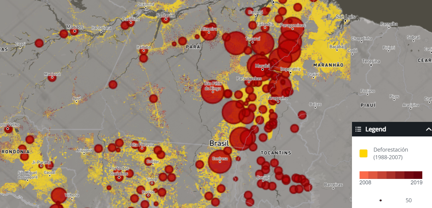
Many of InfoAmazonia’s visualizations begin with the Mapbox tool, like this graphic, which shows accelerating rates of Amazon deforestation over time. Graphic: Courtesy InfoAmazonia
Satellite Images
EO Browser is an open source web tool for browsing, viewing, and analyzing satellite images from various data sources. It allows you to inspect a map in the desired time range, make visualizations, create time-lapses, and download images. “I have used it to do research in indigenous territories where there are hardly any roads, highways, or trails,” he says. “It is a very good tool, and good for obtaining data.”
With NASA Worldview you can visually explore the planet’s past and present using satellite images. During the wildfire and burning seasons, Faleiros checks Worldview every day. “They update it daily, and you can actually see the smoke,” he says. “There are satellite images that allow you to visualize the emission of smoke from a forest burning, and pollution emissions.”
For Tables and Visualizations
“I use this a lot more than Excel,” he says. “Every time I have to do a type of visualization I use it; it is the basis of many things, such as dynamic tables and analysis.” For Faleiros, the great advantage of Google Sheets over Excel is the internet connectivity, which allows direct links to be embedded. “And it is a more dynamic application, which suggests the functions to work with.”
InfoAmazonia’s most-read story was “NASA Satellites Reveal High Fire Rates Alongside Deforestation.” It contained charts made in Datawrapper. The story, published in 2019, shows that fires in the Amazon had increased by 38% and that seven of the places that saw the most fires were also on the list of areas with the highest levels of deforestation.
Datawrapper allows you to make interactive maps and charts in a simple way, without the need to learn programming languages. “It is such a refined tool, it is so beautiful, whether you have to write down the data, highlight data, or [create] a column. The beauty of Datawrapper is in the details. It is a very good tool, very easy to use, and generates very useful graphics.”
Additional Reading
Resources for Finding and Using Satellite Images
My Favorite Tools 2020: Top Investigative Journalists Tell Us What They’re Using
Get Your Google Earth On: A Trainer’s Guide
 Mariel Lozada is GIJN’s Spanish Associate Editor and a Venezuelan freelance journalist. She has worked in digital journalism for five years, and has reported on health, gender, and human rights issues in Latin America. She is part of the La Tercera newsletter, and collaborates with Salud con Lupa, and Soy Arepita.
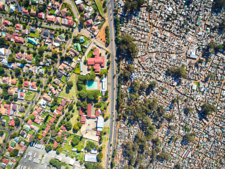
Tips for Reporters Seeking to Reveal the Scale of Inequality
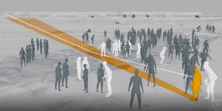
The Forensic Methods Reporters Are Using to Reveal Attacks by Security Forces

AI Accountability Reporting Guide

Guide to Mapping Analysis Using QGIS
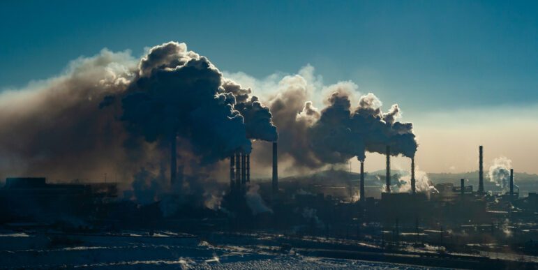
Essential Open Source Tools for Journalists Investigating Air Pollution

Harnessing the Power of Global Forest Watch for Data-Driven Reporting on Land Cover Change

Investigating ‘Cattle Laundering’ and Deforestation in the Amazon: Interview with the 2024 Goldman Prize Winner
Investigating Environmental Crimes: Tips From Reporters Covering the Amazon

This work is licensed under a Creative Commons Attribution-NoDerivatives 4.0 International License
Republish our articles for free, online or in print, under a Creative Commons license.
Republish this article
This work is licensed under a Creative Commons Attribution-NoDerivatives 4.0 International License
Read Next
Reporting Tools & Tips
Essential Open Source Tools for Journalists Investigating Air Pollution
Here is a list of open source data tools that journalists can utilize to track air pollution, uncover its sources, and reveal the corporate networks responsible.
Data Journalism Reporting Tools & Tips
Harnessing the Power of Global Forest Watch for Data-Driven Reporting on Land Cover Change
A Mongabay senior editor shares tips for unlocking the full capabilities of Global Forest Watch, a free-to-use online platform that she says has been instrumental in her reporting.
Awards, Grants, & Fellowships Reporting Tools & Tips
Investigating ‘Cattle Laundering’ and Deforestation in the Amazon: Interview with the 2024 Goldman Prize Winner
The 2024 Goldman Environmental Prize went to a multi-year exposé tracing the connection between meat sold in Western supermarkets and illegal deforestation in Brazil.
GIJC23 Reporting Tools & Tips
Investigating Environmental Crimes: Tips From Reporters Covering the Amazon
Two reporters whose investigative work has exposed systemic land grabbing and illegal mining in the Amazon share their tips.