Data Journalism Top 10: World Cup Odds, Upward Economic Mobility, Wartime Dreams, Noisy Charts
Read this article in


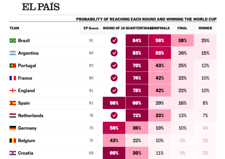
Spanish daily El Pais built a statistical tool to simulate the 2022 World Cup matches and predict the eventual winning country. Image: Screenshot, El Pais
With the 2022 men’s FIFA World Cup in full swing, this global pastime is getting plenty of data journalism treatment. This week we have El Pais’ informative and highly entertaining statistical model that determines who might win the tournament. For issues off the pitch, a striking visual investigation uses satellite images of World Cup construction sites to show the scale of the project — and analyze just how unlikely it is that the tournament will be carbon neutral, despite the organizers’ public promises. Our weekly NodeXL and human curation of the most popular data journalism stories on Twitter also features analysis of dreams people have during wartime, the legal consequences of the #MeToo movement in France, and the problem of pig farm pollution.
Who Will Win the World Cup?
The World Cup taking place in Qatar has been surrounded by controversy: from human rights and labor issues about site construction to press freedom concerns, and from complaints about the heat to the availability of beer. But for die-hard football fans, the most important question centers on which country’s players are most likely to hoist the golden trophy. Spanish newspaper El País created a statistical model to determine the likely results with the probabilities updated daily. (You can also read the Spanish language version.) The simulation takes metrics from recent game results and uses a ranking for the quality of each team’s players (measured by their transfer value in euros). “What we do is simulate every game, match by match. We repeat this process thousands of times,” the creators wrote. While conceding that the World Cup can be quite unpredictable (see Saudi Arabia’s 2–1 shock win over Argentina in the Group stage), the creators say the data can tell fans which team is the favorite (Brazil) and which teams are likely to go through from each stage. Bonus: A very cool interactive explainer on the offside rule from The Washington Post.
Predicting Upward Economic Mobility
Aaron Williams is an African-American data journalist and visualization expert whose work focuses on tackling inequity. For his first deep dive for The Pudding, the former Washington Post journalist decided to dig into his own story to find out how much he would have been expected to earn if he had stayed in different California neighborhoods. If he’d been raised in the part of rural California where his grandparents met and where his mother was born, his expected income by age 35 would be just US$19,000 per year. In the place where he was born, a city with “lousy air quality” 15 miles from downtown Los Angeles, it would be double that, at $38,000. His family’s decision to move to the San Francisco Bay area when he was seven meant his predicted annual income as an adult increased to $49,000. “Three different cities. Three different financial outcomes for Black kids,” he wrote, using census numbers, demographic data, and median household income figures to reveal the stark differences in a child’s expected outcomes. Williams also charts his family’s migration story as part of a greater narrative, including a map that shows the percentage change in Black populations by American city between 1910 and 1940.
Analyzing Dreams in Wartime
“Since the beginning of the war, many of us began to dream of all kinds of cruelty, violence, and so on,” explained data journalist Lyubov Popovets, who used data from a study into the dreams reported by Russians since the start of the war in Ukraine for her latest piece. As she detailed in ReadyMag, dreams are how “the psyche overcomes painful experiences,” so her analysis of around 1,000 night-time recollections recorded since March 2022 offers an insight into the thoughts of ordinary people. Her article, in Russian, used visuals and lists to show the subject matter of the most common dreams. Tweeting about her findings, she said that the most common emotion that respondents reported was “fear/horror.” In terms of action, she wrote, “most often in a dream the respondents ran somewhere or tried to do something, but they did not succeed.”
Junk Carbon Offsets
An investigation by Bloomberg Green revealed that dozens of global companies rely on cheap and ineffective offsets from renewable energy projects to help them tout green credentials or claims to be carbon neutral. For the last of a three-part series looking at the supply chain of “hollow renewable-energy based offsets” that help buyers make money or false claims, journalists Natasha White, Akshat Rathi, and Demetrios Pogkas analyzed hundreds of thousands of transactions and found that almost 40% of the offsets purchased last year involved these dubious projects, a total equivalent to the emissions of some top-polluting countries. Among the culprits buying “bogus offsets” that claim to be carbon neutral are Delta Airlines, bp (British Petroleum), Volkswagen, and Etsy. In response to the Bloomberg investigation, some companies said they would phase out offsets or, in the future, only purchase them from projects that actively remove carbon dioxide emissions.
#MeToo, en Francais
What became of the wave of #MeToo revelations reported in the French media since 2017? For the online investigative magazine Mediapart, journalists Donatien Huet, Lénaïg Bredoux, and Marine Turchey tried to answer this question by analyzing 100 of the most high-profile sexual harassment or assault cases revealed in France to find out what, if any, consequences followed those complaints. They discovered that the majority of these cases reported in the media resulted in legal proceedings: 85 cases went to court, either as a result of complaints or internal referrals to the public prosecutor’s office. Of these, 20 were dismissed — the others are ongoing. In their dissection of the 100 varied cases, they found two common themes: First, apart from political scientist Olivier Duhamel and former surgeon Joël Le Scouarnec, who both confessed, the overwhelming majority of those accused disputed the alleged claims. Second, in nearly two-thirds of cases there were multiple complainants. Also of note: 20% of complainants were men, and two-thirds of complaints concerned individuals in politics or the cultural and creative fields.
Energy as a Weapon
Featured in The Economist’s Graphic Detail, Ainslie Johnstone created a striking visualization to accompany a story about how Russia’s use of energy as a weapon might be deadly during the coming winter. To win the war, the article noted, Vladimir Putin needs the West to stop supporting Ukraine — and this winter might be his best opportunity to drive a wedge between them. Before the war, Russia supplied up to half of the EU’s natural gas imports. Fuel prices surged after Putin turned off a major pipeline to Europe in August, and while the EU has weathered this well by stockpiling, soaring energy costs have reached consumers — and the colder the temperature, the more deaths occur every winter. Johnstone also plotted charts showing that while heatwaves get more headlines, it’s the cold that is more deadly. In Europe, average weekly deaths per million people tend to spike from November to February. “In the past, changes in energy prices have had a small effect on deaths,” noted the article. “But this year’s cost increases are remarkably large.”
Qatar World Cup Carbon Neutral?
The 2022 World Cup in Qatar would be the first event in its history to be carbon-neutral, both FIFA and Qatar pledged. The latter said it would cut emissions with solar-powered lighting and cooling systems, offset unavoidable emissions with local green projects, and construct “energy efficient stadiums.” Experts are skeptical, however, particularly on this last point. This interactive visual investigation — by German daily Der Tagesspiegel and the Investigative Reporting Project Italy (IRPI) — used satellite imagery to analyze stadium and other construction sites, to conclude that it is most unlikely this World Cup is carbon neutral. In the last 10 years, for instance, at least 8 million square meters of Qatar’s mostly desert land have been cemented and asphalted over to accommodate the World Cup — the equivalent of 1,140 soccer fields of concrete. According to Carbon Market Watch, they noted, the amount of carbon dioxide emitted for the permanent stadiums alone is already far higher than that predicted by FIFA and Qatar.
Pollution from Pig Farms
Spain is home to a number of giant pork farms, with thousands of entities housing upwards of 2,000 animals. But according to this analysis by the Spanish investigative data outlet Datadista, methane emissions from these farms are on the increase, despite state and European commitments to cut them. In 2021, the reporters found, the total amount of methane released from these super farms breached 100,000 tons for the first time, up 2.7% from the previous year. The team created an interactive map to highlight the emissions by farm and listed the biggest polluters by name. They also used official data to highlight how ammonia emissions are also increasing, and where the use of slurry risks toxins seeping into aquifers.
Data Journalism Survey
GIJN is partnering with DataJournalism.com for its annual State of Data Journalism Survey – which offers insights into those working in this field, the tools and technology being used, and how data journalism is evolving. The questionnaire is open to anyone who participates in the field of data journalism. Last year more than 1,500 people responded, revealing widespread self-teaching across the sector, and unequal access and quality of data across different countries. This year’s survey closes on December 31, with the results published early next year.
Noisy Charts
While data journalists often have a talent for the visual, journalist Nick Evershed reminds us this week about the power of sound. Sharing a new web app created by his Guardian Australia team that “quickly makes data into charts with audio and animation,” he showed how anything from rising global carbon dioxide levels to a falling pound can be displayed using audio. For example, he used a sad trombone sound to illustrate the decline in Mark Zuckerberg’s average net worth per quarter over the last year. Another example denoted the ups and downs in dog breed popularity in Australia using — yes — dog barks, while the “anxiety-inducing” synth noises on the climate change chart rises to fever pitch to denote a sense of urgency. He shared a behind-the-scenes look at the tool here, explaining the dual motivations of improved accessibility and reaching new audiences. And here’s a video explainer.
Bonus: Training Wheel Approach to Teaching
Data viz expert Alberto Cairo, the Knight Chair in Visual Journalism at the School of Communication of the University of Miami, is back to blogging after more than a year’s hiatus. In one of his latest posts, he explained how he teaches. “The only way to learn a craft is to practice the craft nonstop,” he wrote. He detailed how he tries to give feedback while his students – data scientists, statisticians, engineers, interaction designers, plus a few communication and journalism majors – are still preparing their projects, rather than after, and how regular feedback is important. Comparing the process to learning to ride a bike, he said “you can certainly try to do it without training wheels; it’s faster, but it might also lead to crashes. Or you can begin with two training wheels…then one wheel… and then no training wheels.”
Thanks again to Marc Smith and Harald Meier of Connected Action for gathering the links and graphing them. The Top Ten #ddj list is curated weekly.
 Alexa van Sickle is an associate editor at GIJN. She was previously a senior editor for the foreign correspondence magazine Roads and Kingdoms. She has also been an editor at the International Institute for Strategic Studies and a publisher at an international law non-profit in London. She lives in Vienna, Austria.
 Laura Dixon is an associate editor at GIJN and a freelance journalist from the UK. She has reported from Colombia, the US, and Mexico, and her work has been published by The Times, The Washington Post, and The Atlantic. She has received fellowships from the IWMF and the Pulitzer Center.
For a look at NodeXL’s mapping on #ddj and data journalism on Twitter, check out this map.

This work is licensed under a Creative Commons Attribution-NoDerivatives 4.0 International License
Republish our articles for free, online or in print, under a Creative Commons license.
Republish this article
This work is licensed under a Creative Commons Attribution-NoDerivatives 4.0 International License
Read Next

Data Journalism News & Analysis
Lessons Learned: 10 Common Mistakes in Data Journalism
GIJN asked speakers and attendees in the NICAR conference hallways for the data journalism gaps they see, and for under-covered topic areas and under-used skills that newsrooms can address.

Data Journalism
10 Outstanding Data Projects Win the 2024 Sigma Awards
There were 52 data journalism entries from 22 countries in shortlist for the 2024 Sigma Awards. Here are the top 10 winning projects.

Tipsheet Data Journalism Reporting Tools & Tips
Tipsheet for Using Ocean Data in Your Investigations
Investigations into what happens on, under, and around the ocean can often be answered thanks to the vast amount of data available online.

Data Journalism Reporting Tools & Tips
Best Practices for Working With Mass Shootings Data
There can be confusion among journalists about “mass shootings” data, which leads to wildly different numbers and deeper confusion among audiences.