The Marshall Project analyzed trends in detention of minors at the US-Mexico border. Image: Screenshot
Data Journalism Top 10: Child Detentions at US Border, Slave Journeys, Aztec Iconography, Facebook’s ‘Broken Promises’
Read this article in


The Marshall Project analyzed trends in detention of minors at the US-Mexico border. Image: Screenshot
This week, The Marshall Project analyzed detention conditions for children on the southern US border, while the just-launched nonprofit news site Baltimore Banner dug into the rise in empty housing in that US city and the socio-economic impact of derelict buildings. Our weekly NodeXL and human curation of the most popular data journalism stories on Twitter also features stories about historic slave journeys, airplane-linked lead pollution, weather anomalies, holidays of the Russian elite, a Watergate Scandal visual timeline, and a piece examining how often Facebook has failed to keep its promises.
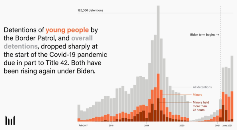
Plight of Children at the US-Mexico Border
The Marshall Project, a US-based nonprofit and a GIJN member organization, investigated the plight of children, either unaccompanied or with their families, trying to reach the Texas border from Central and South America as well as the Caribbean. The journalists analyzed previously unpublished official data, obtained through Freedom of Information requests, on the detention of children under the age of 18 in this southern US state. The analysis revealed that one in three of those held at US border patrol facilities since 2017 were minors — a total of 650,000 children. The data also revealed that about one-third of those were detained for longer than the 72-hour limit allowed by law, and many of them suffered mistreatment from Border Patrol agents. Find out more about the investigation in The Marshall Project’s Twitter Spaces broadcast.
Baltimore’s Vacant Housing Crisis
The US city of Baltimore is a place blighted by vacant housing, which can lead to falling home values and “disinvestment.” And the situation is not improving despite efforts to fix the issue, according to a data analysis by the recently launched nonprofit news outlet Baltimore Banner. While academics at the University of Baltimore noted that a 4% vacancy rate is standard for “stable” neighborhoods, journalist Hallie Miller found that nearly half of the 55 Baltimore neighborhoods she examined have a rate higher than that. Miller also took a look at how the legacy of “redlining” — a discriminatory practice of denying mortgage finance to predominantly Black neighborhoods — contributed to the problem of too many vacant properties. She explains the issue in a tweet thread. You can find the dataset here.
Journeys of Slaves
Journalists at The Economist analyzed a new dataset that tracks the journeys of slaves transported along the US coast to the city of New Orleans, and what happened to these people’s families. The historical data — collected from passenger manifests between 1825 and 1848 — suggests that family separation was “shockingly prevalent.” Some 88% of the 334 slave journeys analyzed by historian Jennie K. Williams showed people being separated from their immediate families — transported from the start without them or separated from their loved ones after arriving in New Orleans. Find the database about former captives from the Atlantic slave trade here.
Airport Emissions Clusters
If you live close to a US airport, you might be at higher risk of exposure to airborne lead ejected by airplanes flying overhead. To understand the scope of the problem, Quartz mapped the flight paths of planes flying to and from 95 of the top lead-emitting airports in the US from 2016 to 2022. The report also highlighted a study that found that children living near airports had higher blood lead levels, a concern since lead exposure can have serious consequences for young people’s health.
https://twitter.com/YAN0/status/1537486517743955969?s=20&t=on_BE5Bw6njikXuG7dZc1Q
Feeling the Heat in Germany
This interactive chart, updated daily by the team at Der Spiegel, draws attention to how temperatures are rising in Germany. Daily high temperatures at or above 35 degrees Celsius (95 degrees Fahrenheit) used to be rare in the country, but are becoming increasingly common. For more on the topic, you can read this academic article. Bonus: Berliner Morgenpost prepared an adaptable and printable fan to help you cool down in the heat while drawing attention to climate change through the data-based, color-coded stripes (based on climatologist Ed Hawkin’s “warming stripes” visualization) that track the rise of global warming.
Visual Timeline of the Watergate Scandal
To mark 50 years since the Watergate scandal — one of the most famous examples of great investigative journalism, and a story that led to the resignation of then-US President Richard Nixon — The Washington Post created a visual chronology to reconstruct how Post reporters covered the story. Featuring the newspaper’s original clippings, the timeline shows how the reporting progressed, from the break-in at the Democratic National Committee’s headquarters, to how one of the accused was tied to President Nixon’s re-election campaign, to where the money that paid for the break-in came from. More importantly, we are reminded how President Nixon, despite all his efforts, could not cover up the crimes that led to his downfall.
Tracking Belgium’s Labor Shortages
Brussels-based data journalism site De Tijd analyzed how labor shortages are creating a crisis situation in workplaces across Belgium, affecting everything from education to health, from cleaning services to engineering. The report features a comparison chart showing the number of open positions (more than 84,500 at the end of May) and a scatter chart showing the ratio between open vacancies and job seekers across different professions. Mapping the data, reporters found that the number of people suitable for the available jobs has gradually decreased in many regions and the places where labor shortages are most severe.
Aztec Iconography
The Aztecs worshipped dozens of different gods, so the team at The Pudding created a kind of Aztec mythology explainer, using “Aztec codices” to collect and restore illustrations of them. Contrary to popular belief, Aztec gods are not associated with a single domain: for example, life and death are embodied in the same god. The team said by getting to know 13 of the “major” gods in detail, it is possible to examine the lasting effects of Aztec society on modern life.
Post-Invasion Getaways of the Russian Elite
Where once the mantra was “follow the money,” investigative journalists may now be as wise to “follow the flights.” According to a data-led investigation by The New York Times, since the invasion of Ukraine, the private jets of Russian elite no longer land as often in Paris, Milan, and Geneva, but increasingly in places like Dubai, Azerbaijan, and Turkey. Using data from RadarBox.com, the team examined 2,000 flights to show how the post-invasion sanctions on Russia have forced that country’s oligarchs and billionaires to abandon the European cities that used to be their playgrounds. According to this analysis, where once only 3% of private flights departing from Russia landed in Dubai and Istanbul, the figure rose to 14% by May.
Facebook’s Broken Promises
The Tech Transparency Project — a group established to track Facebook’s responses to repeated violations of its Community Standards — has produced a report that catalogs hundreds of the “broken promises” of the social media platform, covering complaints related to digital bullying, cyber fraud, and hate speech, among other issues. The interactive database the team created reveals Facebook’s failures over the years, detailing how it has not been able to resolve some problems and questioning if it has been “unwilling” to address others. The data comes from Facebook’s own open database, and the story is bookmarked by historic concessions from the platform’s top team that “we need to do better.”
Thanks again to Marc Smith and Harald Meier of Connected Action for gathering the links and graphing them. The Top Ten #ddj list is curated weekly.
 Pınar Dağ, GIJN’s Turkish editor, is a lecturer in the new media department of Turkey’s Kadir Has University and specializes in data literacy, open data, data visualization, and data journalism. She is co-founder of the Data Literacy Association, Data Journalism Platform Turkey, and DağMedya.
For a look at NodeXL’s mapping on #ddj and data journalism on Twitter, check out this map.


This work is licensed under a Creative Commons Attribution-NoDerivatives 4.0 International License
Republish our articles for free, online or in print, under a Creative Commons license.
Republish this article
This work is licensed under a Creative Commons Attribution-NoDerivatives 4.0 International License
Read Next

Data Journalism News & Analysis
Lessons Learned: 10 Common Mistakes in Data Journalism
GIJN asked speakers and attendees in the NICAR conference hallways for the data journalism gaps they see, and for under-covered topic areas and under-used skills that newsrooms can address.

Data Journalism
10 Outstanding Data Projects Win the 2024 Sigma Awards
There were 52 data journalism entries from 22 countries in shortlist for the 2024 Sigma Awards. Here are the top 10 winning projects.

Tipsheet Data Journalism Reporting Tools & Tips
Tipsheet for Using Ocean Data in Your Investigations
Investigations into what happens on, under, and around the ocean can often be answered thanks to the vast amount of data available online.

Data Journalism Reporting Tools & Tips
Best Practices for Working With Mass Shootings Data
There can be confusion among journalists about “mass shootings” data, which leads to wildly different numbers and deeper confusion among audiences.