Tortoise Tortoise и Sky News разработали базу данных Westminster Accounts — с её помощью можно отслеживать, сколько денег вливается в британскую политику. Скриншот: Tortoise
Data Journalism Top 10: Best Dataviz, Westminster Accounts, Cosmetics Waste, Capitol Rioters Sentencing
Read this article in

Step-By-Step Guide for Journalists on the Basics of Google Sheets

Tipsheet for Using Ocean Data in Your Investigations

No Coding Required: A Step-by-Step Guide to Scraping Websites With Data Miner

GIJC23 – The Future of Data Journalism: New Analytical Tools, Data Visualization, and AI
With the one-year mark of Russia’s invasion of Ukraine approaching, data journalists are still finding novel ways to report on the war’s developments and implications. This week, the Institute of War & Peace Reporting (IWPR) visualized data from thousands of social media comments to see how the war was perceived in Central Asia.
Our weekly NodeXL and human curation of the most popular data journalism stories on Twitter also features a tool by Tortoise and Sky News to explore donations received by UK’s members of Parliament, a look at cosmetics waste from Deduktif, Le Monde’s podcast on mapping, and an analysis of the sentencing of rioters involved in the 2021 US Capitol attack.
The Mega List of Data Visualization Lists
We’re kicking off this year’s first GIJN Top 10 in Data Journalism column with a look back on the great work produced by data teams worldwide in 2022. Since 2015, data journalist and visualization consultant Maarten Lambrechts has been compiling a year-end meta list of best data visualization lists. His latest collection includes the work of Axios, Scientific American, Vox, Atlo Team, and ProPublica, among others. (Disclaimer: GIJN’s own Editor’s Pick: Top 10 Data Journalism Projects from 2022 is mentioned in the piece.)
How Russia’s War is Perceived in Central Asia
A journalist-analyst team at the IWPR’s Central Asia Bureau for Analytical Reporting sifted through over 25,000 comments on social media — including emojis — and Google searches about news on the war in Ukraine, published by leading news outlets in Kazakhstan and Uzbekistan. Among their findings, they noted that users in Uzbekistan were active in commenting from the very start of the war, but that comments declined as the war progressed — until the news in September of Russia’s partial mobilization of military reservists sparked renewed engagement. In Kazakhstan, the most comments on Russia’s mobilization came from users in three regions bordering Russia. Of note: less than one-third of comments from either country were in support of the war.
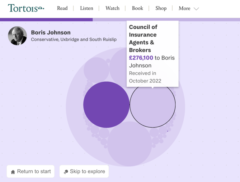
The Westminster Accounts
British news website Tortoise Media and TV channel Sky News collaborated on a first-of-its-kind “database of databases” to reveal the scale of money funneled into UK politics. The tool can be used to search, by UK postcode or by Members of Parliament (MPs), for the sources and amounts of donations. In explaining the methodology, they noted that gathering all sources of cash — often from tens of thousands of financial reports — was a laborious process despite this information being publicly available. Some notable numbers: Sky News reported that, since the end of 2019, MPs have earned around £17.1 million (about US$20.8 million) on top of their salaries. And a small group of mostly Conservative MPs have gotten nearly 90% — £15.2 million (US$18.5 million) — of that amount.
Cosmetics Waste
By combining online surveys, data from the Indonesia Food and Drug Supervisory Agency, and field reporting, this project by Indonesian independent media site Deduktif raises readers’ awareness of the waste problems generated by lipstick usage. They packaged the story into an interactive format in which readers enter their name and, for instance, the number of lipsticks they buy, and receive personalized responses and data visualizations based on their entries. Check out the video (in Indonesian) here.
Podcast: Mapping Change
This week’s Radio France podcast episode “Les Cartes en mouvement” (Moving Maps) discusses an interactive map of rail networks in the Île-de-France — a region in north-central France that includes Paris. This area was featured in a recent Le Monde article that visualized the record-breaking amount of planned works on the region’s rail network in 2023. Never before, the article claims, has so much construction been scheduled in such a short timeframe on one of the world’s densest train networks. Île-de-France residents alone represent 70% of national passenger traffic for the SNCF, France’s state rail company. The map details the vast amount of work is planned, but also shows where major engineering works will result in day-long delays and where track regeneration will cause slowdowns on evenings and weekends. Check out the rest of the podcast episodes here.
Sentencing of US Capitol Rioters
On January 6, 2021, hundreds of people stormed the United States Capitol building to protest against Joe Biden’s 2020 presidential election win. The event triggered the largest police investigation in US history, with more than 900 people federally charged so far for trespassing, participating the insurrection, or other crimes. Two years on, The Washington Post examined the sentencing of more than 300 of these rioters and found that the final punishments meted out by judges were more lenient than the sentencing recommendations of federal prosecutors in more than three-quarters of the cases.
Savings Calculator for a Life of Luxury
GIJN member organization Rise Moldova revealed the riches of a prominent Moldovan oligarch in a news game, by presenting his belongings as items in a shopping catalog. The team included a calculator for readers to estimate, based on their current income, how many years it would take them to save up money to buy any, or all, of the oligarch’s assets, which include a yacht, a house in France, a business jet, and several luxury cars.
On the Brink of Extinction
According to a report by Reuters, records show that at least 881 animal species have gone extinct since the 1500s. However, scientists suspect that the real number is closer to 1,473. Journalists from the wire service dove into the data to examine the extinction risks of threatened species and visualized the last sightings of hundreds of now-extinct animals, including notable species such as the dodo bird.
Tracking India’s Government Data Quality
The availability of open government data increases transparency and accountability of a nation’s governance. It can also be very useful for data journalists to track changes, spot trends, and discover concerning issues by analyzing that data. In India, GIJN member organization Indiaspend highlighted the problem of open government data being released in unusable formats and of poor quality. It also reported on delays in the release or collection of 12 of the 20 government datasets they monitor, including crucial information such as the census, household expenditure, and poverty estimates.
New Book on Data Journalism
Mike Reilley, who teaches data journalism at the University of Illinois at Chicago, and Samantha Sunne, who teaches data techniques to journalists at the Society of Professional Journalists, Investigative Reporters and Editors, and at universities, have published a new book titled “Data + Journalism: A Story-Driven Approach to Learning Data Reporting.” The book is intended as a guide, with a global perspective, to reporting data-driven stories. On Twitter, data journalist and director of the Ohio Center for Journalism Lucia Walinchus noted that the book includes tips on Freedom of Information requests and finding free access to court databases such as PACER, as well as interesting historical case studies. Read a bonus chapter on diversity, equity, and inclusion in data reporting.
Thanks again to Marc Smith and Harald Meier of Connected Action for gathering the links and graphing them. GIJN’s Data Journalism Top 10 list is curated weekly.
 Eunice Au is GIJN’s global team manager. Previously, she was a Malaysia correspondent for Singapore’s The Straits Times, and a journalist at Malaysia’s New Straits Times. She has also written for The Sun, Malaysian Today, and Madam Chair.
 Alexa van Sickle is an associate editor at GIJN. She was previously a senior editor for the foreign correspondence magazine Roads and Kingdoms. She has also been an editor at the International Institute for Strategic Studies and a publisher at an international law non-profit in London. She lives in Vienna, Austria.
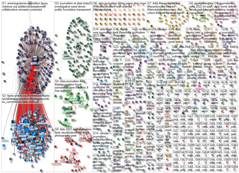
For a look at NodeXL’s mapping on #ddj and data journalism on Twitter, check out this map.
Step-By-Step Guide for Journalists on the Basics of Google Sheets
Tipsheet for Using Ocean Data in Your Investigations
No Coding Required: A Step-by-Step Guide to Scraping Websites With Data Miner
GIJC23 – The Future of Data Journalism: New Analytical Tools, Data Visualization, and AI

Turning the Threat to a Distant Glacier into a Local Story Through Data Visualization

One Name at a Time: How Die Zeit Built a Searchable Database of Nazi Party Members

Visualizing a Trillion Dollars, India’s Warming Cities, Russian Mercenaries at Sea, and World Cup Player Physiques
‘Super’ El Niño Threat, Myanmar Villages Razed, California’s Billionaire Tax Bill, and South Africa’s Murder Rate

This work is licensed under a Creative Commons Attribution-NoDerivatives 4.0 International License
Republish our articles for free, online or in print, under a Creative Commons license.
Republish this article
This work is licensed under a Creative Commons Attribution-NoDerivatives 4.0 International License
Read Next
Climate Data Journalism
Turning the Threat to a Distant Glacier into a Local Story Through Data Visualization
New York Times climate and environmental graphics reporter Mira Rojanasakul discusses how her team visualized the sea level rise threat from the melting Thwaites Glacier in Antarctica.
Data Journalism
One Name at a Time: How Die Zeit Built a Searchable Database of Nazi Party Members
An online tool set up by the German newspaper Die Zeit, in cooperation with archives in Germany and in the United States, allows people to search several million Nazi Party membership cards.
Data Journalism Top 10
Visualizing a Trillion Dollars, India’s Warming Cities, Russian Mercenaries at Sea, and World Cup Player Physiques
Also highlighting how films portray Ukrainians, increasing tree cover in Spain, and how couples meet.
Data Journalism Top 10
‘Super’ El Niño Threat, Myanmar Villages Razed, California’s Billionaire Tax Bill, and South Africa’s Murder Rate
Also highlighting exploitation of journalists in Egypt, Argentina’s returning World Cup squad, and the strain on Singapore’s aging caregivers.