Accessibility Settings

color options

monochrome muted color dark

reading tools

isolation ruler

Series

Top 10 in Data Journalism

430 posts
Structuring visual narratives, by Gurman Bhatia

Data Journalism

Data Journalism Top 10: Women’s Careers, Vitamin D, Visual Stories, Electric Cars, Japan’s Ghost Towns

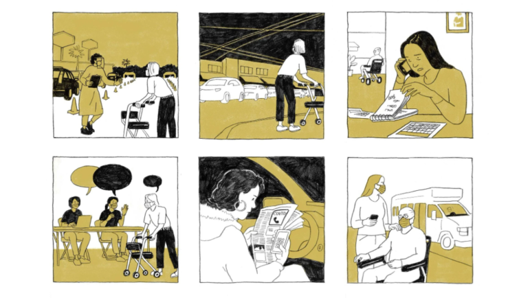
On the one-year anniversary of the COVID-19 crisis being declared a global pandemic, outlets around the world looked back on how the coronavirus has transformed our lives. Our NodeXL #ddj mapping from March 8 to 14 found a comprehensive summary of how the health crisis unfolded in the United States by The Washington Post, and a look at the COVID-19 crisis in Hungary. In this edition, we also feature The Economist’s interactive tool estimating the risk posed by COVID-19 based on a person’s health, a story about the ghost towns in Fukushima by NPR, and an analysis of the future of electric cars by The New York Times.

Data Journalism

Data Journalism Top 10: Pandemic Cocktails, Pricey Food, Zoonotic Diseases, the World’s Top Songs

If you have tried to mix cocktails at home lately, you’re not alone. Tired of waiting for bars and restaurants to reopen, more consumers have started buying premium alcohol, according to data published by the Financial Times. Our NodeXL #ddj mapping from March 1 to 7, which tracks the most popular data journalism stories on Twitter, also found an analysis by Bloomberg showing that global food prices have hit their highest level in six years, an explainer of the connection between bats and virus outbreaks by Reuters, an interactive piece on Atlantic currents by The New York Times, and a musical map by The Pudding.

Data Journalism

Data Journalism Top 10: Solar-Powered Batmobile, Hungarian Money Abroad, Migrants Dying in Qatar, Open Windows & COVID-19

For decades, environmentalists have been dreaming about climate-friendly transportation. The arrival of hybrid and electric cars has brought us one step closer to travelling without damaging the planet. And this year, a California start-up promises to push the technology even further by rolling out the first mass-produced solar-powered car. Our NodeXL #ddj mapping from February 22 to 28 features this story alongside an investigation by the Guardian into deaths of migrant workers in Qatar, a cross-border project revealing Hungarian money flowing overseas, and a creative infographic about animals in space.

Data Journalism

Data Journalism Top 10: Mission to Mars, Myanmar’s Protesters, Sand Mining, Journalism in Russia

After going through “seven minutes of terror,” NASA’s Perseverance rover managed to successfully touch down on Mars last week. Our NodeXL #ddj mapping from February 15 to 21 found reporting by The Wall Street Journal and Al Jazeera, which offers more insight into the rover’s journey to the red planet. In this edition, we also feature a story about the boom in independent journalism in Russia, an analysis of the future of South Africa’s coal mining industry, and a critique of data visualization’s ability to fully convey the realities of large-scale tragedies.

Data Journalism

Data Journalism Top 10: Back to School, Australian Open Underdog, Amazon Oxygen Shortage, Big Tech & Green Energy

How can we get students and teachers safely back into classrooms? For many months, this has been a key question for public authorities, school leaders, and parents around the world. This topic and others topped the data journalism stories on Twitter from February 8 to 14. Check out #ddj stories from The New York Times, NPR, the Financial Times, FiveThirtyEight, and The Pudding.

Data Journalism

Data Journalism Top 10: Biometric IDs, Data Spaghetti, Eviction Avalanche, Remote Working

With countries around the world considering the safest ways to ease lockdown measures, alongside the deployment of COVID-19 vaccines in many places, some are finding reasons to be optimistic about the end of the coronavirus crisis. But returning to once conventional daily activities, such as going to restaurants and sports stadiums, is still a distant prospect. Our NodeXL #ddj mapping from February 1 to 7 found Voxeurop covering the dangers of adopting biometric IDs and health passports, a look at Europe’s COVID-19 divide by Reuters, an analysis of leaked smartphone data by The New York Times, and a Twitter thread collection of archived data visualizations in various languages.

Data Journalism

Data Journalism Top 10: Polarized America, Australia’s Pandemic, Poland’s Toxic Air, the Arab Spring, Life as Lego

Our NodeXL #ddj mapping from January 25 to 31 found interactive projects by the Australian Broadcasting Corporation and The Guardian analyzing these events. In this edition, we also feature environmental reporting by The New York Times and The Economist, a Wall Street Journal story on the GameStop Reddit mania that shook stock markets, and a visual representation of 2020 using Lego bricks.

Data Journalism

Data Journalism Top 10: A New President, Trump’s Twitter Insults, Germany’s Elections, Flying Green

As Joe Biden was sworn in as the 46th president of the United States, much of the international media coverage was focused on an inauguration like no other. Our NodeXL #ddj mapping from January 18 to 24 found a Washington Post analysis of the president’s first address to the nation and a Bloomberg project visualizing the enhanced measures put in place to deal with concerns about security and the coronavirus.

Data Journalism

Data Journalism Top 10: From Newsroom to Netflix, Inside the Capitol Riot, Vaccine Data, Facebook for News

As governments around the world continue vaccination efforts and extend lockdowns, some experts argue that more data is needed to evaluate the effectiveness of immunization campaigns and mobility restrictions. Our NodeXL #ddj mapping from January 11 to 18 found outlets in Germany and the United Kingdom analyzing government measures to reduce the impact of the COVID-19 pandemic. In this edition, we also feature an insightful interview with former Washington Post journalist Aaron Williams, an interactive timeline of the US Capitol riot by ProPublica, and a refreshing data visualization project by The Pudding.

Data Journalism

Data Journalism Top 10: National Geographic Maps, Capitol Riots, Flu vs. Coronavirus, Happiness Index, Black Market Data

Scenes of supporters of outgoing President Donald Trump storming the US Capitol building dominated news headlines and filled social media feeds last week. Our NodeXL #ddj mapping from January 4 to 10 found Reuters producing a play-by-play summary of what happened, and FiveThirtyEight examining the stark difference in reaction by the authorities to the Capitol mob compared to Black Lives Matter protesters. Also in this edition, we feature National Geographic’s cartography archive, Data Crítica’s investigation into under-counting of Indigenous COVID-19 infections, and The Markup’s analysis of the impact of Facebook’s political ads.